
The extended-datetimepicker for Angular Material
The extended-datetimepicker is a date and time picker solution for the Angular based projects. This is a mobile-friendly component that enables month navigation by swiping the smartphone. Swiping left will take to the previous month while the right to the next month.
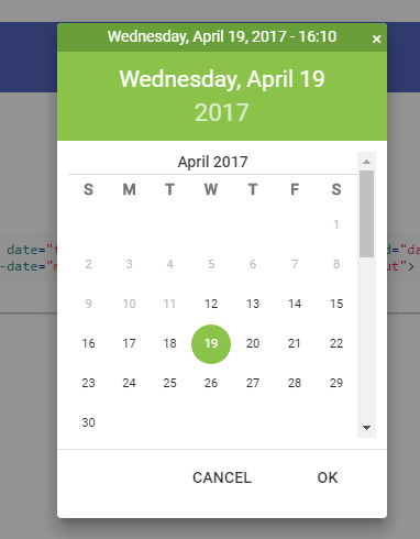
After the date or time picker is opened by clicking inside the input field or using a button etc. the date can be selected by double click or single click the date and press the OK button.
Demo1 Demo2 Demo3
Developer page Download plug-in
How to install and use the Angular datetime picker?
You may install the extended-datetimepicker via Bower or npm as follows.
Via Bower:
bower install extended-datetimepicker
Via npm:
npm install extended-datetimepicker
How to use it?
You need to add the dependency in the Angular Module:
angular.module(‘myAwesomeModule’, [
//other dependencies ignored
‘ngMaterialDatePicker’
]);
See the markup and complete code in the demos below.
A demo of date picker in an input field
In this demo, only the date can be picked. Click inside the input field and the calendar will display. Either double click the date or select a date and press Ok for selecting the date. You can see the selected date in the input field. See the complete code and output on the demo page:
See online demo and code
The code for the date picker:
            <div layout-gt-md="row" layout="column" layout-align-gt-md="center center">

                <md-input-container flex-gt-md="30">

                    <label>Datepicker Only</label>

                    <input time="false" date="true" mdc-datetime-picker type="text" id="date"

                           placeholder="Date"

                           ng-model="date" min-date="minDate" max-date="maxDate">

                </md-input-container>

                <div  flex-gt-md="grow" flex-md="initial" ex-source-code target="input"></div>

            </div>
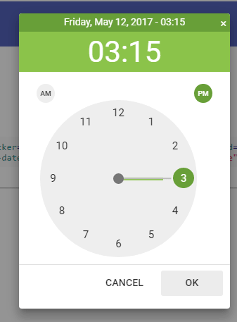
A demo of Angular time picker only
For creating only the time picker, use the date=”false” time=”true” attributes in the input field. For this demo, the time picker will display and just like the date only picker, you may double click the time for selection, have a look:
See online demo and code
The input field code:
<input mdc-datetime-picker date="false" time="true" type="text" id="time" short-time="true"

  placeholder="Time"

   min-date="minDate"

   format="hh:mm a"

   ng-model="time">
See the complete code on the demo page.
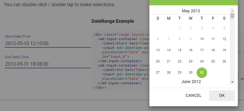
An example of date and time picker with date range
You may also enable the visitors to pick the date and time in the single call. This can be done by using the “true” value for both date and time attributes.
In this demo, you may select the date and time along with the date range selection. For that, two input boxes are given for selecting the range. The date in the second input must be greater than the first date field. The user won’t be able to select the back dates in the second date picker for date range section:
See online demo and code
See the complete code on the demo page.
For learning more about this excellent plug-in, visit the developer page.