
jQuery UI datepicker widget
The date picker widget provided by jQuery UI is highly customizable and very easy to use. From color scheme customization to choosing an option to show a calendar e.g. showing week numbers, multiple months, restricting date ranges and others is just a matter of setting a few lines of options and code.
Basic date-picker style Style 2 Style 3 Style 4
(Note: All these and more date picker styles with codes are listed below with a set up guide)
A jQuery calendar opens in an overlay that may be associated e.g. a text field, text field with an icon while you can open it in a div, span etc. elements as well.
In the early times of web development, one had to develop its own calendars or find out basic scripts from code sites and then integrate ugly to basic looking calendars into your website. Just like in many other features jQuery and jQuery UI made developers and designers life very easier and let them focus on other stuff.
In this tutorial, we are going to show you how simply you can integrate a calendar by using jQuery datepicker widget with different options, methods, and effects. You can click on datepicker images or demo link to get code containing CSS, HTML, and javascript/jQuery.
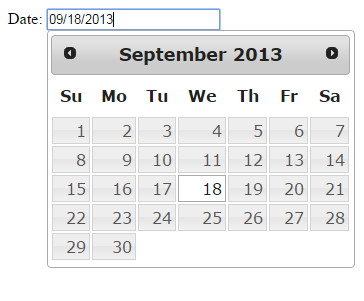
A basic jQuery datepicker example
In its simplest, you can create a calendar in jQuery by creating a text field and just call it by ID in the script area as shown below. If you include jQuery UI CSS then it will take the default color. You can use your own theme colors, however, here we will show how easy it is to create a jQuery date calendar:
See online demo and code
The jQuery script for date picker:
<script>
$(function() {
$( "#date_ex" ).datepicker();
});
</script>
The HTML code:
<div>Selected Date: <input type="text" id="date_ex"></div>
You can see the default calendar shows the current month with next and previous icons with the grayish theme.
Now let us look at choosing different themes and calendars with different options.
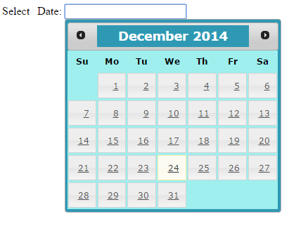
A datepicker example with different color scheme
In this example of datepicker jQuery UI widget, we will override default CSS scheme. The calendar will use CSS styles of UI CSS in internal CSS. Although, you can use your own custom CSS file and apply this to datepicker, we will cover this in the later part of this tutorial.
See online demo and code
You can see the color of month and year in the title bar and the background color of the calendar are changed. Also, dates are made underlined. We changed following CSSclasses:
ui-datepicker, .ui-datepicker-title, ui-datepicker table and ui-datepicker td a.
The CSS used in the example:
.ui-datepicker {
width: 17em;
padding: .2em .2em 0;
display: none;
background:#2F99B4;
}
.ui-datepicker .ui-datepicker-title {
margin: 0 2.3em;
line-height: 1.8em;
text-align: center;
color:#FFFFFF;
background:#2F99B4;
}
.ui-datepicker table {
width: 100%;
font-size: .7em;
border-collapse: collapse;
font-family:verdana;
margin: 0 0 .4em;
color:#000000;
background:#9EEFEE;
}
/*This is date TD */
.ui-datepicker td {

border: 0;
padding: 1px;


}
.ui-datepicker td span,
.ui-datepicker td a {
display: block;
padding: .8em;
text-align: right;
text-decoration: underline;
}
While script and markup almost remains the same as in the first example.
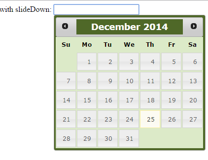
A datepicker jQuery example with different effect
The jQuery datepicker UI widget has an option that you can use to open or close calendar overlay with a specified effect. The option is showAnim that you can assign a different value that represent the effect. The list is available in the official website: http://api.jqueryui.com/category/effects/.
Following examples show how you can use this option. The first example uses slideDown effect.
See online demo and code
The script:
<script>
$(function() {
$( "#date_ex" ).datepicker({
showAnim: "slideDown"
});
});
</script>
Following example uses bounce effect. This is the replica of above example except the effect value.
See online demo and code
The script for this example:
<script>
$(function() {
$( "#date_ex" ).datepicker({
showAnim: "bounce"
});
});
</script>
Similarly, you can use bounce, clip, drop etc. values to make datepicker open with a different effect.
Date formatting in jQuery Calendar
The jQuery UI datepicker format date option allows to format dates quite easily. The option name is dateFormat that you can use in the script and specify as per requirement. You can use formatting characters to format date. For example:
- D – Name of the day in three character e.g. Fri, Sat, Sun
- DD – Full day name e.g. Friday, Saturday, Sunday
- d – (small d) will format day number without leading zero while dd will format by leading zero.
- Similarly, M is for month name like Jan, Feb, Mar…
- MM is for full month name e.g. January, February, March
- m (small m) is for month number without leading zero like 1 for Jan.
- mm is for month number with leading zero e.g. 01, 02..
- and y is for two digit year while yy is for four digit year.
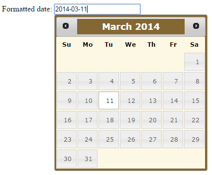
In the following example, the date is formatted in yy-mm-dd format. That means the date is shown in four digit year and the month with leading zero and day number.
See code by clicking the link or image below.
See online demo and code
The script with date formatting options:
<script>
$(function() {
$( "#date_ex" ).datepicker({
showAnim: "fold",
dateFormat: "yy-mm-dd"
});
});
</script>
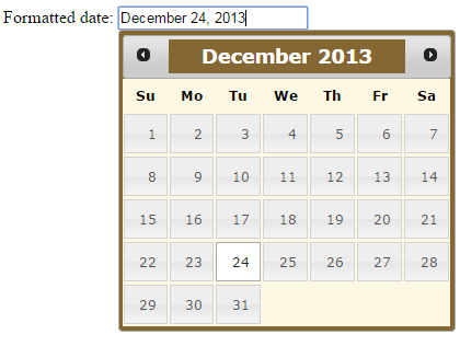
jQuery date in full Month name format
In the following example, we will format the date in full Month name format. The formatting character M is used to get the short name of the month while MM will get the full name. The returned date should look like this:
December 24, 2013
See online demo and code
The code:
<script>
$(function() {
$( "#date_ex" ).datepicker({
showAnim: "fold",
dateFormat: "MM dd, yy"
});
});
</script>
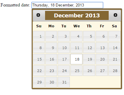
jQuery Date in day name format
In this example, we will use DD date formatting with other characters to show date in this format: e.g. Saturday 22 Mar 2013.
You can use single D to show date in short day name like Sat, Sun.
See online demo and code
The jQuery code for day name format:
<script>
$(function() {
$( "#date_ex" ).datepicker({
showAnim: "slide",
dateFormat: "DD, dd MM, yy"
});
});
</script>
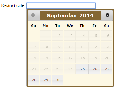
Restricting date selection in jQuery date
By using jQuery calendar plugin, you can restrict the date selection as well. For example, your site has an option to pull reporting only for last three months. So you want a user to navigate only to last three months. After that, the arrow and days will be disabled so selection cannot be made.
This can be done quite easily in datepicker widget by using minDate and maxDate options. The minDate specifies the backward date in the calendar while maxDate allows setting the next dates.
In next example, the UI calendar is shown with three months backward selection and one month ahead. You can also use other options like the animation style and date format with minDate and maxDate (besides other options and methods provided by jQuery UI datepicker plugin).
See online demo and code
The script:
<script>
$(function() {
$( "#date_ex" ).datepicker({
minDate: "-3M",
maxDate: "+1M",
showAnim: "slide",
dateFormat: "DD, dd MM, yy"
});
});
</script>
You can see days and arrow to select month are disabled after reaching the specified limit.
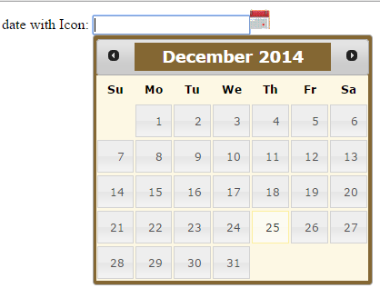
A calendar example with icon
You can use a calendar icon ahead of area or field where you will display chosen date by using available options in datepicker UI plugin. These options are showOn with button value. The buttonImage option specifies which icon file to use. The following example shows you how you can include an image ahead of a textbox that contains selected date.
See online demo and code
The script:
<script>
$(function() {
$( "#date_ex" ).datepicker({
showOn: "button",
buttonImage: "calendar1.gif",
buttonImageOnly: true,
buttonText: "Choose",
minDate: "-3M",
maxDate: "+1M",
showAnim: "fade",
dateFormat: "DD, dd MM, yy"
});
});
</script>
As you click on the calendar icon, it will display the calendar with restricted dates and specified effect.
Styling calendar with more customized CSS
In above examples, we used different options provided by jQuery UI datepicker widget. As for calendar style, we used jQuery UI CSS file and simply override few of its classes to change the header where month and year appears. Also, we changed the background color of calendar etc.
You can avoid to include default CSS file by jQuery UI. Rather you can simply use a few of its classes and ids and simply include the CSS file of your own (external CSS) or use <style> inside your web page where you will use that calendar.
In the following example, we will not include default CSS. The web page will only include jQuery and jQuery UI libraries. Note that, you even do not require to include whole UI library into your web page if you are using only calendar widget. Simply include components that you need for the project and download customized JavaScript here: http://jqueryui.com/download/. This will reduce overhead at your web server.
Reason why we included whole libraries in our demos is because we are using CDN.
Before explaining any further, have a look at following jQuery calendar image and code link:
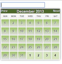
See online demo and code
The jQuery code:
<script>
$(function() {
$( "#date_ex" ).datepicker({
showOn: "button",
buttonImage: "calendar1.gif",
buttonImageOnly: true,
buttonText: "Choose",
minDate: "-3M",
maxDate: "+1M",
showAnim: "fade",
dateFormat: "DD, dd MM, yy"
});
});
</script>
The complete CSS used for above calandar:
.ui-datepicker {
width: 233px;
height: auto;
margin: 5px auto 0;
font: 9pt Arial, sans-serif;
-webkit-box-shadow: 0px 0px 10px 0px rgba(0, 0, 0, .5);
-moz-box-shadow: 0px 0px 10px 0px rgba(0, 0, 0, .5);
}

.ui-datepicker table {
width: 100%;
}
.ui-datepicker-header {
background: #4D662B;
color: #e0e0e0;
font-weight: bold;
-webkit-box-shadow: inset 0px 1px 1px 0px rgba(250, 250, 250, 2);
-moz-box-shadow: inset 0px 1px 1px 0px rgba(250, 250, 250, .2);
box-shadow: inset 0px 1px 1px 0px rgba(250, 250, 250, .2);
text-shadow: 1px -1px 0px #000;
border-width: 1px 0 0 0;
border-style: solid;
border-color: #111;
}

.ui-datepicker-title {
text-align: center;
font-size:15px;

}
.ui-datepicker-prev {
float: left;
cursor:pointer;
background-position: center -30px;
}
.ui-datepicker-next {
float: right;
cursor:pointer;
background-position: center 0px;
}
.ui-datepicker thead {
background-color: #f7f7f7;
background-image: -moz-linear-gradient(top, #f7f7f7 0%, #f1f1f1 100%);
background-image: -webkit-gradient(linear, left top, left bottombottom, color-stop(0%,#f7f7f7), color-stop(100%,#f1f1f1));
background-image: -webkit-linear-gradient(top, #f7f7f7 0%,#f1f1f1 100%);
background-image: -o-linear-gradient(top, #f7f7f7 0%,#f1f1f1 100%);
background-image: -ms-linear-gradient(top, #f7f7f7 0%,#f1f1f1 100%);
background-image: linear-gradient(top, #f7f7f7 0%,#f1f1f1 100%);
border-bottom: 1px solid #bbb;
}
.ui-datepicker th {
text-transform: uppercase;
font-size: 6pt;
padding: 5px 0;
color: #666666;
text-shadow: 1px 0px 0px #fff;
filter: dropshadow(color=#fff, offx=1, offy=0);
}
.ui-datepicker tbody td {
padding: 0;
border-right: 1px solid #bbb;
}
.ui-datepicker tbody td:last-child {
border-right: 0px;
}
.ui-datepicker tbody tr {
border-bottom: 1px solid #bbb;
}
.ui-datepicker tbody tr:last-child {
border-bottom: 0px;
}
.ui-datepicker a {
text-decoration: none;
}
.ui-datepicker td span, .ui-datepicker td a {
display: inline-block;
font-weight: bold;
text-align: center;
width: 30px;
height: 30px;
line-height: 30px;
color: #666666;
text-shadow: 1px 1px 0px #fff;
filter: dropshadow(color=#fff, offx=1, offy=1);
}
.ui-datepicker-calendar .ui-state-default {
background: #ededed;
background: -moz-linear-gradient(top, #9DC464 0%, #dedede 100%);
background: -webkit-gradient(linear, left top, left bottombottom, color-stop(0%,#9DC464), color-stop(100%,#dedede));
background: -webkit-linear-gradient(top, #9DC464 0%,#dedede 100%);
background: -o-linear-gradient(top, #9DC464 0%,#dedede 100%);
background: -ms-linear-gradient(top, #9DC464 0%,#dedede 100%);
background: linear-gradient(top, #9DC464 0%,#dedede 100%);
filter: progid:DXImageTransform.Microsoft.gradient( startColorstr='#9DC464', endColorstr='#dedede',GradientType=0 );
-webkit-box-shadow: inset 1px 1px 0px 0px rgba(250, 250, 250, .5);
-moz-box-shadow: inset 1px 1px 0px 0px rgba(250, 250, 250, .5);
box-shadow: inset 1px 1px 0px 0px rgba(250, 250, 250, .5);
}

.ui-datepicker-calendar .ui-state-hover {
background: #4F6828;
color:#FFFFFF;
}
.ui-datepicker-calendar .ui-state-active {
background: #4F6828;
-webkit-box-shadow: inset 0px 0px 10px 0px rgba(0, 0, 0, .1);
-moz-box-shadow: inset 0px 0px 10px 0px rgba(0, 0, 0, .1);
box-shadow: inset 0px 0px 10px 0px rgba(0, 0, 0, .1);
color: #e0e0e0;
text-shadow: 0px 1px 0px #4d7a85;
border: 1px solid #55838f;
position: relative;
margin: -1px;
}
.ui-datepicker-unselectable .ui-state-default {
background: #D6E4BE;
color: #000;
}
First of all, we used three letters for day names that are done in the script section of the example unlike above example that used two letters. See this line in code:
dayNamesMin: [‘Sun’, ‘Mon’, ‘Tue’, ‘Wed’, ‘Thu’, ‘Fri’, ‘Sat’]
In header section, we changed the background color and used prev / next. You can replace previous and next to icons by using background-image property in ui-datepicker-next and ui-datepicker-prev classes.
After that, the days appearance is managed with a different color scheme in its classes. You can use ui-datepicker-calendar .ui-state-default for main day blocks.
The current date or active date can be stand out by using its class: ui-datepicker-calendar .ui-state-active.
If your calendar shows previous or next month days that are non-selectable, you can style this by using ui-datepicker-unselectable .ui-state-default class.
Also, we used few other options in script section that controlled effect of displaying calendar and date format as well.