
The modal and minimize/maximize options
As using the modal component of Bootstrap 3 framework, you saw it allows closing the modal window by clicking on the cross button or by adding an option, it can be closed by clicking anywhere outside of the modal window area.
This is the normal behavior and options available in Bootstrap modal component. If you want to add minimize/maximize options for the modal component so that as a user clicks on minimize option, the modal will reside at the left bottom of the parent window. If he/she clicks on the maximize button, the modal will appear again, you can do this by using a jQuery plug-in which is the topic of this tutorial.
In that case, as a modal is minimized, the other content of the parent window will be active. As it is maximized, the content of the parent window will not be active or a user may not interact with parent window content.
Let me show you adding minimize and maximize options in the modal of Bootstrap in the following demos.
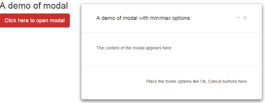
A demo of modal with minimize and maximize options
In this demo, a modal dialog is created by using the Bootstrap JS and its related CSS classes. For example, this is how a modal is created as using Bootstrap:
<div class=”modal fade mymodal” id=”modal-1″ role=”dialog”>
After that, you define the header and body content etc. As you click the red button in the demo page, the modal will appear with the minimize option, have a look:
See online demo and code
You can see the cross button for closing the modal and minimize button initially. If you click on it, the modal will minimize to the left bottom of the screen with maximize option.
Follow these steps for setting up this modal dialog.
Step 1:
Include the Bootstrap and font-awesome CSS files. The icons for minimize and maximize options are referred from the font-awesome CSS file. The path of icons is set in the font-awesome.css file. If you use some other path to store this file than the demo then edit the location accordingly in the CSS file, otherwise, icons will not appear.
Step2:
Also include the JS libraries of Bootstrap and jQuery.
Step 3:
Use the markup for creating the modal. The close, maximize and minimize options are set there while its functionality is done in the jQuery code which is placed just above the </body> tag.
The markup:
<div class="container">


<h2>A demo of modal</h2>

<!-- Trigger the modal with a button -->

<button type="button" class="btn btn-danger btn-lg mdlFire"  data-target="#modal-1" >Click here to open modal</button>


<!-- Modal -->

<div class="modal fade mymodal" id="modal-1" role="dialog">

<div class="modal-dialog">


<!-- Modal content-->

<div class="modal-content">

<div class="modal-header" style="padding:35px 50px;">

<button type="button" class="close" data-dismiss="modal"> <i class='fa fa-times'></i> </button>


<button class="close modalMinimize"> <i class='fa fa-minus'></i> </button>


<h4 class="modal-title">A demo of modal with min/max options</h4>

</div>


<div class="modal-body"  style="padding:40px 50px;">

<p>The content of the modal appears here</p>

</div>


<div class="modal-footer"  style="padding:40px 50px;">

<p>Place the footer options like Ok, Cancel buttons here</p>

</div>


</div>

</div>

</div>

<div class="minmaxCon"></div>
Have a look at the <script> and complete code on the demo page.
(Credit: kumar-uxui)
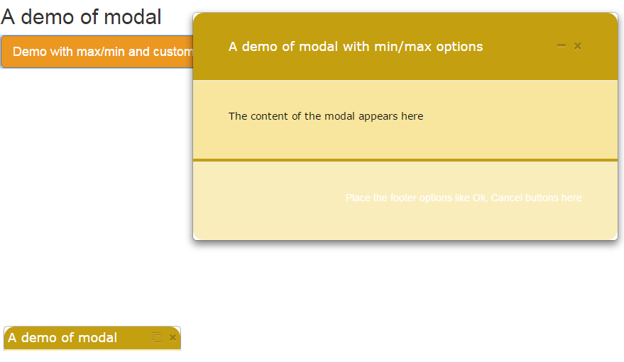
Customizing the modal and header in minimized form demo
In order to customize the modal as per your choice or need, you require dealing with a few CSS classes.
Pick and place those into your own CSS file or in the <style> section. I have written this in detail with demos in the Bootstrap 3 modal tutorial. In this demo, I am just showing how you may customize the modal with maximize and minimize options.
The customized header is also visible as you minimize the modal.
Complete code (BS and jQuery)
<!DOCTYPE html>
<html>
<head>
  <link rel="stylesheet" href="https://maxcdn.bootstrapcdn.com/bootstrap/3.3.5/css/bootstrap.min.css">


  <script src="https://ajax.googleapis.com/ajax/libs/jquery/1.11.3/jquery.min.js"></script>
  <script src="https://maxcdn.bootstrapcdn.com/bootstrap/3.3.5/js/bootstrap.min.js"></script>


  <!-- font Awesome 4.5.0 -->
  <link href="css/modal-minimize-and-maximize/font-awesome.css" rel="stylesheet" type="text/css" />


  <style type="text/css">

    .modal-header .btnGrp{
      position: absolute;
      top: 8px;
      right: 10px;
    }


    .min{
        width: 250px;
        height: 35px;
        overflow: hidden !important;
        padding: 0px !important;
        margin: 0px;

        float: left;
        position: static !important;
      }

    .min .modal-dialog, .min .modal-content{
        height: 100%;
        width: 100%;
        margin: 0px !important;
        padding: 0px !important;
      }

    .min .modal-header{
        height: 100%;
        width: 100%;
        margin: 0px !important;
        padding: 3px 5px !important;
      }

    .display-none{display: none;}

    button .fa{
        font-size: 16px;
        margin-left: 10px;
      }

    .min .fa{
        font-size: 14px;
      }

    .min .menuTab{display: none;}

    button:focus { outline: none; }

    .minmaxCon{
      height: 35px;
      bottom: 1px;
      left: 1px;
      position: fixed;
      right: 1px;
      z-index: 9999;
    }

.modal-header {
    background-color: #C49F0F;
    padding:9px 15px;
    color:#FFF;
    font-family:Verdana, sans-serif;
    border-bottom:1px solid #eee;
    border-top-left-radius: 15px;
    border-top-right-radius: 15px;
 }
 .modal-body {
    background-color: #F8E69E;
    padding:9px 15px;
    color:#000;
    font-family:Verdana, sans-serif;
    border-bottom:4px solid #C49F0F;

 }
.modal-footer {
    background-color: #FAEDBC;
    color:#FFF;
    border-bottom-left-radius: 15px;
    border-bottom-right-radius: 15px;
 }

  </style>

</head>

<body>

<div class="container">

  <h2>A demo of modal</h2>
  <!-- Trigger the modal with a button -->
  <button type="button" class="btn btn-warning btn-lg mdlFire"  data-target="#modal-1" >Demo with max/min and customized CSS</button>

  <!-- Modal -->
  <div class="modal fade mymodal" id="modal-1" role="dialog" >
    <div class="modal-dialog">

      <!-- Modal content-->
      <div class="modal-content">
        <div class="modal-header" style="padding:35px 50px;">
          <button type="button" class="close" data-dismiss="modal"> <i class='fa fa-times'></i> </button>

          <button class="close modalMinimize"> <i class='fa fa-minus'></i> </button>

          <h4 class="modal-title">A demo of modal with min/max options</h4>
        </div>

        <div class="modal-body"  style="padding:40px 50px;">
          <p>The content of the modal appears here</p>
        </div>

        <div class="modal-footer"  style="padding:40px 50px;">
          <p>Place the footer options like Ok, Cancel buttons here</p>
        </div>

      </div>
    </div>
  </div>


<div class="minmaxCon"></div>


<script>

  $(document).ready(function(){


      var $content, $modal, $apnData, $modalCon;

      $content = $(".min");


      //To fire modal
      $(".mdlFire").click(function(e){

          e.preventDefault();

          var $id = $(this).attr("data-target");

          $($id).modal({backdrop: false, keyboard: false});

        });


      $(".modalMinimize").on("click", function(){

                  $modalCon = $(this).closest(".mymodal").attr("id");

                  $apnData = $(this).closest(".mymodal");

                  $modal = "#" + $modalCon;

                  $(".modal-backdrop").addClass("display-none");

                  $($modal).toggleClass("min");

                    if ( $($modal).hasClass("min") ){

                        $(".minmaxCon").append($apnData);

                        $(this).find("i").toggleClass( 'fa-minus').toggleClass( 'fa-clone');

                      }
                      else {

                              $(".container").append($apnData);

                              $(this).find("i").toggleClass( 'fa-clone').toggleClass( 'fa-minus');

                            };

                  });

        $("button[data-dismiss='modal']").click(function(){

                $(this).closest(".mymodal").removeClass("min");

                $(".container").removeClass($apnData);

                $(this).next('.modalMinimize').find("i").removeClass('fa fa-clone').addClass( 'fa fa-minus');

              });

  });

</script>
</body>
</html>
You can see three additional classes in the <style> section, i.e. modal-header, modal-body, and modal-footer. The style of modal-header is also visible as you minimize the modal dialog.
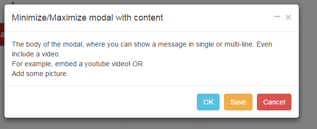
In all above demos, the modal window closed only when you clicked the cross button. In this example, the modal will close as you click anywhere outside the modal. Also, I added additional content i.e. buttons in the footer that will also close the modal dialog.
See online demo and code
You may get the complete code, including CSS, jQuery, and markup from the demo page. One thing to be noted, if you are picking the specific items of this plug-in, the last <div>:
<div class=”minmaxCon”></div>
deals with minimize position so must take it and its related CSS.