
The portfolio plug-in based on jQuery
This jQuery portfolio plug-in can be used for presenting your skills or services etc. in a nice and modern way. The plug-in is responsive that adapts different screen sizes so that you do not lose mobile users.
As clicking a thumbnail of gallery items, the detail will open in the same window just below the clicked or tapped image. There, you may place textual information, video or other content for the detailed view of that portfolio item.
See the following section for learning how to use this plug-in along with live demos.
A demo of portfolio jQuery plug-in
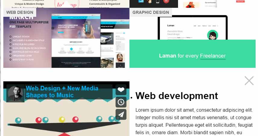
You have to use portfolio images as thumbnails for the presentation in the website. Each portfolio item or thumbnail is specified in the <li> tag along with the description that you may provide in the <span> tag. There, you may also specify the heading of the item. In the demo, headings like SEO, Web design, Graphic design etc. are used; have a look:
See online demo and code
In the code section, you can see for the detail part of each thumbnail, a <div> is created with an ID corresponding to the thumbnail’s ID. As you click any thumbnail, the details open just below it where you may add the paragraph of text, images, and video as well.
Let me brief how you may configure this plug-in to be used for your portfolio website.
Steps for using the portfolio plug-in
Step1:
After downloading the plug-in here (GitHub website), extract the package and get the CSS and JS file.
<link rel=”stylesheet” href=”css/portfolio/portfolio.jquery.css”>
<script src=”http://ajax.googleapis.com/ajax/libs/jquery/1.11.0/jquery.min.js”></script>
<script src=”js/portfolio/portfolio.jquery.js”></script>
Make sure including the JS file of the plug-in after the jQuery reference.
Step2:
In the jQuery script, use the options for the portfolio like how many thumbnails to show by using the cols option. You may also specify the transition effect. In the example, the slideDown effect is used.
        <script>

            $(document).ready(function() {

                $('.thumbs').portfolio({

                    cols: 4, //Number of cols in a row

                    transition: 'slideDown' //Specify transition here. slideDown

                });

            });

        </script>
You may use other values like fadeOut, fadeIn etc. See the demo below with a different number of columns and transition effect.
Step 3:
Write the markup for the thumbnails, headings, description and details of each item. For example:
        <ul class="thumbs">

            <li><a href="#thumb1" class="thumbnail" style="background-image: url('gal-images/thumb1.jpg')">

                <h4>Web development</h4><span class="description">Get the latest technologies</span></a>

            </li>

      </ul>
The respective detail information is specified like below:
        <div class="portfolio-content">

            <div id="thumb1">

                <div class="media"><iframe src="//player.vimeo.com/video/69666609?byline=0" width="500" height="281" frameborder="0" webkitallowfullscreen mozallowfullscreen allowfullscreen></iframe></div>

                <h1>Web development</h1>

                <p>The description for the portfolio item with ID=”thumb1”comes here</p>

                <a href="#" class="btn btn-primary">Learn More</a>

            </div>
See the complete code in the demo page.
A demo with using other options for effect and columns
As mentioned earlier, you may use different options like number of columns and transition effect while using this portfolio plug-in for your website. Have a look at the demo, where I used six columns and fadeIn effect for displaying the detail of an opened portfolio item:
See online demo and code
Note that, due to displaying code in the demo page, less space is given to the portfolio section. As this is responsive, still it is displaying six thumbnails (in desktop screens) with small sized images.