
The confirm alert in JavaScript
A confirm alert is a type of alert box where a user is asked before taking a certain action.
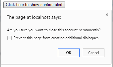
A simple JavaScript confirm dialogue can be created by using the following code:
confirm("Are you sure you want to close this account permanently?");
The user is presented with the OK and cancel buttons. For each action, you can perform the related action, based on user selection. For example, deleting an account.
A demo to create a simple confirm alert box
In this demo, an alert is created by using the “confirm” keyword, so the user is presented with OK and Cancel buttons. As you click the OK or Cancel button, a simple alert will be shown accordingly.
As you click the button, the confirm alert is shown by using this code in the <script> section:
<!DOCTYPE html>
<html>
<head>

</head>
<body>
<button onclick="confirmalert()">Click here to show confirm alert</button>

<script type="text/javascript">
function confirmalert(){
var userselection = confirm("Are you sure you want to close this account permanently?");
if (userselection == true){
    alert("Your Account deleted!");
  }
else{
    alert("Your account is not deleted!");
}
}
</script>
</body>
</html>
This code is placed in a JavaScript function, confirmalert, which is called at the click event of the button.
Rather than showing an alert, you may perform an action there. For example, if a user is asked, “if they want to redirect to another website”, you may write the code of redirection there.
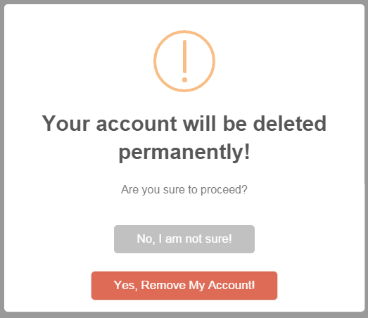
A fancy JavaScript confirmation alert example
By default, the alert uses the browser’s style for the presentation. These days, it is generally desired to match it with the design of your website. For that, you can use third-party JavaScript-based plug-ins.
The following demo uses the SweetAlert plugin to design a much better confirm JavaScript alert. See the demo which is followed by how you can set up this on your web page:
See online demo and code
You can see that not only presentation of JS confirm alert is better but it is also allowing to add different text for OK and Cancel buttons. The following code is used to create this confirm dialogue box:
<script type="text/javascript">

function JSconfirm(){

swal({   title: "Your account will be deleted permanently!",

text: "Are you sure to proceed?",

type: "warning",

showCancelButton: true,

confirmButtonColor: "#DD6B55",

confirmButtonText: "Yes, Remove My Account!",

cancelButtonText: "No, I am not sure!",

closeOnConfirm: false,

closeOnCancel: false },

function(isConfirm){

if (isConfirm)

{

swal("Account Removed!", "Your account is removed permanently!", "success");

}

else {

swal("Hurray", "Account is not removed!", "error");

} });

}

</script>
You can see, there are many options that you can set to present that alert. If you click Yes… it will show another alert with an animation to confirm the action. Similarly, pressing the “Cancel” option will lead to another alert accordingly.
The JSconfirm function, which contains the code of this confirm alert, is called at the click event of the button.
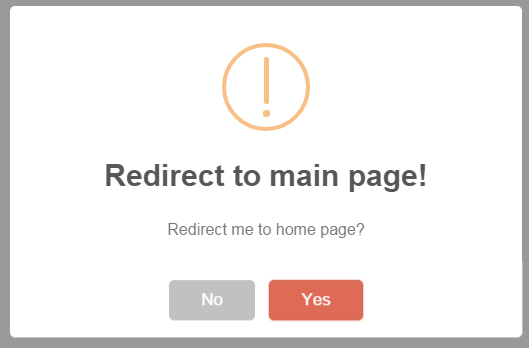
An example of redirecting after confirmation by clicking a link
In this demo, as the link “Redirect me to home page” is clicked, a confirm JavaScript alert will be displayed. If you press “Yes” it will redirect to the home page.
The following code is for this example:
<!DOCTYPE html>
<html>
<head>
  <script src="alert/dist/sweetalert.min.js"></script>
  <link rel="stylesheet" href="alert/dist/sweetalert.css">
</head>
<body>
<a href="#" onclick="JSconfirm()">Redirect me to home page</a>

<script type="text/javascript">
function JSconfirm(){
	swal({
    title: "Redirect to main page!",
    text: "Redirect me to home page?",
    type: "warning",
    showCancelButton: true,
    confirmButtonColor: "#DD6B55",
    confirmButtonText: "Yes",
    cancelButtonText: "No",
    closeOnConfirm: false,
    closeOnCancel: false },
    function(isConfirm){
        if (isConfirm)
    {
        window.location = "https://www.jquery-az.com/";
        }
        else {
            swal("You are not redirected!", "success");
            } });
}
</script>
</body>
</html>
How to use this plug-in
To set up SweetAlert plug-in, you simply need to include two dependency files in the <head> section of your website.
<script src=” sweetalert-dev.js”></script>
<link rel=”stylesheet” href=” sweetalert.css”>
You may read more about in the JS alert chapter (at the bottom).
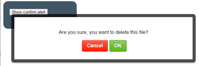
A confirm alert by using alertify.js plug-in
There is another cool plug-in to create different types of JavaScript alerts like confirm, simple alerts, prompt alerts, and even notifications at different parts of the screen. This plug-in is called alertify.js which is available at the Github website.
Following is a demo of a confirm dialogue by using this plugin. See it online along with code:
See online demo and code
This code is used in the <script> section to call this confirm dialog:
<script>

function JSalert(){

// A confirm dialog

alertify.confirm("Are you sure, you want to delete this file?", function (e) {

if (e) {

alertify.alert("File is Removed!");

} else {

alertify.alert("File is safe!");

}

});

}

</script>
After including the dependency files in the <head> section, you need to call that plug-in by alertify.confirm keyword. While the simple alert can be called by using alertify.alert as used in the if statement.
Setting up alertify.js plug-in
In the <head> section, you have to place the required alertify.min.js (if you are using a minified version) and CSS files. You may use your own style file or amend the default style in the CSS file to change the look of alerts.
These files are included:
<script src=”alert/dist/alertify.min.js”></script>
<link rel=”stylesheet” href=”alert/dist/alertify.core.css” />
<link rel=”stylesheet” href=”alert/dist/alertify.default.css” id=”toggleCSS” />
You may read more about this plug-in here along with getting the source files. See a demo below where I have changed the default style of alerts by changing the properties in alertify.default.css.
A demo of confirm alert with different style
In this confirm JavaScript dialog, I have changed the background-color, text-size, font-family, button colors of the alertify alerts.
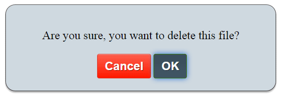
For that, I simply copied the default CSS file (alertify.default) and renamed this to alertify.custom.css. This file name is also replaced in the <head> section:
<script src=”alert/dist/alertify.min.js”></script>
<link rel=”stylesheet” href=”alert/dist/alertify.core.css” />
<link rel=”stylesheet” href=”alert/dist/alertify.custom.css” id=”toggleCSS” />
Now, open the alertify.custom.css file and start changing the look and feel of the alerts. For example, I changed the background by modifying the .alertify class where I also added text size and font family properties:
.alertify {

font-family:Aerial;

font-size:24px;

background: #CFD9E0;

…

}
Complete code:
<!DOCTYPE html>
<html>
<head>

    <script src="alert/dist/alertify.min.js"></script>
	<link rel="stylesheet" href="alert/dist/alertify.core.css" />
	<link rel="stylesheet" href="alert/dist/alertify.custom.css" id="toggleCSS" />

<style>
.divclass {
  background: #415665;
  height: 50px;
  width:200px;
  border-radius: 15px;
  padding:20px;
  font-size:22px;
  color:#fff;
}
</style>
</head>
<body>
<div class="divclass">
<button onclick="JSalert()">Show confirm alert</button>
</div>
<script>
function JSalert(){
// A confirm dialog
alertify.confirm("Are you sure, you want to delete this file?", function (e) {
    if (e) {
        alertify.alert("File is Removed!");
    } else {
        alertify.alert("File is safe!");
    }
});
}
</script>
</body>
</html>
To change the OK or cancel buttons, you may modify .alertify-button-cancel, and .alertify-button-ok classes.
Credit: The plug-in website at GitHub