
The loading buttons can be used to show users something is happening behind the “scene”. For example, a link is loading behind while you are showing users to wait.
Similarly, a user makes an AJAX call and your script is loading the data from a database server which may take some time. In the meanwhile, you can show users that “wait on”, the data for them is loading.
As the Bootstrap framework has become popular incredibly, in this tutorial, I am going to show you Bootstrap-based loading buttons that you may use for purposes like those mentioned above.
In fact, this is quite simple to create – no further dependencies or JS file is required. I assume that you are already working with Bootstrap, so at least CSS reference of the Bootstrap framework is already established.
You just need to add a reference of font-awesome.min.css, and do it in the <head> section.
In the markup section, create the button with btn btn-default classes of the size you need.
The <head> section contains the references of the CSS files:
<link rel=”stylesheet” href=”http://netdna.bootstrapcdn.com/bootstrap/3.3.4/css/bootstrap.min.css”>
<link href=”//maxcdn.bootstrapcdn.com/font-awesome/4.2.0/css/font-awesome.min.css” rel=”stylesheet”>
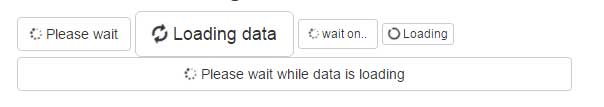
In the markup section, the buttons are created with default classes and different sizes like btn-sm, btn-lg, btn-block, etc. Each button is also assigned an icon from the font-awesome.css file:
Complete code:
<!DOCTYPE html>
<html>
<head>

<link rel="stylesheet" href="https://netdna.bootstrapcdn.com/bootstrap/3.3.4/css/bootstrap.min.css">
<link href="//maxcdn.bootstrapcdn.com/font-awesome/4.2.0/css/font-awesome.min.css" rel="stylesheet">


</head>

<body>

<div class="container">
    <div class="row">
    <h2>A demo of loading buttons</h2>
        <div class="col-md-6">
            <button class="btn btn-default"><i class="fa fa-spinner fa-spin"></i> Please wait</button>
            <button class="btn btn-default btn-lg"><i class="fa fa-refresh fa-spin"></i> Loading data</button>
            <button class="btn btn-default btn-sm"><i class="fa fa-spinner fa-spin"></i> wait on..</button>
            <button class="btn btn-default btn-xs"><i class="fa fa-circle-o-notch fa-spin"></i> Loading</button>
            <button class="btn btn-default btn-block"><i class="fa fa-spinner fa-spin"></i> Please wait while data is loading</button>
        </div>

    </div>


    </div>

</div>

</body>
</html>
Use the button size according to the text you want to show to your users.
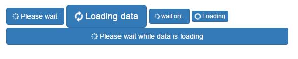
The same buttons and text as in the above examples, except I changed the button style to use primary classes. See the output:
The markup:
<body>

<div class="container">
    <div class="row">
    <h2>A demo of loading buttons</h2>
        <div class="col-md-6">
            <button class="btn btn-primary"><i class="fa fa-spinner fa-spin"></i> Please wait</button>
            <button class="btn btn-primary btn-lg"><i class="fa fa-refresh fa-spin"></i> Loading data</button>
            <button class="btn btn-primary btn-sm"><i class="fa fa-spinner fa-spin"></i> wait on..</button>
            <button class="btn btn-primary btn-xs"><i class="fa fa-circle-o-notch fa-spin"></i> Loading</button>
            <button class="btn btn-primary btn-block"><i class="fa fa-spinner fa-spin"></i> Please wait while data is loading</button>
        </div>

    </div>


    </div>

</div>
Only the button classes are changed from default to primary, for example:
<button class="btn btn-primary btn-block"><i class="fa fa-spinner fa-spin"></i> Please wait while data is loading</button>
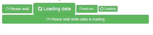
A demo with success classes
See the output with the success class of Bootstrap framework for buttons:
The code:
<div class="container">
    <div class="row">
    <h2>A demo of loading buttons</h2>
        <div class="col-md-6">
            <button class="btn btn-success"><i class="fa fa-spinner fa-spin"></i> Please wait</button>
            <button class="btn btn-success btn-lg"><i class="fa fa-refresh fa-spin"></i> Loading data</button>
            <button class="btn btn-success btn-sm"><i class="fa fa-spinner fa-spin"></i> wait on..</button>
            <button class="btn btn-success btn-xs"><i class="fa fa-circle-o-notch fa-spin"></i> Loading</button>
            <button class="btn btn-success btn-block"><i class="fa fa-spinner fa-spin"></i> Please wait while data is loading</button>
        </div>

    </div>


    </div>

</div>
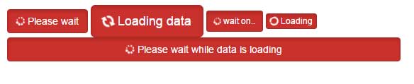
With danger classes
If the wait is critical, you may show the Red buttons so users must not close the app or window:
Complete code:
<!DOCTYPE html>
<html>
<head>

<link rel="stylesheet" href="https://netdna.bootstrapcdn.com/bootstrap/3.3.4/css/bootstrap.min.css">
<link href="//maxcdn.bootstrapcdn.com/font-awesome/4.2.0/css/font-awesome.min.css" rel="stylesheet">


</head>

<body>

<div class="container">
    <div class="row">
    <h2>A demo of loading buttons</h2>
        <div class="col-md-6">
            <button class="btn btn-danger active"><i class="fa fa-spinner fa-spin"></i> Please wait</button>
            <button class="btn btn-danger active btn-lg"><i class="fa fa-refresh fa-spin"></i> Loading data</button>
            <button class="btn btn-danger active btn-sm"><i class="fa fa-spinner fa-spin"></i> wait on..</button>
            <button class="btn btn-danger active btn-xs"><i class="fa fa-circle-o-notch fa-spin"></i> Loading</button>
            <button class="btn btn-danger active btn-block"><i class="fa fa-spinner fa-spin"></i> Please wait while data is loading</button>
        </div>

    </div>


    </div>

</div>

</body>
</html>
This time, I used the active state of the button as well.