
A split button has two components; one is the label and the other is an arrow. The purpose of the arrow is opening a dropdown with the set of actions. Whereas clicking on the label takes to the default action.
In this tutorial, I will show you creating the Split buttons by using custom CSS, JavaScript, and HTML. Along with this, you will see creating the buttons by frameworks like Bootstrap.
Note: See the last example for the pure CSS/HTML split button.
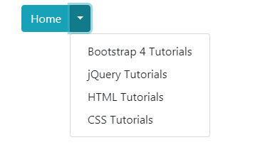
Before I show you the example of creating a split button by your own CSS/HTML, let me show you an example of a split button by using the Bootstrap 4 framework.
So, if you are already using Bootstrap 4 for your project then creating a split button is pretty simple and requires referencing the same files as you might already be using.
First, have a look and I will explain how it is created:
See online demo and code
The code:
<!DOCTYPE html>

<html>

<head>

<link rel="stylesheet" href="https://stackpath.bootstrapcdn.com/bootstrap/4.3.1/css/bootstrap.min.css" integrity="sha384-ggOyR0iXCbMQv3Xipma34MD+dH/1fQ784/j6cY/iJTQUOhcWr7x9JvoRxT2MZw1T" crossorigin="anonymous">


<script src="https://code.jquery.com/jquery-3.3.1.slim.min.js" integrity="sha384-q8i/X+965DzO0rT7abK41JStQIAqVgRVzpbzo5smXKp4YfRvH+8abtTE1Pi6jizo" crossorigin="anonymous"></script>

<script src="https://cdnjs.cloudflare.com/ajax/libs/popper.js/1.14.7/umd/popper.min.js" integrity="sha384-UO2eT0CpHqdSJQ6hJty5KVphtPhzWj9WO1clHTMGa3JDZwrnQq4sF86dIHNDz0W1" crossorigin="anonymous"></script>

<script src="https://stackpath.bootstrapcdn.com/bootstrap/4.3.1/js/bootstrap.min.js" integrity="sha384-JjSmVgyd0p3pXB1rRibZUAYoIIy6OrQ6VrjIEaFf/nJGzIxFDsf4x0xIM+B07jRM" crossorigin="anonymous"></script>

</head>

<body>

<div class="container">

<h3>Split button by Bootstrap 4</h3>

<div class="btn-group">

  <button type="button" class="btn btn-info">Home</button>

  <button type="button" class="btn btn-info dropdown-toggle dropdown-toggle-split" data-toggle="dropdown" aria-haspopup="true" aria-expanded="false">

    <span class="sr-only">Toggle</span>

  </button>

  <div class="dropdown-menu" aria-labelledby="btnDropdownDemo">

    <a class="dropdown-item" href="https://www.jquery-az.com/bootstrap-4/">Bootstrap 4 Tutorials</a>

    <a class="dropdown-item" href="https://www.jquery-az.com/jquery-tips/">jQuery Tutorials</a>

    <a class="dropdown-item" href="https://www.jquery-az.com/html-tutorials/">HTML Tutorials</a>

    <a class="dropdown-item" href="https://www.jquery-az.com/css-tutorials/">CSS Tutorials</a>

  </div>

</div>

</div>


</body>

</html>
- In the code, you can see a main <div> element is created with the .btn-group class.
- Inside that div, two button tags are used.
- The first button with “Home” text is given the .btn and .btn-info. You may use the desired contextual class for the “label” button.
- In the second button, you may see a number of classes are used along with data attributes:
<button type="button" class="btn btn-info dropdown-toggle dropdown-toggle-split" data-toggle="dropdown" aria-haspopup="true" aria-expanded="false">
Also notice the <span> tag.
- Another <div> tag is used inside the main div and there we created the dropdown links or menu items.
You may learn more about the Bootstrap 4 buttons here.
For dropdown details, go to this tutorial: Dropdowns in Bootstrap 4. There, you may also learn how to create the link based dropdowns.
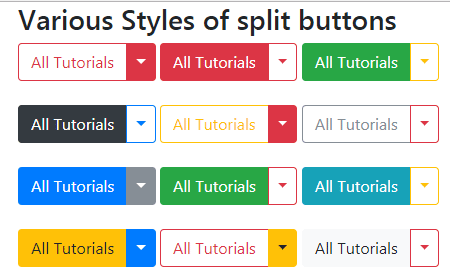
Similarly, you may create many different styles of split buttons by using the Bootstrap framework. The demo below shows using various button combinations, particularly look at the solid button with the outline button style. These make really good combinations:
See online demo and code
Here is the button’s markup:
<div class="btn-group">

  <button type="button" class="btn btn-outline-danger" data-toggle="dropdown" aria-haspopup="true" aria-expanded="false">All Tutorials</button>

  <button type="button" class="btn btn-danger dropdown-toggle dropdown-toggle-split" data-toggle="dropdown" aria-haspopup="true" aria-expanded="false">

    <span class="sr-only">Toggle</span>

  </button>

  <div class="dropdown-menu" aria-labelledby="btnDropdownDemo">

    <a class="dropdown-item" href="https://www.jquery-az.com/bootstrap-4/">Bootstrap 4</a>

    <a class="dropdown-item" href="https://www.jquery-az.com/jquery-tips/">jQuery</a>

    <a class="dropdown-item" href="https://www.jquery-az.com/html-tutorials/">HTML</a>

    <a class="dropdown-item" href="https://www.jquery-az.com/css-tutorials/">CSS</a>

  </div>

</div>


<div class="btn-group">

  <button type="button" class="btn btn-danger">All Tutorials</button>

  <button type="button" class="btn btn-outline-danger dropdown-toggle dropdown-toggle-split" data-toggle="dropdown" aria-haspopup="true" aria-expanded="false">

    <span class="sr-only">Toggle</span>

  </button>

</div>


<div class="btn-group">

  <button type="button" class="btn btn-success">All Tutorials</button>

  <button type="button" class="btn btn-outline-warning dropdown-toggle dropdown-toggle-split" data-toggle="dropdown" aria-haspopup="true" aria-expanded="false">

    <span class="sr-only">Toggle</span>

  </button>

</div>

<br /><br />


<div class="btn-group">

  <button type="button" class="btn btn-dark">All Tutorials</button>

  <button type="button" class="btn btn-outline-primary dropdown-toggle dropdown-toggle-split" data-toggle="dropdown" aria-haspopup="true" aria-expanded="false">

    <span class="sr-only">Toggle</span>

  </button>

</div>


<div class="btn-group">

  <button type="button" class="btn btn-outline-warning">All Tutorials</button>

  <button type="button" class="btn btn-danger dropdown-toggle dropdown-toggle-split" data-toggle="dropdown" aria-haspopup="true" aria-expanded="false">

    <span class="sr-only">Toggle</span>

  </button>

</div>


<div class="btn-group">

  <button type="button" class="btn btn-outline-secondary">All Tutorials</button>

  <button type="button" class="btn btn-outline-danger dropdown-toggle dropdown-toggle-split" data-toggle="dropdown" aria-haspopup="true" aria-expanded="false">

    <span class="sr-only">Toggle</span>

  </button>

</div>


<br /><br />

<div class="btn-group">

  <button type="button" class="btn btn-primary">All Tutorials</button>

  <button type="button" class="btn btn-secondary dropdown-toggle dropdown-toggle-split" data-toggle="dropdown" aria-haspopup="true" aria-expanded="false">

    <span class="sr-only">Toggle</span>

  </button>

</div>


<div class="btn-group">

  <button type="button" class="btn btn-success">All Tutorials</button>

  <button type="button" class="btn btn-outline-danger dropdown-toggle dropdown-toggle-split" data-toggle="dropdown" aria-haspopup="true" aria-expanded="false">

    <span class="sr-only">Toggle</span>

  </button>

</div>


<div class="btn-group">

  <button type="button" class="btn btn-info">All Tutorials</button>

  <button type="button" class="btn btn-outline-warning dropdown-toggle dropdown-toggle-split" data-toggle="dropdown" aria-haspopup="true" aria-expanded="false">

    <span class="sr-only">Toggle</span>

  </button>

</div>


<br /><br />

<div class="btn-group">

  <button type="button" class="btn btn-warning">All Tutorials</button>

  <button type="button" class="btn btn-primary dropdown-toggle dropdown-toggle-split" data-toggle="dropdown" aria-haspopup="true" aria-expanded="false">

    <span class="sr-only">Toggle</span>

  </button>

</div>


<div class="btn-group">

  <button type="button" class="btn btn-outline-danger">All Tutorials</button>

  <button type="button" class="btn btn-warning dropdown-toggle dropdown-toggle-split" data-toggle="dropdown" aria-haspopup="true" aria-expanded="false">

    <span class="sr-only">Toggle</span>

  </button>

</div>


<div class="btn-group">

  <button type="button" class="btn btn-light">All Tutorials</button>

  <button type="button" class="btn btn-outline-danger dropdown-toggle dropdown-toggle-split" data-toggle="dropdown" aria-haspopup="true" aria-expanded="false">

    <span class="sr-only">Toggle</span>

  </button>

</div>


</div>
You may grab the complete code from the demo page.
If your project is not based on the Bootstrap framework then this is unlikely that you would want using the dependent libraries only for the split buttons in your web pages.
In such a case, you may want a solution based on the CSS/HTML only or a little JavaScript only for the purpose of split button.
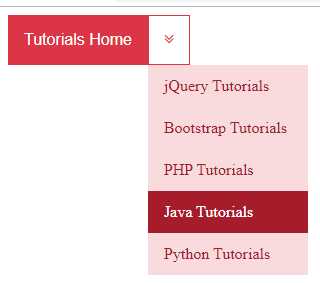
The example below is a solution based on HTML and CSS only.
See online demo and code
<!DOCTYPE html>

<html>

<head>

<link rel="stylesheet" href="https://cdnjs.cloudflare.com/ajax/libs/font-awesome/4.7.0/css/font-awesome.min.css">


<style>

.button-cls {

  background-color: #DC3545;

  color: white;

  padding: 16px;

  font-size: 16px;

  border: none;

  outline: none;

}


.button-cls-split {

  color: #dc3545;

  border-color: #dc3545;

  background-color:#fff;

  padding: 15px;

  font-size: 16px;

  border: 1px solid #dc3545;

}


.dd-cls {

  position: absolute;

  display: inline-block;

}

.dd-cls:hover .dd-cont-cls {

  display: block;

}


.button-cls:hover, .dd-cls:hover .button-cls {

  background-color: #A51D2B;

}

.dd-cont-cls {

  display: none;

  position: absolute;

  background-color: #F9DBDE;

  min-width: 160px;

  z-index: 1;


}


.dd-cont-cls a {

  color: #A51D2B;

  padding: 12px 16px;

  text-decoration: none;

  display: block;

}


.dd-cont-cls a:hover {

    background-color: #A51D2B;

    color:#fff;


    }


</style>

</head>

<body>

<button class="button-cls">Tutorials Home</button>

<div class="dd-cls">

  <button class="button-cls-split">

        <i class="fa fa-angle-double-down"></i>

  </button>

  <div class="dd-cont-cls">

    <a href="#">jQuery Tutorials</a>

    <a href="#">Bootstrap Tutorials</a>

    <a href="#">PHP Tutorials</a>

    <a href="#">Java Tutorials</a>

    <a href="#">Python Tutorials</a>

  </div>

</div>

</body>

</html>
You may get the complete code with output on the demo page.