
For creating a progress bar as using the Bulma framework, you may simply apply the progress class to the progress element of HTML.
For the color of the progress bar, just apply the general contextual class e.g. is-primary, is-info, etc or you may customize the color by using Sass variables.
Similarly, size can be specified by its classes – is-small, is-large etc.
All these and more progress bars are shown in the examples below.
A simple Bulma progress bar demo
In this example, a progress bar with the default color is created. We set the value of the progress bar that sets the fill of the bar. Have a look:

See online demo and code
<!DOCTYPE html>

<html>

<head>

<link rel="stylesheet" href="https://cdn.jsdelivr.net/npm/bulma@0.8.0/css/bulma.min.css">


</head>

<body>

<div class="container">


<progress class="progress" value="75" max="100">75%</progress>


</div>


</body>

</html>
Note that the value parameter defines the fill while the text given between the tags is not displayed. (See the third example to learn how to display progress text).
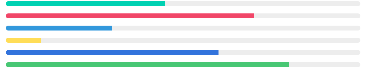
Progress bars with various colors
Just use the contextual class for pre-built colors for the progress bar. For example, is-primary for light green, is-success for green, is-danger for red and so on. The example below shows various available colors:
See online demo and code
<!DOCTYPE html>

<html>

<head>

<link rel="stylesheet" href="https://cdn.jsdelivr.net/npm/bulma@0.8.0/css/bulma.min.css">


</head>

<body>

<div class="container">


<progress class="progress is-primary" value="45" max="100">45% fill</progress>

<progress class="progress is-danger" value="70" max="100">70% fill</progress>

<progress class="progress is-info" value="30" max="100">30% fill</progress>

<progress class="progress is-warning" value="10" max="100">40% fill</progress>

<progress class="progress is-link" value="60" max="100">60% fill</progress>

<progress class="progress is-success" value="80" max="100">80% fill</progress>


</div>


</body>

</html>
Customizing the colors – Sass variables
For customizing the color, you may use the Sass variables in Bulma:
- $progress-bar-background-color
- $progress-value-background-color
- $progress-border-radius
- $progress-indeterminate-duration
Learn how to customize Bulma here.
How to display text in a progress bar
The default progress bar in Bulma does not show the value in the bar. Above, we have seen that we can set the value that is used to fill the bar with a specific color.
So, how to display the progress value? While there is no built-in solution in Bulma, you may use a trick for that. One of the ways is using the span tag and custom CSS as shown in the example below:
See online demo and code
<!DOCTYPE html>

<html>

<head>

<link rel="stylesheet" href="https://cdn.jsdelivr.net/npm/bulma@0.8.0/css/bulma.min.css">

<style>

span{

    position: absolute;

    top: -2px;

    left: 50%;

    font-size: 12px;

}

</style>

</head>

<body>

<div class="container">


<span>48%</span>

<progress  class="progress is-danger" value="48" max="100" ></progress>


<br /><br />


</div>


</body>

</html>
Adjust the height of the span element accordingly. Solution at StackOverflow
An indeterminate progress bar example
In scenarios where you want to show the progress bar but the progress is indeterminate. For example, you are showing the progress bar saving a record in another server but time to complete the process in not measurable. However, you may display the ongoing process to the users by way of an indeterminate progress bar.
The example below shows how to create this in Bulma:
See online demo and code
<!DOCTYPE html>

<html>

<head>

<link rel="stylesheet" href="https://cdn.jsdelivr.net/npm/bulma@0.8.0/css/bulma.min.css">


</head>

<body>

<div class="container">

<progress class="progress is-primary" max="100"></progress>

<progress class="progress is-danger" max="100"></progress>

<progress class="progress is-info" max="100"></progress>

<progress class="progress is-warning" max="100"></progress>

<progress class="progress is-link" max="100"></progress>

<progress class="progress is-success" max="100"></progress>


</div>


</body>

</html>
A dynamic progress bar with steps
The final example is the dynamic progress bar that shows the progress of the process/operation. So, the bar is filled by specified value in each step. This is done by using the Bulma/jQuery and inspired by this solution in CodePen.io.
See online demo and code
<!DOCTYPE html>

<html>

<head>

<link rel="stylesheet" href="https://cdn.jsdelivr.net/npm/bulma@0.8.0/css/bulma.min.css">

<script src = "https://ajax.googleapis.com/ajax/libs/jquery/2.1.1/jquery.min.js"></script>


<style>

body {

  margin:2rem;

}


.progress::-webkit-progress-value {

  transition: width 0.5s ease;

}

</style>

</head>

<body>

<div class="container">


<progress id="step-progress" class="progress is-danger is-large" value="0" max="100"></progress>


</div>


<script>

var progressArr = [5, 15, 30, 40, 60, 65, 80, 90, 95, 100];


function fillProgress() {

  progressArr.forEach(function(num, index) {

    setTimeout(function() {

      $('#step-progress').val(num);

    }, 1000 * index);

  });

}


fillProgress();

</script>

</body>

</html>
You may just add or remove the steps as required in the progressArr array.