
Creating Bootstrap modal easily with a jQuery plug-in
By using the modal component of Bootstrap framework, you may create the modal dialog in your web pages. All it requires is to include the Bootstrap CSS and JS files, jQuery library and using the modal related classes in the markup section.
I have written a guide for creating modal dialogs by using Bootstrap here.
In this tutorial, I am using a jQuery plug-in that makes it even easier for creating the modal in Bootstrap. Not only it will be easier but allows creating Bootstrap modals with plenty of options. See the section below with code, live demos and how to set up this plug-in to be used on your website.
A simple example of creating modal
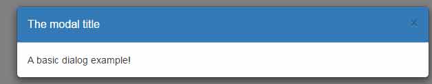
First, let me start with a basic demo of creating a modal window by using bootstrap3-dialog plug-in. Click on the “Launch modal” button for displaying the dialog in the demo page.
See online demo and code
The markup for the example:
<div class="container">

   <h3>A demo of simple dial</h3>


    <div class="source-code runnable">

        <!--

        BootstrapDialog.show({

            title: 'The modal title',

            message: 'A basic dialog example!'

        });

        -->

    </div>

</div>
The script:
<script type="text/javascript">

$(function(){

    $('.source-code').each(function(index){

        var $section = $(this);

        var code = $(this).html().replace('<!--', '').replace('-->', '');


        // Run code

        if($section.hasClass('runnable')){

            var $button = $('<button class="btn btn-primary">Launch Modal Bootstrap</button>');

            $button.on('click', {code: code}, function(event){

                eval(event.data.code);

            });

            $button.insertAfter($section);

            $('<div class="clearfix" style="margin-bottom: 10px;"></div>').insertAfter($button);

        }

    });

});

</script>
See the complete code including dependent JS/CSS files in the demo page.
A demo of manipulating text in dialog box
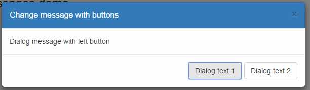
In this demo, two buttons are displayed in the modal window. As you click the left button, the corresponding text associated with that button will display in the dialog message area. Similarly, as you press the right button, it will display the message associated with that button.
That way, you may display different messages in a Bootstrap dialog on the fly upon user’s action. Have a look:
See online demo and code
The Script for this example:
<script type="text/javascript">

$(function(){

    $('.source-code').each(function(index){

        var $section = $(this);

        var code;

        if($section.hasClass('runnable')){

            var $button = $('<button class="btn btn-danger">Modal with multiple messages</button>');

            $button.on('click', {code: code}, function(event){


        BootstrapDialog.show({

            title: 'Change message with buttons',

            message: 'Press any button for displaying its respetive message here',

            buttons: [{

                label: 'Dialog text 1',

                action: function(dialog) {

                    dialog.setMessage('Dialog message with left button');

                }

            }, {

                label: 'Dialog text 2',

                action: function(dialog) {

                    dialog.setMessage('Dialog message with right button');

                }

            }]

        });

            });

            $button.insertAfter($section);

            $('<div class="clearfix" style="margin-bottom: 10px;"></div>').insertAfter($button);

        }

    });

});

</script>
See the complete code on the demo page.
In this example, multiple buttons are used in the modal dialog. You may perform various actions like closing the dialog, triggering an alert etc. In above example, I also showed how the message is displayed with respect to each button.
See online demo and code
The script for this demo:
<script type="text/javascript">

$(function(){

    $('.source-code').each(function(index){

        var $section = $(this);

        var code;

        if($section.hasClass('runnable')){

            var $button = $('<button class="btn btn-danger">Modal with multiple buttons</button>');

            $button.on('click', {code: code}, function(event){


        BootstrapDialog.show({

            message: 'A demo of multiple buttons with different actions!',

            buttons: [{

                label: 'A simple button',

                title: 'simple button'

            }, {

                label: 'Show alert',

                cssClass: 'btn-success',

                action: function(){

                    alert('The green button with alert!');

                }

            }, {

                icon: 'glyphicon glyphicon-cloud',

                label: 'Cloud icon',

                cssClass: 'btn-danger'

            }, {

                label: 'Close wirth cross icon',

                icon: 'glyphicon glyphicon-remove',

                cssClass: 'btn-warning',

                action: function(dialogItself){

                    dialogItself.close();

                }

            }]

        });


            });

            $button.insertAfter($section);

            $('<div class="clearfix" style="margin-bottom: 10px;"></div>').insertAfter($button);

        }

    });

});

</script>
You can see, the button styles are set by using the cssClass class while you may also display an icon with button caption by using the icon option.
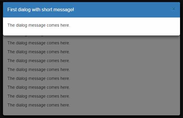
A demo of displaying multiple modals
You may also display multiple modal dialogs by using this cool plug-in. See this demo where four dialogs are displayed. Close first to display the second and so on.
See online demo and code
The script:
<script type="text/javascript">

$(function(){

    $('.source-code').each(function(index){

        var $section = $(this);

        var code;

        if($section.hasClass('runnable')){

            var $button = $('<button class="btn btn-danger">Multiple dialogs demo</button>');

            $button.on('click', {code: code}, function(event){


        var shortContent = '<p>The dialog message comes here.</p>';

        var longContent = '';

        for(var i = 1; i <= 10; i++) {

            longContent += shortContent;

        }

        BootstrapDialog.show({

            title: 'Fourth dialog with long message',

            message: longContent

        });

        BootstrapDialog.show({

            title: 'Third dialog with short message',

            message: shortContent,

            draggable: true

        });

        BootstrapDialog.show({

            title: 'Second dialog with long message',

            message: longContent,

            draggable: true

        });

        BootstrapDialog.show({

            title: 'First dialog with short message!',

            message: shortContent

        });


            });

            $button.insertAfter($section);

            $('<div class="clearfix" style="margin-bottom: 10px;"></div>').insertAfter($button);

        }

    });

});

</script>
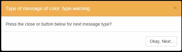
Using different colors in title bar of the dialog demo
In all above examples, the title bar uses the blue color (primary). By using the BootstrapDialog option in the script section, you may use a different color like the Bootstrap standard colors. For example, BootstrapDialog.TYPE_INFO for light blue, BootstrapDialog.TYPE_SUCCESS for green and so on.
Have a look at this demo where multiple dialogs are displayed with different title bar color. Press the close or “Okay, Next” button to display the next dialog until all are done:
See online demo and code
The script:
<script type="text/javascript">

$(function(){

    $('.source-code').each(function(index){

        var $section = $(this);

        var code;

        if($section.hasClass('runnable')){

            var $button = $('<button class="btn btn-danger">Different title bar colors</button>');

            $button.on('click', {code: code}, function(event){


  var types = [BootstrapDialog.TYPE_DEFAULT,

                     BootstrapDialog.TYPE_INFO,

                     BootstrapDialog.TYPE_PRIMARY,

                     BootstrapDialog.TYPE_SUCCESS,

                     BootstrapDialog.TYPE_WARNING,

                     BootstrapDialog.TYPE_DANGER];


        $.each(types, function(index, type){

            BootstrapDialog.show({

                type: type,

                title: 'Type of message of color: ' + type,

                message: 'Press the close or button below for next message type?',

                buttons: [{

                    label: 'Okay, Next..',

                    action: function(dialogItself){

                    dialogItself.close();

                }

                }]

            });

        });


            });

            $button.insertAfter($section);

            $('<div class="clearfix" style="margin-bottom: 10px;"></div>').insertAfter($button);

        }

    });

});

</script>
On the other hand, these colors also act as message types in a dialog. For example, the red represents the danger or critical message. The green for success, orange for warning, and light blue for the information etc.
How to set up this plug-in to be used on your website?
You may download the plug-in from the Github website here. There, you may see the demo page where many other examples are included with live demos.
All required libraries are fetched from the CDNs that include Bootstrap, jQuery and plug-in files that you can see in the demo pages’ <head> section.