
The Bootstrap container and container-fluid classes
For developing a web project in the Bootstrap framework, you need to specify a containing element that houses the Bootstrap grid system. The grid system is used to define the layout of the web pages by using a series of rows and columns.
For the containing element, you may specify either of these two classes:
- container
- container-fluid
The difference between these two containing classes:
The .container class is the fixed-width container. That does not mean it is not responsive. It is responsive; however, it is fixed based on screen size.
The screen sizes include:
| Screen Size | Description |
|---|---|
| xs | Extra small devices (used for less than 768 pixels, e.g., smartphones, mobile, etc.) |
| sm | Small screens (From 768 pixels and up, e.g., tablets) |
| md | Medium screens (>= 992 pixels, desktops/laptops) |
| lg | Large screens (>= 1200 pixels, e.g., large desktops) |
- If you use the .container class and check the webpage in a browser, it will adjust according to the screen and browser size.
- For example, if your current browser width is more than 1200, it will adjust to 1170px wide. If you resize the browser to a small size, it will remain the same until it reaches 992px. At this point, the container class will adjust to 970px wide.
- On the other hand, the container-fluid class will take the full width of the viewport. If you use the container-fluid and resize the browser, you may notice the content inside will adjust with every pixel to take the full available width.
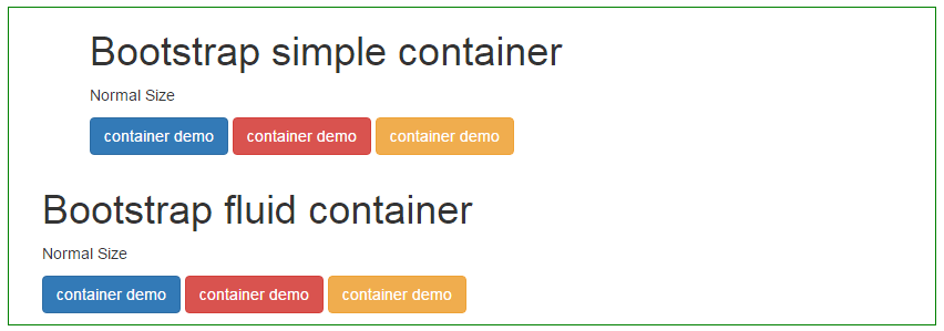
To make it clearer, have a look at the example below.
An example to understand the difference between container and container-fluid Bootstrap
To demonstrate that, I have used the same number of Bootstrap buttons in two rows. The first div is assigned the container class while the second div is given the container-fluid class.
For distinction, I am using an outer div with a non-Bootstrap class. It is just given the border and margin. See the difference initially, as well as, by resizing the screen if you are using a desktop/notebook:
The markup for this example:
<div style="border: 1px solid green;margin: 15px;">

    <div class="container">

       <div class="col-md-6">

        <h1>Bootstrap simple container</h1>

        <p>Normal Size</p>

        <p>

          <button type="button" class="btn btn-primary">container demo</button>

          <button type="button" class="btn btn-danger">container demo</button>

          <button type="button" class="btn btn-warning">container demo</button>

        </p>

       </div>

  </div>

    <div class="container-fluid">

       <div class="col-md-6">

        <h1>Bootstrap fluid container</h1>

        <p>Normal Size</p>

        <p>

          <button type="button" class="btn btn-primary">container demo</button>

          <button type="button" class="btn btn-danger">container demo</button>

          <button type="button" class="btn btn-warning">container demo</button>

        </p>

       </div>

  </div>


</div>
You can see that the buttons contained in the container class div move and adjust after a certain resize or as the width of the browser changes while buttons used inside the container-fluid div stay the same.