
In this tutorial, the effects are added in the Bootstrap based buttons by using custom CSS.
Along with this, the font-awesome icons are also added in buttons.
Have a look at code and demos in the following section.
(You may find the reference of font-awesome CSS file after the first demo)
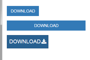
In this demo, the Bootstrap primary buttons of different sizes are created with the font-awesome icon. The button caption is used “Download” so accordingly, the download icon from the font-awesome is used. Have a look at the code and live demo online:
See online demo and code
Following is the CSS used for creating the buttons hover effect:
<style>

.btn-effets{

    border-radius: 0;

    position: relative;

    color: #fff;

    border:1px solid transparent;

    text-transform: uppercase;

    transition: all 0.40s ease 0s;

}

.btn-effets:after{

    content: "\f019";

    font-family: fontawesome;

    position: absolute;

    right: 6px;

    top: -4px;

    opacity: 0;

    color: #fff;

    transition: all 0.40s ease 0s;

}

.btn-effets:hover:after{

    top:40%;

    opacity: 5;

}

.btn-effets span{

    display: block;

    transition: all 0.70s linear 0s;

}

.btn-effets:hover span{

    transform: translate(-9px);

}

</style>
For using the font-awesome icons in button, you have to include the CSS file:
<link rel=”stylesheet” href=”https://maxcdn.bootstrapcdn.com/font-awesome/4.5.0/css/font-awesome.min.css”>
In the CSS part, font-family is specified as fontawesome (See the .btn-effets:after class). For including the icon of font-awesome, you may use the icon content code. For example, for the download icon, the code is:
content: “\f019”;
Find the appropriate icon as per button usage.
The markup used in the demo is:
<div class="container">


<div class="row">

        <div class="col-md-3">

            <a href="#" class="btn btn-effets btn-primary "><span>Download</span></a>

        </div>


        <div class="col-md-6">

            <a href="#" class="btn btn-effets btn-primary btn-block"><span>Download</span></a>

        </div>


        <div class="col-md-3">

            <a href="#" class="btn btn-effets btn-primary btn-lg"><span>Download</span></a>

        </div>

    </div>


</div>
In this example, the success button class of Bootstrap i.e. green buttons is used for creating the upload button with the icon from the font-awesome library.

See online demo and code
Following is the CSS used for button effect on hover state:
<style>

.btn-effets{

    border-radius: 10px;

    position: relative;

    color: #FFFFA6;

    font-weight:700;

    transition: all 0.40s ease 0s;

}

.btn-effets:after{

    content: "\f093";

    font-family: fontawesome;

    position: absolute;

    right: 3px;

    top: -2px;

    opacity: 0;

    color: #fff;

    transition: all 0.40s ease-out 0s;

}

.btn-effets:hover:after{

    top:2%;

    opacity: 5;

}

.btn-effets span{

    display: block;

    transition: all 0.70s linear 0s;

}

.btn-effets:hover span{

    transform: translate(-9px);

    color: #fff;

    background: transparent;


}


.btn.blue:hover{


}

</style>
You may get the complete code from the demo page.