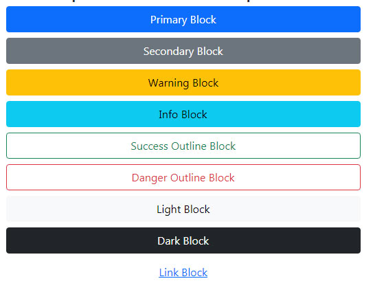
Bootstrap 5 Select

BS5-select-sizes

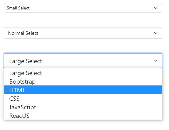
The select is an HTML element to get the user input in the form of a dropdown list. Most often, the select is used in the HTML form. Bootstrap 5 provides built-in classes to design/style the HTML select for control

Bootstrap 5 Close Button

Bootstrap-close-custom

The close button is used with different components to give an option to the use to dismiss the content. These components can be:

Alerts
Modals
Popovers etc.

Bootstrap 5 Accordion

accordion-content-style

Bootstrap 5 Accordion Just like older Bootstrap versions, you may create accordion or collapsible components in your web pages using the Bootstrap 5 framework – without using JavaScript. Why use Accordion? If you have less space on a web page and more content to show then you may create a panel line component that expands … Read more

How to Create Bootstrap 5 Alerts

Bootstrap-5-alerts-icon

The alert is a way of communicating with the users of your website. A contextual feedback message can be displayed to the user by using the Bootstrap 5 built-in component, easily.

Bootstrap 5 Buttons

BS-buttons-block

Bootstrap 5 (just like version 3, and 4) has predefined built-in classes for creating buttons. These styles have semantic meaning.