
In this tutorial, I am going to present a few demos of gooey menus using jQuery.
This gooey menu plug-in uses the jQuery library, font-awesome, and demos use Bootstrap classes for presenting this menu.
So you have to include jQuery, Bootstrap’s CSS file, and plug-in’s JS and CSS files for this gooey menu to work.
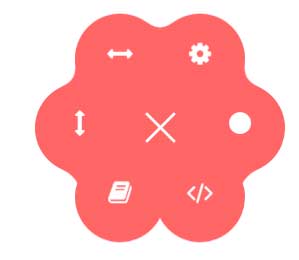
In this example, a circle menu is created with glue item positions. You may adjust the radius which is kept 80 for this demo.
Follow these steps to create this circle menu:
First of all, the CSS files of Bootstrap, gooey plug-in, font-awesome, and live-demo are included in the <head> section.
You may get these files packaged with the plug-in by following this link (credit: dominicg666). Download the zipped file and find these files:
<link rel=”stylesheet” href=”http://netdna.bootstrapcdn.com/bootstrap/3.3.4/css/bootstrap.min.css”>
<link rel=”stylesheet” href=”css/gooey/gooey.min.css”>
<link rel=”stylesheet” href=”css/gooey/font-awesome.min.css”>
<link rel=”stylesheet” href=”css/gooey/livedemo.css”>
You also need to include jQuery and plug-in JS file:
<script src=”http://ajax.googleapis.com/ajax/libs/jquery/1.11.1/jquery.min.js”></script>
<script src=”js/gooey/gooey.min.js”></script>
In the <body> section, the script is written for initiating the plug-in with certain options. For example, in the above demo, the bgColor, ContentColor, style, and many other options are used. See the <script> section on the demo page.
In the markup section, the input type checkbox is created with three lines, that are visible as the demo page loads.
As you click this, the menu opens with glued items whose radius is kept 80.
Complete code:
<!DOCTYPE html>
<html>
<head>

<link rel="stylesheet" href="https://netdna.bootstrapcdn.com/bootstrap/3.3.4/css/bootstrap.min.css">
<link rel="stylesheet" href="css/gooey/gooey.min.css">
 <link rel="stylesheet" href="css/gooey/font-awesome.min.css">
<link rel="stylesheet" href="css/gooey/livedemo.css">

<script src="https://ajax.googleapis.com/ajax/libs/jquery/1.11.1/jquery.min.js"></script>
<script src="js/gooey/gooey.min.js"></script>


</head>

<body>
    <script>
        $(function($) {
            $("#gooey-upper").gooeymenu({
                bgColor: "#ff6666",
                contentColor: "white",
                style: "circle",
                horizontal: {
                    menuItemPosition: "glue"
                },
                vertical: {
                    menuItemPosition: "spaced",
                    direction: "up"
                },
                circle: {
                    radius: 80
                },
                margin: "small",
                size: 90,
                bounce: true,
                bounceLength: "small",
                transitionStep: 100,
                hover: "#e55b5b"
            });


        });
    </script>


   <header class="plugin-demo-header">
    <h2> A demo of gooey menu using SVG filters </h2>
    <nav id="gooey-upper">
  <input type="checkbox" class="menu-open" name="menu-open1" id="menu-open1"/>
  <label class="open-button" for="menu-open1">
    <span class="burger burger-1"></span>
    <span class="burger burger-2"></span>
    <span class="burger burger-3"></span>
  </label>

  <a href="#features" class="gooey-menu-item"> <i title="Features" class="fa fa-cog fa-2x"></i> </a>
  <a href="#h-spaced-menu" class="gooey-menu-item"> <i title="Horizontal Menu" class="fa fa-arrows-h fa-2x"></i> </a>
  <a href="#menu-v-example" class="gooey-menu-item"> <i title="Vertical Menu" class="fa fa-arrows-v fa-2x"></i> </a>
  <a href="#docs" class="gooey-menu-item"> <i title="Docs" class="fa fa-book fa-2x"></i> </a>
  <a href="#event-api" class="gooey-menu-item"> <i title="Event API" class="fa fa-code fa-2x"></i> </a>
  <a href="#round" class="gooey-menu-item"> <i title="Round Menu" class="fa fa-circle fa-2x"></i> </a>

 </nav>
    </header>


</body>
</html>
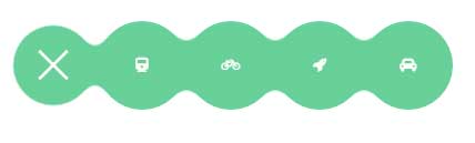
In this example, a horizontal menu is created by using the same plug-in. The difference is the style option which is kept horizontal as compared to the circle in the above example.
The code:
<!DOCTYPE html>
<html>
<head>

<link rel="stylesheet" href="https://netdna.bootstrapcdn.com/bootstrap/3.3.4/css/bootstrap.min.css">
<link rel="stylesheet" href="css/gooey/gooey.min.css">
 <link rel="stylesheet" href="css/gooey/font-awesome.min.css">
<link rel="stylesheet" href="css/gooey/livedemo.css">

<script src="https://ajax.googleapis.com/ajax/libs/jquery/1.11.1/jquery.min.js"></script>
<script src="js/gooey/gooey.min.js"></script>


</head>

<body>
    <script>
        $(function($) {
    $("#gooey-h").gooeymenu({
                bgColor: "#68d099",
                contentColor: "white",
                style: "horizontal",
                horizontal: {
                    menuItemPosition: "glue"
                },
                vertical: {
                    menuItemPosition: "spaced",
                    direction: "up"
                },
                circle: {
                    radius: 90
                },
                margin: "small",
                size: 80,
                bounce: true,
                bounceLength: "small",
                transitionStep: 100,
                hover: "#5dbb89"
            });


        });
    </script>


<div class="row">
        <div class="col-xs-8 col-sm-6 col-md-5">

            <nav id="gooey-h">
                <input type="checkbox" class="menu-open" name="menu-open2" id="menu-open2"/>
  <label class="open-button" for="menu-open2">
    <span class="burger burger-1"></span>
    <span class="burger burger-2"></span>
    <span class="burger burger-3"></span>
  </label>

  <a href="#" class="gooey-menu-item"> <i class="fa fa-train"></i> </a>
  <a href="#" class="gooey-menu-item"> <i class="fa fa-bicycle"></i> </a>
  <a href="#" class="gooey-menu-item"> <i class="fa fa-rocket"></i> </a>
  <a href="#" class="gooey-menu-item"> <i class="fa fa-automobile"></i> </a>
            </nav>
        </div>

    </div>


</body>
</html>
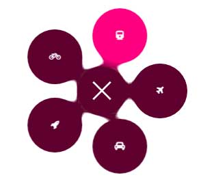
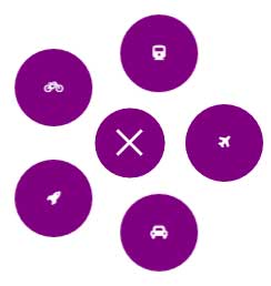
In this example, a round menu with glued items is created by using the circle style. To make it round, the radius value is 85 while the size value is 80.
The bgColor and hover colors are also changed to the above demos.
Markup, CSS, and jQuery:
<!DOCTYPE html>
<html>
<head>

<link rel="stylesheet" href="https://netdna.bootstrapcdn.com/bootstrap/3.3.4/css/bootstrap.min.css">
<link rel="stylesheet" href="css/gooey/gooey.min.css">
 <link rel="stylesheet" href="css/gooey/font-awesome.min.css">
<link rel="stylesheet" href="css/gooey/livedemo.css">

<script src="https://ajax.googleapis.com/ajax/libs/jquery/1.11.1/jquery.min.js"></script>
<script src="js/gooey/gooey.min.js"></script>


</head>

<body>
    <script>
        $(function($) {
            $("#gooey-round").gooeymenu({
                bgColor: "#5E002F",
                contentColor: "white",
                style: "circle",
                horizontal: {
                    menuItemPosition: "spaced"
                },
                vertical: {
                    menuItemPosition: "spaced",
                    direction: "up"
                },
                circle: {
                    radius: 85
                },
                margin: "small",
                size: 80,
                bounce: true,
                bounceLength: "small",
                transitionStep: 100,
                hover: "#FF0080"
            });


        });
    </script>


<div class="row">
        <div class="col-md-5 col-xs-12 col-sm-6 round-example">
            <nav id="gooey-round">
  <input type="checkbox" class="menu-open" name="menu-open3" id="menu-open3"/>
  <label class="open-button" for="menu-open3">
    <span class="burger burger-1"></span>
    <span class="burger burger-2"></span>
    <span class="burger burger-3"></span>
  </label>

  <a href="#" class="gooey-menu-item"> <i class="fa fa-train"></i> </a>
  <a href="#" class="gooey-menu-item"> <i class="fa fa-bicycle"></i> </a>
  <a href="#" class="gooey-menu-item"> <i class="fa fa-rocket"></i> </a>
  <a href="#" class="gooey-menu-item"> <i class="fa fa-automobile"></i> </a>
  <a href="#" class="gooey-menu-item"> <i class="fa fa-plane"></i> </a>
 </nav>
        </div>

        </div>


</body>
</html>
Get the round menu code from the demo page.
Again, by adjusting the option values, you may create a vertical gooey menu as well. See the following example which expands vertically as you click on three lines (which is a checkbox):

Code:
<!DOCTYPE html>
<html>
<head>

<link rel="stylesheet" href="https://netdna.bootstrapcdn.com/bootstrap/3.3.4/css/bootstrap.min.css">
<link rel="stylesheet" href="css/gooey/gooey.min.css">
 <link rel="stylesheet" href="css/gooey/font-awesome.min.css">
<link rel="stylesheet" href="css/gooey/livedemo.css">

<script src="https://ajax.googleapis.com/ajax/libs/jquery/1.11.1/jquery.min.js"></script>
<script src="js/gooey/gooey.min.js"></script>


</head>

<body>
    <script>
        $(function($) {
$("#gooey-v").gooeymenu({
                bgColor: "#00005B",
                contentColor: "white",
                style: "vertical",
                horizontal: {
                    menuItemPosition: "glue"
                },
                vertical: {
                    menuItemPosition: "spaced",
                    direction: "up"
                },
                circle: {
                    radius: 90
                },
                margin: "small",
                size: 70,
                bounce: true,
                bounceLength: "small",
                transitionStep: 100,
                hover: "#C4C400"
            });


        });
    </script>


<div class="row">
        <div class="col-md-5 col-xs-12 vertical-example">
            <nav id="gooey-v">
  <input type="checkbox" class="menu-open" name="menu-open4" id="menu-open4"/>
  <label class="open-button" for="menu-open4">
    <span class="burger burger-1"></span>
    <span class="burger burger-2"></span>
    <span class="burger burger-3"></span>
  </label>

  <a href="#" class="gooey-menu-item"> <i class="fa fa-train"></i> </a>
  <a href="#" class="gooey-menu-item"> <i class="fa fa-bicycle"></i> </a>
  <a href="#" class="gooey-menu-item"> <i class="fa fa-rocket"></i> </a>
  <a href="#" class="gooey-menu-item"> <i class="fa fa-automobile"></i> </a>
 </nav>
        </div>

        </div>
    </div>

</body>
</html>
You can use open and close events to change the look like color or other properties or perform a certain action as the menu opens or closes.
See the following demo where the menu color is changed upon closing and opening the menu:
Here is the complete code:
<!DOCTYPE html>
<html>
<head>

<link rel="stylesheet" href="https://netdna.bootstrapcdn.com/bootstrap/3.3.4/css/bootstrap.min.css">
<link rel="stylesheet" href="css/gooey/gooey.min.css">
 <link rel="stylesheet" href="css/gooey/font-awesome.min.css">
<link rel="stylesheet" href="css/gooey/livedemo.css">

<script src="https://ajax.googleapis.com/ajax/libs/jquery/1.11.1/jquery.min.js"></script>
<script src="js/gooey/gooey.min.js"></script>


</head>

<body>
    <script>
        $(function($) {
   $("#gooey-API").gooeymenu({
                bgColor: "#006A00",
                contentColor: "white",
                style: "circle",
                circle: {
                    radius: 85
                },
                margin: "small",
                size: 70,
                bounce: true,
                bounceLength: "small",
                transitionStep: 100,
                hover: "#00F000",
                open: function() {
                    $(this).find(".gooey-menu-item").css("background-color", "#800080");
                    $(this).find(".open-button").css("background-color", "#800080");
                },
                close: function() {
                    $(this).find(".gooey-menu-item").css("background-color", "#ffdf00");
                    $(this).find(".open-button").css("background-color", "#ffdf00");
                }
            });


        });
    </script>


<div class="row">
                <div class="col-md-5 col-xs-12 event-api-ex">

                    <nav id="gooey-API">
  <input type="checkbox" class="menu-open" name="menu-open5" id="menu-open5"/>
  <label class="open-button" for="menu-open5">
    <span class="burger burger-1"></span>
    <span class="burger burger-2"></span>
    <span class="burger burger-3"></span>
  </label>

  <a href="#" class="gooey-menu-item"> <i class="fa fa-train"></i> </a>
  <a href="#" class="gooey-menu-item"> <i class="fa fa-bicycle"></i> </a>
  <a href="#" class="gooey-menu-item"> <i class="fa fa-rocket"></i> </a>
  <a href="#" class="gooey-menu-item"> <i class="fa fa-automobile"></i> </a>
  <a href="#" class="gooey-menu-item"> <i class="fa fa-plane"></i> </a>
 </nav>
                </div>

            </div>

</body>
</html>