
The full-screen modal plugin
The ap-full-screen modal is a jQuery-based plug-in that uses CSS3 animations. As the name shows, it is a full-screen modal window where you may present DOM elements like subscription forms, or other informative content.
The plug-in is light-weight, only 13Kb and includes CSS and JS files. See the following section for setting and using this modal plug-in in your web projects.
I have also included Bootstrap-based markup, a form that uses Bootstrap classes as using this modal plug-in. let me start by a simple example.
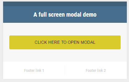
A demo of the full-screen modal component
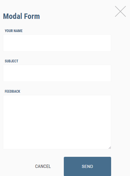
As you click the button on the demo page (links are given below), the modal window appears with a simple form.
Code:
<!DOCTYPE html>
<html lang="en">
<head>
        <link rel="stylesheet" href="css/reset.css" type="text/css" media="screen" />
        <link rel="stylesheet" href="css/ap-fullscreen-modal/style.css" type="text/css" media="screen" />
        <link rel="stylesheet" href="css/ap-fullscreen-modal/ap-fullscreen-modal.css" type="text/css" media="screen" />

         <script src="https://ajax.googleapis.com/ajax/libs/jquery/1.11.3/jquery.min.js"></script>

         <script src="js/ap-fullscreen-modal/ap-fullscreen-modal.js"></script>


</head>
<body>

        <div class="controls-container">
            <header>
                A full screen modal demo
            </header>
            <div class="options">
                <input type="button" value="Click here to open modal" id="open-modal-1" />
            </div>
            <footer>
                <a href="#">Footer link 1</a>
                <a href="#">Footer link 2</a>
            </footer>
        </div>

        <div style="display: none;">

            <div id="modal-content-1" class="modal-content">
                <div class="wrapper">
                    <h2>Modal Form </h2>
                    <div class="form">
                        <div class="row">
                            <label for="name-1">Your Name</label>
                            <input type="text" name="name-1" id="name-1" />
                        </div>
                        <div class="row">
                            <label for="subject-1">Subject</label>
                            <input type="text" name="subject-1" id="subject-1" />
                        </div>
                        <div class="row">
                            <label for="message-1">Feedback</label>
                            <textarea name="message-1" id="message-1" rows="5"></textarea>
                        </div>
                        <div class="row buttons">
                            <a href="#close-modal" class="close-modal">Cancel</a>
                            <input type="submit" value="Send" id="send-1" />
                        </div>
                    </div>
                </div>
            </div>

        </div>


        <script type="text/javascript">
            $(document).ready(function() {
                $('#modal-content-1').apFullscreenModal({
                    openSelector: '#open-modal-1',
                    closeSelector: '.close-modal, #send-1'
                });

            });
        </script>

</body>
</html>
In the markup section, a button is created with an id.
<input type="button" value="Click here to open modal" id="modal-demo" />
The ID is used in the jQuery code, just above the </body> tag.
$('#modal-content-1').apFullscreenModal({

openSelector: '#modal-demo',

closeSelector: '.close-modal, #send-1'

});
Get the complete code on the demo page.
Adding animations for opening and closing of modal
This time, the modal window opens slowly which is done by using the animation duration option in the <script> part of jQuery. In the demo, I used 1500 values that means 1.5 seconds. See the code below:
Only this part is changed as compared to the above example in the <script> section:
$('#modal-demo-contenr').apFullscreenModal({

backgroundColor: '#fafafa',

openSelector: '#modal-demo',

closeSelector: '.close-modal, #send-2',

animationDuration: 1500

});
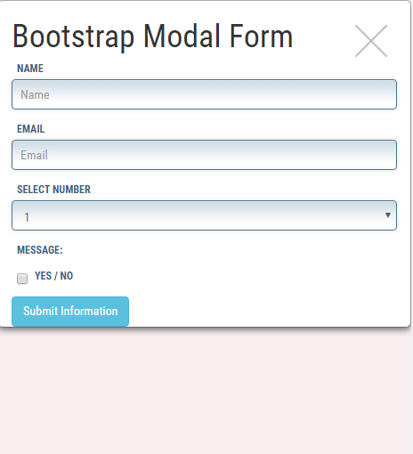
A demo of using this with Bootstrap classes
As such Bootstrap is a popular web framework these days, the following example uses Bootstrap classes for various buttons and content of the modal window. Although I have covered the modal component of Bootstrap framework in its tutorial, the purpose is to show you may use this plug-in if you are working with Bootstrap.
Complete code for this example:
<!DOCTYPE html>
<html lang="en">
<head>
        <link href="https://netdna.bootstrapcdn.com/bootstrap/3.1.1/css/bootstrap.min.css" rel="stylesheet">
		<link rel="stylesheet" href="css/ap-fullscreen-modal/style.css" type="text/css" media="screen" />
		<link rel="stylesheet" href="css/ap-fullscreen-modal/ap-fullscreen-modal.css" type="text/css" media="screen" />

		 <script src="https://ajax.googleapis.com/ajax/libs/jquery/1.11.3/jquery.min.js"></script>

		 <script src="js/ap-fullscreen-modal/ap-fullscreen-modal.js"></script>

<style>
.inputstl {
    padding: 9px;
    border: solid 1px #4B718B;
    outline: 0;
    background: -webkit-gradient(linear, left top, left 25, from(#FFFFFF), color-stop(4%, #CDDBE4), to(#FFFFFF));
    background: -moz-linear-gradient(top, #FFFFFF, #CDDBE4 1px, #FFFFFF 25px);
    box-shadow: rgba(0,0,0, 0.1) 0px 0px 8px;
    -moz-box-shadow: rgba(0,0,0, 0.1) 0px 0px 8px;
    -webkit-box-shadow: rgba(0,0,0, 0.1) 0px 0px 8px;

    }

</style>

</head>
<body>
<div class="container">
		<div class="controls-container">
			<header>
				A full screen modal demo
			</header>
			<div class="options">
                <button class="btn btn-danger" id="modal-demo">Click here to open modal</button>
			</div>
			<footer>
				<a href="#">Footer link 1</a>
				<a href="#">Footer link 2</a>
			</footer>
		</div>

		<div style="display: none;">

			<div id="modal-demo-contenr" class="modal-content">


<div class="container">
<h1>Bootstrap Modal Form </h1>
<form>
  <div class="form-group">
    <label for="Name">Name</label>
    <input type="name" class="form-control inputstl" id="Name" placeholder="Name">
  </div>
  <div class="form-group">
    <label for="Email1">Email</label>
    <input type="email" class="form-control inputstl" id="Email1" placeholder="Email">
  </div>
  <div class="form-group">
    <label for="Inputselect">Select Number</label>
    <select class="form-control inputstl" >
      <option>1</option>
      <option>2</option>
      <option>3</option>
    </select>
  </div>
  <div class="form-group">
    <label for="Email1msg">Message:</label>
<!-- Add textarea here -->
  </div>
  <div class="checkbox">
    <label>
      <input type="checkbox" id="yesno"> Yes / No
    </label>
  </div>

  <button type="submit" class="btn btn-info">Submit Information</button>
</form>
</div>


            </div>


		</div>
</div>

		<script type="text/javascript">
			$(document).ready(function() {
				$('#modal-demo-contenr').apFullscreenModal({
					backgroundColor: '#F9EEEF',
					openSelector: '#modal-demo',
					closeSelector: '.close-modal, #send-2',
					animationDuration: 1500
				});

			});
		</script>

</body>
</html>
The same ID is given that is used in the <script> part.
The form opened in modal uses different Bootstrap and custom CSS classes for styling the input fields.