
Multi item Bootstrap carousel template
This slider template is the continuation of HTML 5/ CSS 3 product template that was used in the previous part.
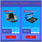
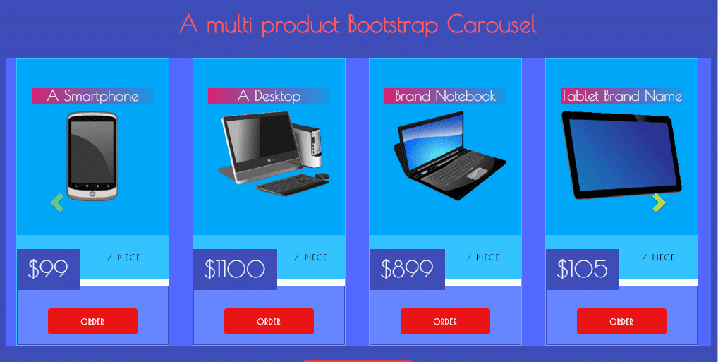
In this template, I have displayed items in the Bootstrap multi-item carousel by using the carousel plug-in. The color scheme is also changed for product / item or current work for titles along with rest of the boxes.
In full-screen mode, four products are displayed at a time. As the screen becomes smaller, the carousel will slide only three products. In the smartphones, only a single item is displayed at a time.
Live Preview Download Code
You may use this component to display products in sliding manner along with an option to place the order. Similarly, this free Bootstrap carousel template can be used to display catalogs, portfolio items etc.
The carousel component is displayed with an animation which is done by using the wow animation plug-in. (The download package includes JS and CSS files).
Feel free to change the color schemes as per the rest of the theme of your website project. For that, you simply need to change a few CSS classes like:
To change the background of the main container, find ourbkground class in CSS file and change its HEX value. The inner container is using the innerbkground class.
The boxes section where product name and image is shown is dealt in the mainbox CSS class. Just go through other classes and amend as per need or use as it is.
The markup code for this carousel is as below:
<!-- Complete Range of Products carosel-->

<div class="ourbkground wow flipInX" data-wow-delay="0.6s">

<div class="container text-center"><h1 class="text-center">A multi product Bootstrap Carousel</h1>

<div class="row">

<div class="carousel slide row innerbkground" data-ride="carousel" data-type="multi" data-interval="3000" id="productscarousel">


<div class="carousel-inner">

<div class="item active">

<div class="col-md-3 col-sm-4 col-xs-12">


<div class="spe-prods">

<div class="mainbox">

<h3>A Smartphone</h3>

<img class="rotprod" src="img/products/p1.png" alt="">

</div>

<div class="price-big">

<div>

<div class="floatting-price">

<h3>$99</h3>

</div>

<div class="month">

<p>/ piece</p>

</div>

</div>

<div class="ordersection">

<a href="#" class="buybtn">Order</a>

</div>

</div>

</div>


</div>

</div>

<div class="item">

<div class="col-md-3 col-sm-4 col-xs-12">


<div class="spe-prods">

<div class="mainbox">

<h3>A Desktop</h3>

<img class="rotprod" src="img/products/p2.png" alt="">

</div>

<div class="price-big">

<div>

<div class="floatting-price">

<h3>$1100</h3>

</div>

<div class="month">

<p>/ piece</p>

</div>

</div>

<div class="ordersection">

<a href="#" class="buybtn">Order</a>

</div>

</div>

</div>


</div>

</div>

<div class="item">

<div class="col-md-3 col-sm-4 col-xs-12">


<div class="spe-prods">

<div class="mainbox">

<h3>Brand Notebook</h3>

<img class="rotprod" src="img/products/p3.png" alt="">

</div>

<div class="price-big">

<div>

<div class="floatting-price">

<h3>$899</h3>

</div>

<div class="month">

<p>/ piece</p>

</div>

</div>

<div class="ordersection">

<a href="#" class="buybtn">Order</a>

</div>

</div>

</div>


</div>

</div>

<div class="item">

<div class="col-md-3 col-sm-4 col-xs-12">


<div class="spe-prods">

<div class="mainbox">

<h3>Tablet Brand Name</h3>

<img class="rotprod" src="img/products/p4.png" alt="">

</div>

<div class="price-big">

<div>

<div class="floatting-price">

<h3>$105</h3>

</div>

<div class="month">

<p>/ piece</p>

</div>

</div>

<div class="ordersection">

<a href="#" class="buybtn">Order</a>

</div>

</div>

</div>


</div>

</div>


<div class="item">

<div class="col-md-3 col-sm-4 col-xs-12">


<div class="spe-prods">

<div class="mainbox">

<h3>Smartphone</h3>

<img class="rotprod" src="img/products/p5.png" alt="">

</div>

<div class="price-big">

<div>

<div class="floatting-price">

<h3>$500</h3>

</div>

<div class="month">

<p>/ piece</p>

</div>

</div>

<div class="ordersection">

<a href="#" class="buybtn">Order</a>

</div>

</div>

</div>


</div>

</div>


</div>


<a class="left carousel-control" href="#productscarousel" data-slide="prev"><i class="glyphicon glyphicon-chevron-left"></i></a>


<a class="right carousel-control" href="#productscarousel" data-slide="next"><i class="glyphicon glyphicon-chevron-right"></i></a>

</div>

</div>

<div class="space">

<a class="btn btn-danger btn-lg wow bounceIn" href="https://www.jquery-az.com/"><i class="icon-upload-alt"></i>Download Code</a>

</div>

</div>

</div>

<!-- Complete range of products / small carousel ending here -->
To get complete files or view the demo online follow the links below:
Live Preview Download Code
The downloaded package also contains the main CSS file, markup, wow plugin, jQuery and Bootstrap libraries.
If you liked this free template, then feel free to share the link at programming forums, stackoverflow or other sites.