The mega menu, as clicked or opened takes the much space of the visible screen where you may show plenty of information including the links to categories, sub-categories, some special collection/products as well.
You might have seen mega menu developed by using different web techniques, I am going to show you a large menu based on Bootstrap framework. So, if you are working in a Bootstrap based project and need to present lots of informative links and content in menu , you may try this mega menu.
Just like other header menus in Bootstrap, it starts with the main navbar class. Inside that, you will use navbar-header that deals with the mobile-menu (the typical three lines).
For the mega menu, the mega-dropdown-menu class is used along with other classes. You can see other classes related to mega-dropdown-menu in the <style> section that defines the layout, color etc. of the menu.
See this demo online, click on the Web item to open the large menu:

See online demo and code
The sliding of images in “Latest Products” or ‘Collection” in achieved by using the carousel component:
<li class="dropdown-header">Latest Products</li>

<div id="myCarousel" class="carousel slide" data-ride="carousel">

<div class="carousel-inner">

<div class="item active">

<a href="#"><img src="http://placehold.it/254x150/3498db/f5f5f5/&text=New+Collection" class="img-responsive" alt="jQuery"></a>

<h4><small>A jQuery editor</small></h4>

<button class="btn btn-primary" type="button">$25.99</button>

<button href="#" class="btn btn-default" type="button"><span class="glyphicon glyphicon-heart"></span> Add to Wishlist</button>

</div>
See the complete code including JS, markup and CSS in the demo page.
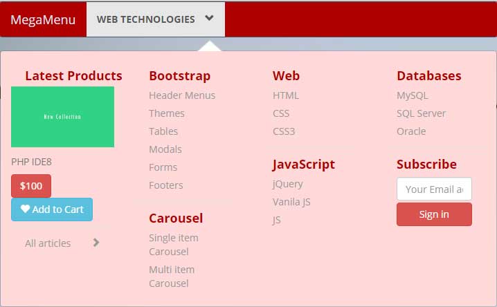
In this demo, a mega menu which is similar to above template is created with the red scheme. For that, the btn-danger class for buttons is used with the combination of btn-info. A few other properties are also changed along with overriding the navbar-default class. First, have a look at the demo online:

See online demo and code
You may change the scheme as per the need of your project. For the background of the top bar where it says “Mega Menu” and “Web Technologies”, you have to change the navbar-default class properties. For that, simple copy the class from main Bootstrap CSS file and paste it in the <style> section or to your external CSS file. I did this in the <style> section:
.navbar-default {

background-color: #B00000;

border-color: #425766;

}
It will override the default color of the class. Make sure to include this after the reference of Bootstrap’s CSS file.
For changing the colors of mega menu that pull down as you click the ‘Web Technologies”, change these classes in the <style> section:
.mega-dropdown-menu {

padding: 20px 0px;

width: 100%;

box-shadow: none;

-webkit-box-shadow: none;

background-color:#FFD9D9;

}
For managing the color of header menus like Bootstrap, Carousel, Web, Databases; find and modify this class:
.mega-dropdown-menu .dropdown-header {

color: #B00000;

font-size: 18px;

font-weight: bold;

}
You many change the menu items color as well. Just play by changing the properties!
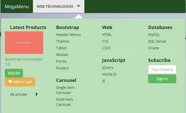
Have a look at another style that used green scheme.

See online demo and code
The same set of classes is modified as in above example.
Credit: Atiq ur Rehman
