
Adding some spice to Bootstrap tabs
In Bootstrap tabs tutorial, I showed you how to create tabs by using built-in Bootstrap classes. I also showed examples of overriding the tabs related classes and changing / adding a few properties for the look and presentation of tabs.
In this tutorial, I am going to extend the same i.e. overriding the default classes for creating tabs with a different style.
It will use a few built-in properties along with new or modified CSS. Have a look in the demos below.
A demo of tabs of Bootstrap with custom CSS
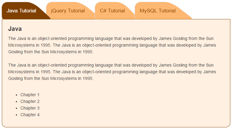
In this demo, four tabs are created by using Bootstrap and custom CSS. The same set of classes in the markup section are used as you would generally use. In the <style> section of <head> tag, the classes .tab, .nav-tabs, .tab .nav-tabs li a, .tab-content .tab-pane etc are overridden. First, have a look at the demo and I will explain the CSS properties used after that:

See online demo and code
The CSS:
<style>

.tab .nav-tabs {

    border-bottom:0 none;

}

.tab .nav-tabs li a{

    position: relative;

    padding: 15px;

    color: #408080;

    font-size: 17px;

    z-index: 1;

}

.tab .nav-tabs li a:hover{

    background:transparent;

    border:1px solid transparent;

}

.tab .nav-tabs li a:before{

    content: "";

    width:100%;

    height:100%;

    position:absolute;

    bottom: 8px;

    left:-2px;

    background: #00D5D5;


    border: 1px solid #d3d3d3;

    border-bottom: 0px none;

    border-radius: 10px 10px 0 2px;

    transform-origin: left center 0;

    transform: perspective(4px) rotateX(2deg);

    z-index:-30;

}

.tab .nav-tabs li{

    margin-right: 15px;

}

.tab .nav-tabs li.active a:before{

    background: #008A8A;

}

.tab .nav-tabs li.active a,

.tab .nav-tabs li.active a:focus,

.tab .nav-tabs li.active a:hover{

    border:1px solid transparent;

    background:transparent;

    color: #00D5D5;

    font-weight:700;

    z-index: 2;

}

.tab-content .tab-pane{

    border-bottom-left-radius:15px;

    border-bottom-right-radius:15px;

    border: 1px solid #408080;

    padding: 20px;

    background:#EFF8F8;

    line-height: 22px;

}

.tab-content .tab-pane h4{

    margin-top: 0;

    font-weight:700;

    font-size: 20px;

}

@media only screen and (max-width: 767px) {

    .tab .nav-tabs li a{

        padding: 15px 10px;

        font-size: 14px;

    }

    .tab .nav-tabs li a:before{

        bottom: 6px;

    }

}

@media only screen and (max-width: 499px) {

    .tab .nav-tabs li{

        width:100%;

        margin-bottom: 5px;

        margin-top: 5px;

    }

    .tab .nav-tabs li a:before{

        bottom: 0;

        transform: none;

        border-bottom: 1px solid #408080;

    }

}

</style>
You may modify the border-radius of the tab-pane containing the tab’s content by .tab-content .tab-pane class.
For modifying the tab’s color or other properties find the tab .nav-tabs li a, tab .nav-tabs li a:hover and tab .nav-tabs li a:before classes and make changes appropriately. There, the CSS 3 transform property is also used for shaping the tabs.
The CSS is used in such a way that it will adjust for small devices. In devices with width less than 499px, the tabs will become panels and will be visible as shown below:
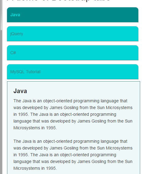
So, the tabs are responsive or mobile friendly.
The markup section:
<div class="container">

<h2>A demo of Bootstrap tabs</h2>

    <div class="row">

        <div class="col-md-8">

            <div class="tab" role="tabpanel">

                <!-- Nav tabs -->

                <ul class="nav nav-tabs" role="tablist">

                    <li role="presentation" class="active"><a href="#javatab" aria-controls="home" role="tab" data-toggle="tab">Java</a></li>

                    <li role="presentation"><a href="#jquerytab" aria-controls="profile" role="tab" data-toggle="tab">jQuery</a></li>

                    <li role="presentation"><a href="#ctab" aria-controls="messages" role="tab" data-toggle="tab">C#</a></li>

                    <li role="presentation"><a href="#mysqltab" aria-controls="settings" role="tab" data-toggle="tab">MySQL Tutorial</a></li>

                </ul>

                <!-- Tab panes content goes here-->

                <div class="tab-content">

                    <div role="tabpanel" class="tab-pane active" id="javatab">

                        <h4>Java</h4>

                        <p>

                            The Java is an object-oriented programming language that was developed by James Gosling from the Sun Microsystems in 1995.

                            The Java is an object-oriented programming language that was developed by James Gosling from the Sun Microsystems in 1995.<br /><br />

                            <ul>

                              <li>Chapter 1</li>

                              <li>Chapter 2</li>

                              <li>Chapter 3</li>

                              <li>Chapter 4</li>

                        </ul>

                        </p>

                    </div>

                    <div role="tabpanel" class="tab-pane" id="jquerytab">

                        <h4>jQuery</h4>

                        <p>

                            jQuery content here

                        </p>

                    </div>

                    <div role="tabpanel" class="tab-pane" id="ctab">

                        <h4>C#</h4>

                        <p>

                           C# is also a programming language

                        </p>

                    </div>

                    <div role="tabpanel" class="tab-pane" id="mysqltab">

                        <h4>MySQL</h4>

                        <p>

                            MySQL is a databased mostly used for web applications.

                        </p>

                    </div>

                </div>

            </div>

        </div>

    </div>

</div>
A demo with fading effect as switching tabs
In this demo, the tabs are fading as you switch from one to the other tab. A different style is used for tabs than above example along with fading effect.
See online demo and code
The only difference is using the fade class for all inactive tabs and fade-in for active tab and tweaking the CSS a bit.
Get the complete code from the demo page.