
The rotate animation by using CSS3 and jQuery
The jQuery rotate plug-in can be used for creating animations in different elements of the web page including images, icons, or other elements quite easily.
This is a light-weight plug-in, with only 1Kb of JS file. So, if you are already using jQuery in a web project then creating rotating animations is quite easy by including a simple JS file.
Have a look at demos in the following section where you may see and get the code.
A demo of animating image
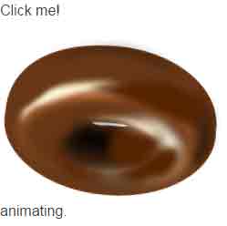
In this demo, an image is used for jQuery / CSS3 animation. The plug-in uses CSS 3 transform property where the degree of rotation is specified as per the option’s value given in the jQuery code.
You may use easing option for specifying the type of animation as well. Have a look:
Online demo and code
Apart from jQuery and jQuery-easing JS files, you only need to include the JS file of the plug-in above the </body> tag:
<script src=”http://code.jquery.com/jquery-2.2.3.min.js”></script>
<script src=”http://cdnjs.cloudflare.com/ajax/libs/jquery-easing/1.3/jquery.easing.min.js”></script>
<script src=”js/jquery-rotate/rotate.js”></script>
The markup is simple:
   <div>

        <p>Click the image</p>

        <img id="animate-demo1" src="images/donut.png" alt="CSS 3 animation">

    </div>
Just use the ID used in <img> tag in the jQuery code where animation in jQuery is initiated along with specifying different options:
<script>

$('#animate-demo1').on('click', function () {


    if (!$(this).is(':animated')) {

        $(".complete").remove();

        $(this).after("<div class='ani-status'>The image is animating</div>");

    }


    $(this).rotate(-1500, {

        duration: 1500,

        easing: 'easeOutExpo',

        complete: function() {

            $(".ani-status").remove();

            $(this).after("<div class='complete'>Animation is done!</div>");

        }

    });


});


</script>
The code specifies the type of easing i.e. easeOutExpo. You may use different; the list can be seen here. Besides, duration of the animation and rotate values are also set. The rotate value is used by CSS 3 transform property in the plug-in JS file.
A demo with different ease and animated values
In this example, using the same image as above but with different values for duration, rotate and easing. The easing value is swing, the duration is 3000 milliseconds and CSS 3 rotate is 3000.
Online demo and code
HTML, jQuery code:
<!DOCTYPE html>
<html>
<head>
</head>
<body>


    <div>
        <p>Click the image</p>
        <img id="animate-demo2" src="images/donut.png" alt="CSS 3 animation">
    </div>


<script src="https://code.jquery.com/jquery-2.2.3.min.js"></script>
<script src="https://cdnjs.cloudflare.com/ajax/libs/jquery-easing/1.3/jquery.easing.min.js"></script>
<script src="js/jquery-rotate/rotate.js"></script>
<script>
$('#animate-demo2').on('click', function () {

    if (!$(this).is(':animated')) {
        $(".complete").remove();
        $(this).after("<div class='ani-status'>The image is animating</div>");
    }

    $(this).rotate(1500, {
        duration: 3000,
        easing: 'swing',
        complete: function() {
            $(".ani-status").remove();
            $(this).after("<div class='complete'>Animation is done!</div>");
        }
    });

});

</script>

</body>
</html>
A demo of rotating text to vertical angle
As mentioned earlier, you may not only use images but other elements of the web page by using rotate jQuery/CSS 3 plug-in. In this demo, some text with shadow effect is created with Bootstrap classes.
The text is rotated to 270 degrees angle, so it will be vertical at the end. The duration is kept two seconds for the animation to complete.

Online demo and code
The markup:
<div class="container">

    <p>Click on text</p>

    <div class="row" id="animate-demo3">

        <div class="col-md-8">

            <span class="shadow-effects">Text Rotate</span>

        </div>

    </div>

</div>
The script:
<script>

$('#animate-demo3').on('click', function () {

    if (!$(this).is(':animated')) {

        $(".complete").remove();

        $(this).after("<div class='ani-status'>The text is animating</div>");

    }

    $(this).rotate(270, {

        duration: 2000,

        easing: 'swing',

        complete: function() {

            $(".ani-status").remove();

            $(this).after("<div class='complete'>Animation is done!</div>");

        }

    });

});

</script>
Get the complete code, including style from the demo page.
In this example, animated button based on Bootstrap classes are created. As you click any button, it will rotate by using the rotate plug-in. Different buttons are given different options and values for duration, easing, and angle:

As buttons are using the icons from the font-awesome library, its CSS file is included in the <head> section.
Complete code:
<!DOCTYPE html>
<html>
<head>

<link rel="stylesheet" href="https://netdna.bootstrapcdn.com/bootstrap/3.3.4/css/bootstrap.min.css">
<link href="//maxcdn.bootstrapcdn.com/font-awesome/4.2.0/css/font-awesome.min.css" rel="stylesheet">


</head>

<body>

<div class="container">
<h3>A demo of button rotation</h3>
    <div class="row">
        <div class="col-md-6">
            <button id="animate-demo4" class="btn btn-primary"><i class="fa fa-spinner fa-spin"></i> Please wait</button>
            <button id="animate-demo5" class="btn btn-primary btn-lg"><i class="fa fa-refresh fa-spin"></i> Loading data</button>
            <button id="animate-demo6" class="btn btn-primary btn-sm"><i class="fa fa-spinner fa-spin"></i> wait on..</button>
        </div>

    </div>


    </div>

</div>


<script src="https://code.jquery.com/jquery-2.2.3.min.js"></script>
<script src="https://cdnjs.cloudflare.com/ajax/libs/jquery-easing/1.3/jquery.easing.min.js"></script>
<script src="js/jquery-rotate/rotate.js"></script>

<script>
$('#animate-demo4').on('click', function () {

    if (!$(this).is(':animated')) {
        $(".complete").remove();
        $(this).after("<div class='ani-status'>The image is animating</div>");
    }

    $(this).rotate(90, {
        duration: 1000,
        easing: 'swing',
        complete: function() {
            $(".ani-status").remove();
            $(this).after("<div class='complete'>Animation is done!</div>");
        }
    });

});


$('#animate-demo5').on('click', function () {

    if (!$(this).is(':animated')) {
        $(".complete").remove();
        $(this).after("<div class='ani-status'>The image is animating</div>");
    }

    $(this).rotate(180, {
        duration: 1500,
        easing: 'linear',
        complete: function() {
            $(".ani-status").remove();
            $(this).after("<div class='complete'>Animation is done!</div>");
        }
    });

});

$('#animate-demo6').on('click', function () {

    if (!$(this).is(':animated')) {
        $(".complete").remove();
        $(this).after("<div class='ani-status'>The image is animating</div>");
    }

    $(this).rotate(380, {
        duration: 1000,
        easing: 'swing',
        complete: function() {
            $(".ani-status").remove();
            $(this).after("<div class='complete'>Animation is done!</div>");
        }
    });

});
</script>
</body>
</html>
Credit: clarketm