
The jqm-simple-colorpicker is a jQuery mobile based widget that you can use on your website to allow users to select the color value after choosing from three sliders.
The sliders are for red, green and blue (RGB) values and the resultant color is displayed on the front.
The value of each slider (Red, Green, and Blue) is also displayed in front of each slider. For this color picker widget to work on your project, it must support ECMAScript 2015.
You also need to include the jQuery library along with jQuery mobile.
Developer page Download plug-in
Setting up the RGB color picker widget
First of all, download the dependency files from the Github website (via above links). You may also install the package via npm:
npm install jqm-simple-colorpicker
Grab the jqm-simple-colorpicker.min.js and jqm-simple-colorpicker.min.css files and place after the jQuery and jQuery mobile libraries:
<link rel=”stylesheet” href=”http://code.jquery.com/mobile/1.4.5/jquery.mobile-1.4.5.min.css”>
<link rel=”stylesheet” href=”css/jqm-simple-colorpicker/colorpicker.less”>
<script src=”https://code.jquery.com/jquery-1.12.4.min.js”></script>
<script src=”http://code.jquery.com/mobile/1.4.5/jquery.mobile-1.4.5.min.js”></script>
<script src=”js/jqm-simple-colorpicker/jqm-simple-colorpicker.min.js”></script>
The markup:
For creating the popup to launch the color picker, create a div element and add a data attribute as follows:
data-role=”colorpicker”
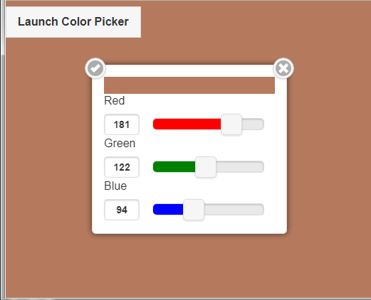
A Demo of color picker for mobile
In this demo, click the button towards the left side “Launch Color Picker”. A pop up appears where you can see three sliders for choosing the colors. Slide as you want and the resultant color will update on the top bar of the popup.
If you press the tick, the color will apply on the web page containing it.
The simple markup for this demo:
<!DOCTYPE html>
<html>
   <head>
      <link rel="stylesheet" href="https://code.jquery.com/mobile/1.4.5/jquery.mobile-1.4.5.min.css">
      <link rel="stylesheet" href="css/jqm-simple-colorpicker/colorpicker.less">
      <script src="https://code.jquery.com/jquery-1.12.4.min.js"></script>
      <script src="https://code.jquery.com/mobile/1.4.5/jquery.mobile-1.4.5.min.js"></script>
      <script src="js/jqm-simple-colorpicker/jqm-simple-colorpicker.min.js"></script>
      <script type="text/javascript">
         $(function(){
            $('#color-picker-demo').colorpicker('option', {
               picked:function(event, data){
                  $('div[data-role=page]').css('background-color', data.color)
               },
               defaultColor:$('div[data-role=page]').css('background-color')
            })
            $('#launch-col-pick').click(function(){
               $('#color-picker-demo').colorpicker('open')
            })
         })
      </script>
   </head>
   <body>
      <a id="launch-col-pick" href="#picker" data-rel="popup" class="ui-btn ui-btn-inline">Launch Color Picker</a>
      <div id="color-picker-demo" data-role="colorpicker" data-transition="turn">The Color picker</div>
   </body>
</html>
The options and methods of color picker widget
The color picker widget has a few options and methods that you may use to customize as per the need of your project.
For example, you may specify the default color by defaultColor option.
If you need to change the Red, Green, and Blue text to some other then use the redText, greenText, and blueText options, respectively.
For more on its methods and supported events, visit the developer’s page.