
CSS layout by using shapes
In this post, the CSS shapes are used for creating webpage layouts.
The shape-outside property of CSS can be used for defining the float area for inline content for wrapping around a shape by specifying the shape values like margin-box, content-box, and function values e.g. circle, ellipse, etc.
For example, this is how the shape-outside CSS property can be used:
 -webkit-shape-outside: circle();

          shape-outside: circle();
OR
  -webkit-shape-outside: ellipse();

          shape-outside: ellipse();
Similarly, you may use:
See the examples below of using the shape-outside property in CSS.
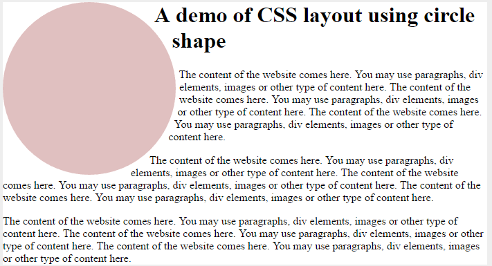
A demo of creating a layout with a circle shape-outside
In this demo of creating the CSS template, the circle shape is defined by using the shape-outside property. First, have a look by clicking the links below:
The CSS:
body {

  background-color: #eee;

}


.container {

  background-color: #fff;

  margin: 0 auto;

  width: 960px;

}

.container::after {

  content: "";

  clear: both;

}


.circle-demo-shape {

  width: 250px;

  height: 250px;

  border-radius: 50%;

  background-color: rgba(203, 150, 150, 0.6);

  float: left;

  margin-right: 10px;

  -webkit-shape-outside: circle();

          shape-outside: circle();

}
The markup:
<main class="container">

  <aside class="circle-demo-shape"></aside>

  <h1>A demo of CSS layout using circle shape</h1>

  <p>The content of the website comes here. You may use paragraphs, div elements, images or other type of content here. The content of the website comes here. You may use paragraphs, div elements, images or other type of content here. The content of the website comes here. You may use paragraphs, div elements, images or other type of content here.</p>

  <p>The content of the website comes here. You may use paragraphs, div elements, images or other type of content here. The content of the website comes here. You may use paragraphs, div elements, images or other type of content here. The content of the website comes here. You may use paragraphs, div elements, images or other type of content here.</p>


</main>
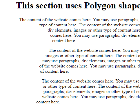
A demo of creating layout with Polygon
In this example, the layout is created with the shape-outside and other properties of CSS. The shape-outside is assigned the polygon value as follows:
The CSS for this demo:
body {

  background-color: #eee;

}


.container {

  background-color: #fff;

  margin: 0 auto;

  width: 700px;

}

.container::after {

  content: "";

  clear: both;

}


.polygon-shape-demo {

  float: left;

  width: 200px;

  height: 400px;

  -webkit-shape-outside: polygon(22% 0, 23% 18%, 79% 25%, 90% 36%, 66% 56%, 75% 80%, 28% 101%, 45% 60%, 45% 40%);

          shape-outside: polygon(22% 0, 23% 18%, 79% 25%, 90% 36%, 66% 56%, 75% 80%, 28% 101%, 45% 60%, 45% 40%);

}
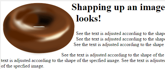
Using an image to shape up content
In this demo, an image is used as the value in the shape-outside property.
The CSS:
body {

  background-color: #eee;

}


.container {

  background-color: #fff;

  margin: 0 auto;

  width: 700px;

}

.container::after {

  content: "";

  clear: both;

}


img {

  float: left;

  -webkit-shape-image-threshold: .9;

          shape-image-threshold: .9;

  -webkit-shape-outside: url(images/donut.png);

          shape-outside: url(images/donut.png);

  -webkit-shape-margin: 10px;

          shape-margin: 10px;

}
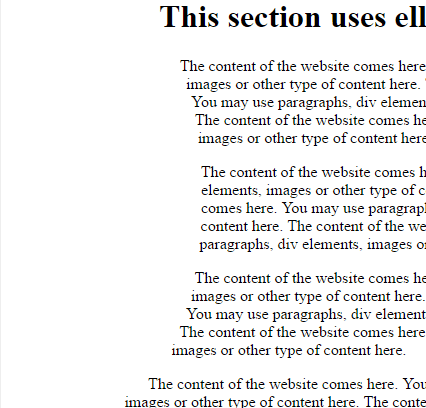
A demo with an ellipse shape
See this demo where ellipse value is used to shape up content:
CSS:
<style>
body {
  background-color: #eee;
}

.container {
  background-color: #fff;
  margin: 0 auto;
  width: 700px;
}
.container::after {
  content: "";
  clear: both;
}

.ellipse-shape-demo {
  float: left;
  width: 200px;
  height: 400px;
  -webkit-shape-outside: ellipse();
          shape-outside: ellipse();
}


</style>