
The box-shadow property in CSS
In this tutorial, the Apple logo is used to display without using any image. The demo in the following section uses pure CSS where the box-shadow CSS property is used along with other properties for making the Apple logo.
Before showing you the example, FYI, the box-shadow property is used to attach shadows in the specified HTML elements like div. You may attach one or more shadows by using the box-shadow.
The simple syntax of using the box-shadow property is:
Where,
| Value | Description |
|---|---|
| h-offset | The first value specifies the horizontal shadow length. This is the required value when using the box-shadow property. |
| v-offset | The second value is the vertical distance of the shadow. This is also required. |
| blur | The ‘3px’ value is for the blur radius. This is optional. If you want a larger and lighter shadow, use a higher value. |
| shadow color | After that, the color of the shadow is given. This is also optional. If left blank, the default black color will be applied. |
| inset | You may also use the “inset” keyword. If used, it creates an inner shadow. The default is an outer shadow. If you do not use this, the drop shadow is assumed. |
- Have a look at the following section to see the live demos and code for using the box-shadow property.
A demo of using box-shadow in a div tag
In this demo, a simple box shadow is created for illustration purposes. There, I only used the horizontal, vertical, and blur lengths along with the color of the shadow. No “inset” keyword is used:
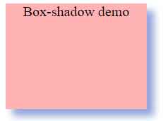
The CSS:
.box-shadow-demo {

    width: 200px;

    height: 150px;

    background-color: #FFB3B3;

    box-shadow: 10px 10px 15px #92A5DE;

    text-align:center;

    font-size:20px;


}
</head>
<body>
<div class="box-shadow-demo">Box-shadow demo</div>
</body>
A demo with inset keyword in box-shadow
Using the same example as above except the inset keyword is added. Have a look and see the difference:
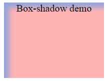
CSS:
.box-shadow-demo {

    width: 200px;

    height: 150px;

    background-color: #FFB3B3;

    box-shadow: 10px 10px 15px #92A5DE inset;

    text-align:center;

    font-size:20px;

}
You can see the difference between the two demos; in the first example, the drop shadow was created without using the inset keyword.
An example of attaching multiple shadows to a single element
You may attach multiple shadows separated by commas in a single declaration. There, you may specify (for example), one drop shadow and another as the inset. That way, you may create shadows in the top, bottom, and other directions separately and use different colors and blur lengths. See the following demo with multiple shadows:
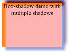
The CSS:
.box-shadow-demo {

    width: 200px;

    height: 150px;

    background-color: #FFB3B3;

    box-shadow: 10px 10px 10px #92A5DE, 10px -10px 20px #400040, 10px 10px 10px #FF8000 inset;

    text-align:center;

    font-size:20px;


}
In that demo, you can see the first drop shadow is created with positive values while the next one is with negative vertical value. The last shadow is given the inset keyword.
Creating the Apple logo by using the box-shadow property
Now, taste the real example by using the CSS box-shadow property. In this demo, the Apple logo is created purely based on CSS. Many other properties are also used, however, the main is box-shadow with multiple shadows:
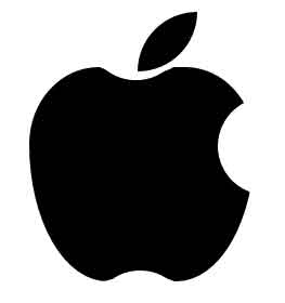
HTML and CSS
<!DOCTYPE html>
<html>
<head>

<style>
body{
  width: 200px;
  margin: 0 auto;
  padding: 80px;
}
.box-shadow-apple-logo{
  background: #000;
  width: 208px;
  height: 198px;
  position: absolute;
  border-radius: 36% 36% 41% 41% / 42% 42% 75% 75%;
}

.box-shadow-apple-logo:before{
  background: #000;
  content: "";
    width: 55px;
  height: 55px;
  position: absolute;
  margin: -51px 0 0 100px;
  border-radius: 100px 0;
  z-index: 5;
}

.box-shadow-apple-logo:after{
  background: #fff;
  content: "";
  width: 90px;
  height: 90px;
  position: absolute;
  margin: 28px 0 0 174px;
  border-radius: 50%;
  transform: rotate(-53deg);
  z-index: 4;
  box-shadow:
    24px -154px 0 #fff,
    10px -175px 0 #fff,
    11px -171px 0 #fff,
    12px -160px 0 #fff,
    -215px -7px 0 #fff,
    -195px 17px 0 #fff,
    -198px 3px 0 #fff,
    -198px 13px 0 #fff;
}

</style>

</head>
<body>

<div class="box-shadow-apple-logo"></div>


</body>
</html>
Credit for this example: samarkandiy