
Purpose of CSS border
The border property is used to set the border or lining of the specified HTML elements like div, paragraphs, lists, tables, etc.
Ways to use the border property
You may set border properties in a single declaration or set by using each border property separately.
Similarly, you may set borders for different directions (top, left, right, and bottom) separately.
By single declaration for all directions:
border: solid 1px #fff000;
By using the separate property for border:
 border-style: solid;

border-color: #fff000;

border-width: 5px;
For each direction separately:
border-top: solid 1px #fff000;

border-bottom: dashed 2px #eee000;

border-right: dotted 2px #fffaaa;

border-left: solid 1px #fff000;
Now I will show you a few demos of setting the border of different elements by single and separate declarations for each direction.
Setting a simple border by a single declaration of div
Following is a simple example of setting the border of a div element in a single declaration. For that, a div with a given height and width is created along with border properties as shown below:
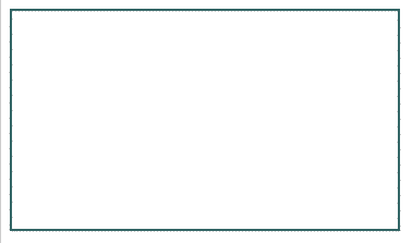
The CSS code for the border:
border: 2px solid #3C514D;
Specifying borders for each direction
By using the CSS border property separately, you can set the borders for the top, bottom, left, and right each with its own set of properties like border style, width, color.
For the demo, I have used four different border styles for each side:
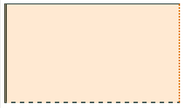
- The top is using solid with 2-pixel width
- Bottom with dashed style
- Left border is double
- The right border is dotted
While each border is given a different color by using hexadecimal and RGB codes. See the live demo and code by the link below:
The CSS code for borders used:
border-top: 2px solid #3C514D;

border-bottom: 3px dashed #3C514D;

border-left: 5px double #212410;

border-right: 3px dotted rgb(223,112,0);
Adding radius in borders CSS
The CSS3 has introduced a new border property, the border-radius that you can use to add radius in borders. Just like normal border property, you can add border radius by single declaration that will be applied to all corners like this:
You may also use CSS border-radius for each side i.e. top left, top right, bottom left, and bottom right separately as this:
border-top-left-radius: 10px;

border-top-right-radius: 15px;

border-bottom-left-radius: 10px;

border-bottom-right-radius: 15px;
The following example’s border-radius is set by the single declaration that will be applied to all four corners.
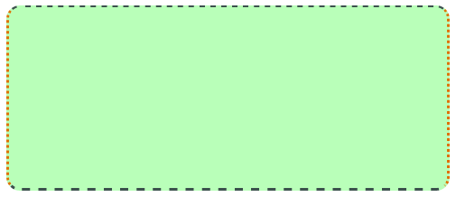
The border properties are set as follows:
border-top: 2px dashed #3C514D;

border-bottom: 3px dashed #3C514D;

border-left: 3px dotted #DF7000;

border-right: 3px dotted rgb(223,112,0);

border-radius: 15px;
An HTML table border example with CSS
In that demo, the table borders are set by using the CSS border properties. By using the CSS, it allows great flexibility to set not only borders but other table related properties for beautiful styles.
You may set the CSS table border to an overall table and also may style table header and rows independently.
See the following table demo and code by the links below followed by a little description:
Online demo and code
There are many other CSS properties used for styling the table like background, line-height, etc. However, this is how the borders are set:
For the table header border, I have used:
border: solid 3px #fff000;
For table data, the border CSS properties are used:
border: dashed 1px #DF7000;
You may use different border styles, widths, etc. as needed for the theme of your website.
In the demo, the table header uses the linear-gradient property to set the background (which is not an image).
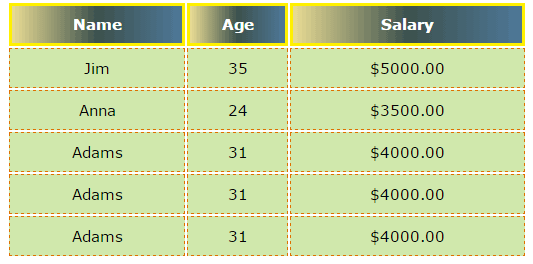
A CSS table demo with radius border
Just like in div or other elements, you can add border radius in the tables as well. The radius can be set for the overall table, table header or at the table data level.
See the following demo and code:
The markup:
<!DOCTYPE html>
<html>
<head>

<style>
.table_bg {
  width:40%;
  font-family:verdana;
  font-size:15px;
  color:#fff;
  padding: 10px;
  text-align:center;
}
.table_bg th{
    border: dotted 5px #6C6CFF;
    border-radius: 10px;

    background: linear-gradient(to right, #800000, #202B28, #4E7898);
    color: #fff;
    line-height:35px;
  }
.table_bg td{
    border: solid 1px #446982;
    border-radius: 3px;

    background: #D1DEE7;
    padding:10px;
    color: #000;
  }
</style>
</head>
<body>
<table class="table_bg">
    <tr>
     <th>Name</th>
     <th>Age</th>
     <th>Salary</th>
    </tr>
    <tr>
     <td>Jim</td>
     <td>35</td>
     <td>$5000.00</td>
    </tr>
    <tr>
     <td>Anna</td>
     <td>24</td>
     <td>$3500.00</td>
    </tr>
    <tr>
     <td>Adams</td>
     <td>31</td>
     <td>$4000.00</td>
    </tr>
    <tr>
     <td>Adams</td>
     <td>31</td>
     <td>$4000.00</td>
    </tr>
    <tr>
     <td>Adams</td>
     <td>31</td>
     <td>$4000.00</td>
    </tr>
</table>
</body>
</html>
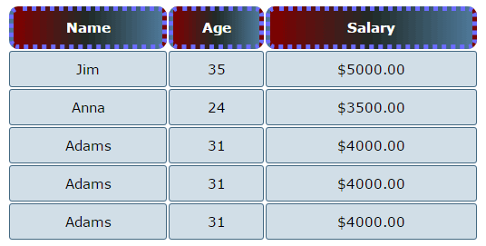
In that demo, the table header is given the dotted border style with a 5px width while the border-radius property is given the 10px value.
The table data, <td>, is given the solid border while border-radius is set with 3px.
Bordering the anchor texts
The border property of CSS can be applied to many elements including the links. Normally, the links are underlined with a solid border line that you can change.
Similarly, you can add the top, left, or right borders as well which is generally unlikely to be used in the project. But just in case, you should know how flexible CSS is.
The following anchor texts are styled differently with different border properties.
Markup with CSS:
<!DOCTYPE html>
<html>
<head>

<style>
.link1 a {
    color: #16245A;
    text-decoration: none;
    border-bottom: 1px dotted #239685;
    }
.link1 a:hover {
    border-bottom: 2px solid #FF0000;
    }

.link2 a {
    color: #16245A;
    text-decoration: none;
    border-bottom: 2px dashed #253c93;
    }
.link2 a:hover {
    border-bottom: 1px solid #253c93;
    }

.link3 a {
    color: #16245A;
    text-decoration: none;
    border-bottom: 2px solid #253c93;
    }
.link3 a:hover {
    border-bottom: 1px dashed #253c93;
    }

.link4 a {
    color: #16245A;
    text-decoration: none;
    border-bottom: 1px double #253c93;
    }
.link4 a:hover {
    border-bottom: 1px solid #253c93;
    }
</style>

</head>
<body>
<div class="link1">
<a href="example.com">Link with dotted and solid</a>
</div>
<div class="link2">
<a href="example.com">this is a link demo with dashed and solid</a>
</div>
<div class="link3">
<a href="example.com">Link with solid and dashed borders</a>
</div>
<div class="link4">
<a href="example.com">this is a link demo with double and solid boders</a>
</div>
</body>
</html>
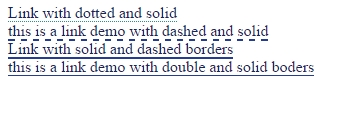
Four links are created with four different classes. The borders are set at normal and hover states of all links. You can see dotted, solid, double, and dashed border styles at normal states of the links used.
You should use text-decoration: none; to make the default underline hidden e.g.
.link1 a {

color: #16245A;

text-decoration: none;

border-bottom: 1px dotted #239685;

}

.link1 a:hover {

border-bottom: 2px solid #FF0000;

}
In order to add the borders on top, left or right you can use the relative border property for the links as well.
Setting borders of the blockquote demo
The blockquotes are used to cite references from other sources like a piece from some other website or someone’s quote.
The following demo uses the CSS properties including border to style blockquote tag.
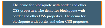
You can see the left and right border properties are used along with others. While the border-radius is given as well.
border-radius: 6px;

border: 1px solid #ccc;

border-left:5px solid #FF7F00;

border-right:5px solid #FF7F00;
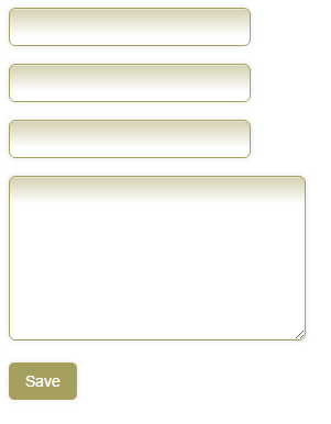
Border properties in the form field’s example
The final demo in this tutorial is for the form fields. You can add CSS properties along with borders in the form fields like text box, textarea, dropdowns, submit buttons, etc.
See the following:
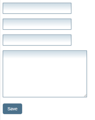
In the example, three textboxes, a textarea, and a submit button are used. You can see in the code, the CSS properties used to style this form. Although other properties complemented incredibly, our topic related to borders is set as follows:
For the text boxes, I used the following border properties:
border: solid 1px #4B718B;
The same style is used for the textarea. For the Save/Submit button I used this:
border: 1px;

-moz-border-radius: 5px;

-webkit-border-radius: 5px;
That is, it also uses border-radius property.
If you also want to add a border radius for the text boxes and textarea, try this in the input, textarea class (in the head section).
-moz-border-radius: 6px;

-webkit-border-radius: 6px;
A few changes in the background and border colors. The output will be as follows:
HTML and CSS
<!DOCTYPE html>
<html>
<head>
<title>HTML form border</title>

<style>
input, textarea {
    padding: 9px;
    border: solid 1px #A5A060;
    outline: 0;
    width: 200px;
    background: -webkit-gradient(linear, left top, left 25, from(#FFFFFF), color-stop(4%, #D5D2B3), to(#FFFFFF));
    background: -moz-linear-gradient(top, #FFFFFF, #D5D2B3 1px, #FFFFFF 25px);
    box-shadow: rgba(0,0,0, 0.1) 0px 0px 8px;
    -moz-box-shadow: rgba(0,0,0, 0.1) 0px 0px 8px;
    -webkit-box-shadow: rgba(0,0,0, 0.1) 0px 0px 8px;
    -moz-border-radius: 6px;
    -webkit-border-radius: 6px;
    }

textarea {
    width: 250px;
    height: 130px;
    }

.btn input {
    width: auto;
    padding: 9px 15px;
    background: #A5A060;
    border: 1px;
    font-size: 14px;
    color: #FFFFFF;
    -moz-border-radius: 5px;
    -webkit-border-radius: 5px;
    }
</style>

</head>
<body>

<p>
  <input type="text"/>
</p>
<p>
  <input type="text"/>
</p>
<p>
  <input type="text"/>
</p>
<p>
  <!--Place text area here-->

</p>
<p class="btn">
        <input type="submit" value="Save" />
</p>

</body>
</html>