
jQuery tab plugin
In many scenarios, you have different pieces of information related to a specific topic while it is important to present all information on one web page. For example, you might have seen in e-commerce sites product pages, that information is presented in Tabs format for features, reviews etc.
The tab feature is quite useful in that it allows you to cater more information while occupying less space, however, you must take into account the SEO perspective in view while managing tabs in your web pages.
The tabs can be filled by the static content or you can use the dynamic or AJAX driven content as well. There are different ways to create tabs in your web pages e.g. bootstrap, jQuery etc. however, this tutorial will deal only creating the tabs by using jQuery tab plug-in.
The jQuery, just like many other features like dialog, sliders, auto-complete etc. provides the way to create tabs by using its plugin. Creating jQuery UI tab is pretty simple that it needs only a few line of codes.
Following is the simple process to create jQuery tabs:
- Include the jQuery library.
- You have to include jquery UI library in web document as well.
- CSS or style can be default as provided by jQuery or you can use as per the design of your website.
- jQuery UI tab uses order or unordered list element i.e <ol> and <ul>.
- The title of each tab is defined inside <li> tag of ordered or unordered lists that are wrapped by anchor tag <a>.
- Finally, you can use div, paragraph or another tag to present Tab’s content but it must contain an ID attribute that corresponds to ID or hash of <a> tag, that contains the title (as mentioned in the last point).
Now, let us look at a few examples of using jquery tab UI plug-in.
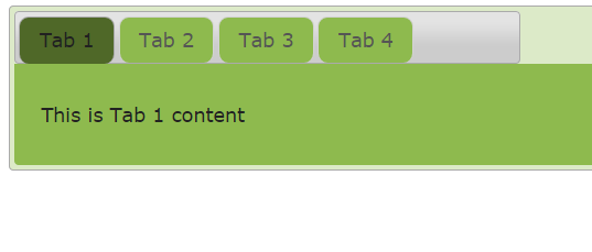
A simple Tab example in jQuery UI
In the following example, we have created simple tabs by using Tab UI plugin in jQuery. The demo shows four tabs with one line of content. For this example, we have changed the default colors by using in-line CSS.
See online demo and code
The Markup used in this example:
<div id="tab_example" style="background:#FFFFFF;width:450px;">
<ul style="background:#846733;">
<li style="background:#FDF8E4;"><a href="#t1">Tab 1</a></li>
<li style="background:#FDF8E4;"><a href="#t2">Tab 2</a></li>
<li style="background:#FDF8E4;"><a href="#t3">Tab 3</a></li>
<li style="background:#FDF8E4;"><a href="#t4">Tab 4</a></li>
</ul>
<div id="t1" >
<p>This is Tab 1 content</p>
</div>
<div id="t2">
<p>This is Tab 2 content</p>
</div>
<div id="t3">
<p>This is Tab 3 content</p>
</div>
<div id="t4">
<p>This is Tab 4 content</p>
</div>
</div>
The simple tab jQuery code:
<script>
$(function() {
$( "#tab_example" ).tabs();
});
</script>
As you can see in the code, first of all, a div element with ID=tab_example is created. Within this, an unordered list <ul> with four list elements are created that represents titles of tabs. Each of these tabs contains the <a> tag with an ID. Keep this ID in mind as this will correspond in the lower div that contains the content for each tab.
Lastly, we created four div elements with same ids as we used for <a> IDs in list items.
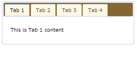
Tab example that opens on mouse-over
In the above example, you need to click on a tab in order to open. By simply using event option with ‘mouseover’ value you can open tabs as mouse hovers over a tab. Following is a working demo of opening a tab as the mouse is over a tab.

See online demo and code
Not only you can use mouseover value but also other valid values related to events like mouseenter, mouseleave, dblclick etc.
If you use the dblclick value in the event option, you can open tabs by using double click. Upon the single click, the tabs will not be opened in that case.
See online demo and code
The jQuery code:
<script>
$(function() {
$( "#tab_example" ).tabs({
event: "mouseover"
});
});
</script>
The CSS:
.ui-tabs {
position: relative;
padding: .2em;
background:#DCEAC8;
}
.ui-tabs .ui-tabs-nav {
margin: 0;
padding: .2em .2em 0;
}
.ui-tabs .ui-tabs-nav li {
list-style: none;
float: left;
position: relative;
top: 0;
margin: 1px .2em 0 0;
border-bottom-width: 0;
padding: 0;
white-space: nowrap;
background:#8EBA4E;
border-radius:9px;
}
.ui-tabs .ui-tabs-nav li.ui-tabs-active {
margin-bottom: -1px;
padding-bottom: 1px;
background:#4F6828;
}

.ui-tabs .ui-tabs-panel {
display: block;
border-width: 0;
padding: 1em 1.4em;
background: #8EBA4E;
}
In the above two examples, we overridden CSS classes provided by jQuery-UI to design the theme of Tabs. You can change it as per the need. You may get the default styles here: http://code.jquery.com/ui/1.11.2/themes/smoothness/jquery-ui.css
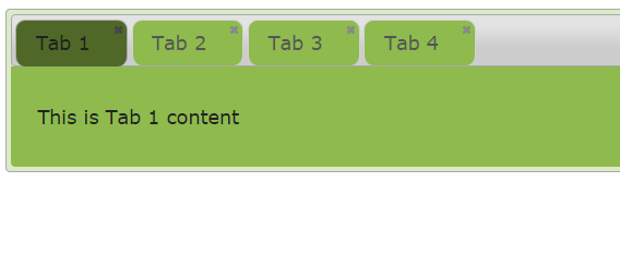
An example of jQuery Tabs with close option
In this example, we have created tabs with a close option. Unfortunately, we don’t have simple option provided by jQuery UI to make it closeable by adding an option. You have to handle it by a little programming. Before explaining how we added the close icon in tabs, first look at its graphic and run-able demo:
See online demo and code
The code of jQuery with close option:
<script>
$(function() {
$( "#tab_example" ).tabs({
});

$('#tab_example span.ui-icon-close').on( "click", function() {
var panelId = $( this ).closest( "li" ).remove().attr( "aria-controls" );
$( "#" + panelId ).remove();
tabs.tabs( "refresh" );
});

});
</script>
First of all, how close icon is added? It is simply by using a span element with icon class:
<span class=’ui-icon ui-icon-close’ role=’presentation’></span>
i.e. ui-icon-close class.
Then in the script section, we used the jQuery on method where we dealt with the closing of tabs.
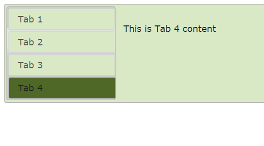
A vertical Tabs example
Until now we have worked with horizontal tabs that you can create quite easily and also used some options and event provided by jQuery tabs plugin. In this example, we will create vertical tabs with custom CSS.
Though there is no simple and straightforward “orientation” option to show tabs as vertical like in the case of the vertical slider that we created, yet creating vertical tabs is easy.
See online demo and code
The vertical tab code:
<script>
$(function() {
$( "#tab_example" ).tabs().addClass( "ui-tabs-vertical ui-helper-clearfix" );
$( "#tab_example li" ).removeClass( "ui-corner-top" ).addClass( "ui-corner-left" );
$( "#tab_example" ).tabs({
event: "mouseover"
});

});
</script>
The CSS:
.ui-tabs-vertical { width: 55em;background:#DAE9C5; }
.ui-tabs-vertical .ui-tabs-nav { padding: .2em .1em .2em .2em; float: left; width: 12em; }
.ui-tabs-vertical .ui-tabs-nav li {background:#DAE9C5; clear: left; width: 100%; border-bottom-width: 1px !important; border-right-width: 0 !important; margin: 0 -1px .2em 0; }
.ui-tabs-vertical .ui-tabs-nav li a { display:block; }
.ui-tabs-vertical .ui-tabs-nav li.ui-tabs-active { padding-bottom: 0; padding-right: .1em; border-right-width: 1px; border-right-width: 1px; background:#4F6828;color:#FFFFFF;}
.ui-tabs-vertical .ui-tabs-panel { padding: 0.9em; float: left; width: 40em;background:#DAE9C5}
You can see in the demo and code that it used a few classes of jQuery UI plugin to create a vertical tab example. You can style it according to your theme and amend colors and width etc. Just like in the horizontal tabs demo you can use the event: “mouseover” to display tab’s content as the mouse is over a particular tab. Otherwise, just remove that line of code from demo code to make it clickable to open a tab.
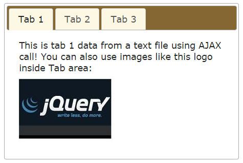
A tab example with AJAX data
Not only you can present the static content in tabs of jQuery UI but you can also use DB driven or information from the text or other files by using AJAX call. This is quite easy to accomplish in jQuery tabs. All you need is to specify text/PHP etc. file in tabs and use the built-in AJAX call to retrieve and present data in the Tabs.
Following example shows how you can do it easily.
See online demo and code
The jQuery code:
<script>
$(function() {
$( "#tab_example" ).tabs();
});
</script>
The Markup section calls the text files:
<div id="tab_example" style="background:#FFFFFF;width:450px;">
<ul style="background:#846733;">
<li style="background:#FDF8E4;"><a href="ajax/tab1.txt">Tab 1</a></li>
<li style="background:#FDF8E4;"><a href="ajax/tab2.txt">Tab 2</a></li>
<li style="background:#FDF8E4;"><a href="ajax/tab3.txt">Tab 3</a></li>
</ul>

</div>
In the above demo, we used text files to populate tab’s content with AJAX. You may use the script files like PHP to get database’s data. You can use events like beforeLoad to manage error handling if AJAX call has some issues.
The beforeLoad event of tab widget occurs just before AJAX request is made. You can change ui.jqXHR e.g. ui.jqXHR.error to do error handling .e.g. Database connection could not be established or data was unable to load or some other message.