
The animation property of CSS 3
The CSS 3 animation property is used to create animations for different web elements including images. For that, you may use the shorthand animation property or specify different animation-related properties separately.
The shorthand of animation property can be used as follows:
 -webkit-animation: aniname 0.9s ease-in-out 0.3s 4 reverse forwards flip-front;

animation: aniname 0.9s ease-in-out 0.3s 4 reverse forwards flip-front;
Where:
| Value | Description |
|---|---|
| First value (animation name) | Sets the name of the animation, e.g., “aniname” in the above example. |
| Second value (duration) | Specifies the duration of the animation, which is set to 0.9 seconds. |
| Third value (timing function) | Represents the speed curve of the animation. You can use values like “linear,” “ease,” “ease-in,” “ease-out,” “ease-in-out,” and more. |
| Fourth value (delay) | Defines the delay before the animation starts, set at 0.3 seconds in this case. |
| Fifth value (iteration count) | Sets the number of times the animation should loop, with a value of 4 in this example. |
| Sixth value (direction) | Specifies the direction of the animation, with “reverse” in this case. Other supported values include “normal,” “alternate,” and “alternate-reverse.” |
| Seventh value (fill mode) | Determines the animation’s final state, set as “forward” in the given syntax. Other supported values are “backwards,” “both,” and “none.” |
- See the following demos of applying the animation CSS property in different HTML elements.
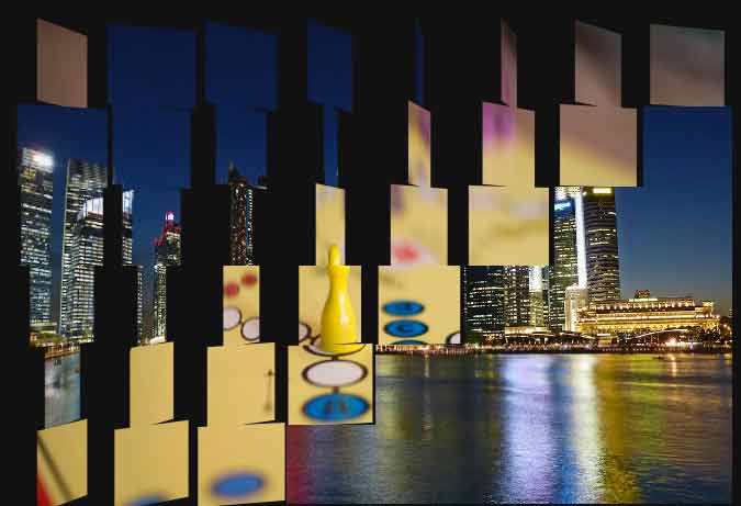
A demo of image animation with flip transition
In this demo, two images are used for the flip transition by using the animation property of CSS 3. As the web page loads, the second image will display in place of the first image with an animation. In the animation property, 0.5s is the value set for the start of the animation.
The speed of the curve is ease-in, along with other properties. Have a look at the live demo and complete code of CSS and markup:
See online demo and code
In the code, you can see a lot of div elements are used for different parts of the images. The div properties are set by using the nth-child in the CSS part. There, animation property is used with different values.
The CSS:
.img-animation {

  width: 650px;

  height: 434px;

  -webkit-perspective: 1000px;

          perspective: 1000px;

}


.img-ripple-transition {

  float: left;

  position: relative;

}

.img-ripple-transition, .img-ripple-transition:before, .img-ripple-transition:after {

  width: 81.25px;

  height: 72.33333px;

}

.img-ripple-transition:before, .img-ripple-transition:after {

  -webkit-backface-visibility: hidden;

          backface-visibility: hidden;

  content: ' ';

  display: block;

  left: 0;

  position: absolute;

  top: 0;

}

.img-ripple-transition:before {

  background: url("http://jquery-az.com/jquery/images/slider-image-1.jpg") 0 0 / 650px 434px;

}

.img-ripple-transition:after {

  background: url("http://jquery-az.com/jquery/images/slider-image-2.jpg") 0 0 / 650px 434px;

  -webkit-transform: rotateY(180deg);

          transform: rotateY(180deg);

}


.img-ripple-transition:nth-child(1):before, .img-ripple-transition:nth-child(1):after {

  background-position: 0px 0px;

}

.img-ripple-transition:nth-child(1):before {

  -webkit-animation: 0.5s ease-in 1.0s 1 reverse backwards flip-front;

          animation: 1.0s ease-in 1.0s 1 reverse backwards flip-front;

}

.img-ripple-transition:nth-child(1):after {

  -webkit-animation: 1.0s ease-in 1.0s 1 reverse backwards flip-back;

          animation: 1.0s ease-in 1.0s 1 reverse backwards flip-back;

}


.img-ripple-transition:nth-child(2):before, .img-ripple-transition:nth-child(2):after {

  background-position: -81.25px 0px;

}

.img-ripple-transition:nth-child(2):before {

  -webkit-animation: 1.0s ease-in 0.6s 1 reverse backwards flip-front;

          animation: 1.0s ease-in 0.6s 1 reverse backwards flip-front;

}

.img-ripple-transition:nth-child(2):after {

  -webkit-animation: 1.0s ease-in 0.6s 1 reverse backwards flip-back;

          animation: 1.0s ease-in 0.6s 1 reverse backwards flip-back;

}


.img-ripple-transition:nth-child(3):before, .img-ripple-transition:nth-child(3):after {

  background-position: -162.5px 0px;

}

.img-ripple-transition:nth-child(3):before {

  -webkit-animation: 1.0s ease-in 0.7s 1 reverse backwards flip-front;

          animation: 1.0s ease-in 0.7s 1 reverse backwards flip-front;

}

.img-ripple-transition:nth-child(3):after {

  -webkit-animation: 1.0s ease-in 0.7s 1 reverse backwards flip-back;

          animation: 1.0s ease-in 0.7s 1 reverse backwards flip-back;

}


.img-ripple-transition:nth-child(4):before, .img-ripple-transition:nth-child(4):after {

  background-position: -243.75px 0px;

}

.img-ripple-transition:nth-child(4):before {

  -webkit-animation: 1.0s ease-in 0.8s 1 reverse backwards flip-front;

          animation: 1.0s ease-in 0.8s 1 reverse backwards flip-front;

}

.img-ripple-transition:nth-child(4):after {

  -webkit-animation: 1.0s ease-in 0.8s 1 reverse backwards flip-back;

          animation: 1.0s ease-in 0.8s 1 reverse backwards flip-back;

}


.img-ripple-transition:nth-child(5):before, .img-ripple-transition:nth-child(5):after {

  background-position: -325px 0px;

}

.img-ripple-transition:nth-child(5):before {

  -webkit-animation: 1.0s ease-in 0.9s 1 reverse backwards flip-front;

          animation: 1.0s ease-in 0.9s 1 reverse backwards flip-front;

}

.img-ripple-transition:nth-child(5):after {

  -webkit-animation: 1.0s ease-in 0.9s 1 reverse backwards flip-back;

          animation: 1.0s ease-in 0.9s 1 reverse backwards flip-back;

}


.img-ripple-transition:nth-child(6):before, .img-ripple-transition:nth-child(6):after {

  background-position: -406.25px 0px;

}

.img-ripple-transition:nth-child(6):before {

  -webkit-animation: 1.0s ease-in 1s 1 reverse backwards flip-front;

          animation: 1.0s ease-in 1s 1 reverse backwards flip-front;

}

.img-ripple-transition:nth-child(6):after {

  -webkit-animation: 1.0s ease-in 1s 1 reverse backwards flip-back;

          animation: 1.0s ease-in 1s 1 reverse backwards flip-back;

}


.img-ripple-transition:nth-child(7):before, .img-ripple-transition:nth-child(7):after {

  background-position: -487.5px 0px;

}

.img-ripple-transition:nth-child(7):before {

  -webkit-animation: 1.0s ease-in 1.1s 1 reverse backwards flip-front;

          animation: 1.0s ease-in 1.1s 1 reverse backwards flip-front;

}

.img-ripple-transition:nth-child(7):after {

  -webkit-animation: 1.0s ease-in 1.1s 1 reverse backwards flip-back;

          animation: 1.0s ease-in 1.1s 1 reverse backwards flip-back;

}


.img-ripple-transition:nth-child(8):before, .img-ripple-transition:nth-child(8):after {

  background-position: -568.75px 0px;

}

.img-ripple-transition:nth-child(8):before {

  -webkit-animation: 1.0s ease-in 1.2s 1 reverse backwards flip-front;

          animation: 1.0s ease-in 1.2s 1 reverse backwards flip-front;

}

.img-ripple-transition:nth-child(8):after {

  -webkit-animation: 1.0s ease-in 1.2s 1 reverse backwards flip-back;

          animation: 1.0s ease-in 1.2s 1 reverse backwards flip-back;

}


.img-ripple-transition:nth-child(9):before, .img-ripple-transition:nth-child(9):after {

  background-position: 0px -72.33333px;

}

.img-ripple-transition:nth-child(9):before {

  -webkit-animation: 1.0s ease-in 0.6s 1 reverse backwards flip-front;

          animation: 1.0s ease-in 0.6s 1 reverse backwards flip-front;

}

.img-ripple-transition:nth-child(9):after {

  -webkit-animation: 1.0s ease-in 0.6s 1 reverse backwards flip-back;

          animation: 1.0s ease-in 0.6s 1 reverse backwards flip-back;

}


.img-ripple-transition:nth-child(10):before, .img-ripple-transition:nth-child(10):after {

  background-position: -81.25px -72.33333px;

}

.img-ripple-transition:nth-child(10):before {

  -webkit-animation: 1.0s ease-in 0.7s 1 reverse backwards flip-front;

          animation: 1.0s ease-in 0.7s 1 reverse backwards flip-front;

}

.img-ripple-transition:nth-child(10):after {

  -webkit-animation: 1.0s ease-in 0.7s 1 reverse backwards flip-back;

          animation: 1.0s ease-in 0.7s 1 reverse backwards flip-back;

}


.img-ripple-transition:nth-child(11):before, .img-ripple-transition:nth-child(11):after {

  background-position: -162.5px -72.33333px;

}

.img-ripple-transition:nth-child(11):before {

  -webkit-animation: 1.0s ease-in 0.8s 1 reverse backwards flip-front;

          animation: 1.0s ease-in 0.8s 1 reverse backwards flip-front;

}

.img-ripple-transition:nth-child(11):after {

  -webkit-animation: 1.0s ease-in 0.8s 1 reverse backwards flip-back;

          animation: 1.0s ease-in 0.8s 1 reverse backwards flip-back;

}


.img-ripple-transition:nth-child(12):before, .img-ripple-transition:nth-child(12):after {

  background-position: -243.75px -72.33333px;

}

.img-ripple-transition:nth-child(12):before {

  -webkit-animation: 1.0s ease-in 0.9s 1 reverse backwards flip-front;

          animation: 1.0s ease-in 0.9s 1 reverse backwards flip-front;

}

.img-ripple-transition:nth-child(12):after {

  -webkit-animation: 1.0s ease-in 0.9s 1 reverse backwards flip-back;

          animation: 1.0s ease-in 0.9s 1 reverse backwards flip-back;

}


.img-ripple-transition:nth-child(13):before, .img-ripple-transition:nth-child(13):after {

  background-position: -325px -72.33333px;

}

.img-ripple-transition:nth-child(13):before {

  -webkit-animation: 1.0s ease-in 1s 1 reverse backwards flip-front;

          animation: 1.0s ease-in 1s 1 reverse backwards flip-front;

}

.img-ripple-transition:nth-child(13):after {

  -webkit-animation: 1.0s ease-in 1s 1 reverse backwards flip-back;

          animation: 1.0s ease-in 1s 1 reverse backwards flip-back;

}


.img-ripple-transition:nth-child(14):before, .img-ripple-transition:nth-child(14):after {

  background-position: -406.25px -72.33333px;

}

.img-ripple-transition:nth-child(14):before {

  -webkit-animation: 1.0s ease-in 1.1s 1 reverse backwards flip-front;

          animation: 1.0s ease-in 1.1s 1 reverse backwards flip-front;

}

.img-ripple-transition:nth-child(14):after {

  -webkit-animation: 1.0s ease-in 1.1s 1 reverse backwards flip-back;

          animation: 1.0s ease-in 1.1s 1 reverse backwards flip-back;

}


.img-ripple-transition:nth-child(15):before, .img-ripple-transition:nth-child(15):after {

  background-position: -487.5px -72.33333px;

}

.img-ripple-transition:nth-child(15):before {

  -webkit-animation: 1.0s ease-in 1.2s 1 reverse backwards flip-front;

          animation: 1.0s ease-in 1.2s 1 reverse backwards flip-front;

}

.img-ripple-transition:nth-child(15):after {

  -webkit-animation: 1.0s ease-in 1.2s 1 reverse backwards flip-back;

          animation: 1.0s ease-in 1.2s 1 reverse backwards flip-back;

}


.img-ripple-transition:nth-child(16):before, .img-ripple-transition:nth-child(16):after {

  background-position: -568.75px -72.33333px;

}

.img-ripple-transition:nth-child(16):before {

  -webkit-animation: 1.0s ease-in 1.3s 1 reverse backwards flip-front;

          animation: 1.0s ease-in 1.3s 1 reverse backwards flip-front;

}

.img-ripple-transition:nth-child(16):after {

  -webkit-animation: 1.0s ease-in 1.3s 1 reverse backwards flip-back;

          animation: 1.0s ease-in 1.3s 1 reverse backwards flip-back;

}


.img-ripple-transition:nth-child(17):before, .img-ripple-transition:nth-child(17):after {

  background-position: 0px -144.66667px;

}

.img-ripple-transition:nth-child(17):before {

  -webkit-animation: 1.0s ease-in 0.7s 1 reverse backwards flip-front;

          animation: 1.0s ease-in 0.7s 1 reverse backwards flip-front;

}

.img-ripple-transition:nth-child(17):after {

  -webkit-animation: 1.0s ease-in 0.7s 1 reverse backwards flip-back;

          animation: 1.0s ease-in 0.7s 1 reverse backwards flip-back;

}


.img-ripple-transition:nth-child(18):before, .img-ripple-transition:nth-child(18):after {

  background-position: -81.25px -144.66667px;

}

.img-ripple-transition:nth-child(18):before {

  -webkit-animation: 1.0s ease-in 0.8s 1 reverse backwards flip-front;

          animation: 1.0s ease-in 0.8s 1 reverse backwards flip-front;

}

.img-ripple-transition:nth-child(18):after {

  -webkit-animation: 1.0s ease-in 0.8s 1 reverse backwards flip-back;

          animation: 1.0s ease-in 0.8s 1 reverse backwards flip-back;

}


.img-ripple-transition:nth-child(19):before, .img-ripple-transition:nth-child(19):after {

  background-position: -162.5px -144.66667px;

}

.img-ripple-transition:nth-child(19):before {

  -webkit-animation: 1.0s ease-in 0.9s 1 reverse backwards flip-front;

          animation: 1.0s ease-in 0.9s 1 reverse backwards flip-front;

}

.img-ripple-transition:nth-child(19):after {

  -webkit-animation: 1.0s ease-in 0.9s 1 reverse backwards flip-back;

          animation: 1.0s ease-in 0.9s 1 reverse backwards flip-back;

}


.img-ripple-transition:nth-child(20):before, .img-ripple-transition:nth-child(20):after {

  background-position: -243.75px -144.66667px;

}

.img-ripple-transition:nth-child(20):before {

  -webkit-animation: 1.0s ease-in 1s 1 reverse backwards flip-front;

          animation: 1.0s ease-in 1s 1 reverse backwards flip-front;

}

.img-ripple-transition:nth-child(20):after {

  -webkit-animation: 1.0s ease-in 1s 1 reverse backwards flip-back;

          animation: 1.0s ease-in 1s 1 reverse backwards flip-back;

}


.img-ripple-transition:nth-child(21):before, .img-ripple-transition:nth-child(21):after {

  background-position: -325px -144.66667px;

}

.img-ripple-transition:nth-child(21):before {

  -webkit-animation: 1.0s ease-in 1.1s 1 reverse backwards flip-front;

          animation: 1.0s ease-in 1.1s 1 reverse backwards flip-front;

}

.img-ripple-transition:nth-child(21):after {

  -webkit-animation: 1.0s ease-in 1.1s 1 reverse backwards flip-back;

          animation: 1.0s ease-in 1.1s 1 reverse backwards flip-back;

}


.img-ripple-transition:nth-child(22):before, .img-ripple-transition:nth-child(22):after {

  background-position: -406.25px -144.66667px;

}

.img-ripple-transition:nth-child(22):before {

  -webkit-animation: 1.0s ease-in 1.2s 1 reverse backwards flip-front;

          animation: 1.0s ease-in 1.2s 1 reverse backwards flip-front;

}

.img-ripple-transition:nth-child(22):after {

  -webkit-animation: 1.0s ease-in 1.2s 1 reverse backwards flip-back;

          animation: 1.0s ease-in 1.2s 1 reverse backwards flip-back;

}


.img-ripple-transition:nth-child(23):before, .img-ripple-transition:nth-child(23):after {

  background-position: -487.5px -144.66667px;

}

.img-ripple-transition:nth-child(23):before {

  -webkit-animation: 1.0s ease-in 1.3s 1 reverse backwards flip-front;

          animation: 1.0s ease-in 1.3s 1 reverse backwards flip-front;

}

.img-ripple-transition:nth-child(23):after {

  -webkit-animation: 1.0s ease-in 1.3s 1 reverse backwards flip-back;

          animation: 1.0s ease-in 1.3s 1 reverse backwards flip-back;

}


.img-ripple-transition:nth-child(24):before, .img-ripple-transition:nth-child(24):after {

  background-position: -568.75px -144.66667px;

}

.img-ripple-transition:nth-child(24):before {

  -webkit-animation: 1.0s ease-in 1.4s 1 reverse backwards flip-front;

          animation: 1.0s ease-in 1.4s 1 reverse backwards flip-front;

}

.img-ripple-transition:nth-child(24):after {

  -webkit-animation: 1.0s ease-in 1.4s 1 reverse backwards flip-back;

          animation: 1.0s ease-in 1.4s 1 reverse backwards flip-back;

}


.img-ripple-transition:nth-child(25):before, .img-ripple-transition:nth-child(25):after {

  background-position: 0px -217px;

}

.img-ripple-transition:nth-child(25):before {

  -webkit-animation: 1.0s ease-in 0.8s 1 reverse backwards flip-front;

          animation: 1.0s ease-in 0.8s 1 reverse backwards flip-front;

}

.img-ripple-transition:nth-child(25):after {

  -webkit-animation: 1.0s ease-in 0.8s 1 reverse backwards flip-back;

          animation: 1.0s ease-in 0.8s 1 reverse backwards flip-back;

}


.img-ripple-transition:nth-child(26):before, .img-ripple-transition:nth-child(26):after {

  background-position: -81.25px -217px;

}

.img-ripple-transition:nth-child(26):before {

  -webkit-animation: 1.0s ease-in 0.9s 1 reverse backwards flip-front;

          animation: 1.0s ease-in 0.9s 1 reverse backwards flip-front;

}

.img-ripple-transition:nth-child(26):after {

  -webkit-animation: 1.0s ease-in 0.9s 1 reverse backwards flip-back;

          animation: 1.0s ease-in 0.9s 1 reverse backwards flip-back;

}


.img-ripple-transition:nth-child(27):before, .img-ripple-transition:nth-child(27):after {

  background-position: -162.5px -217px;

}

.img-ripple-transition:nth-child(27):before {

  -webkit-animation: 1.0s ease-in 1s 1 reverse backwards flip-front;

          animation: 1.0s ease-in 1s 1 reverse backwards flip-front;

}

.img-ripple-transition:nth-child(27):after {

  -webkit-animation: 1.0s ease-in 1s 1 reverse backwards flip-back;

          animation: 1.0s ease-in 1s 1 reverse backwards flip-back;

}


.img-ripple-transition:nth-child(28):before, .img-ripple-transition:nth-child(28):after {

  background-position: -243.75px -217px;

}

.img-ripple-transition:nth-child(28):before {

  -webkit-animation: 1.0s ease-in 1.1s 1 reverse backwards flip-front;

          animation: 1.0s ease-in 1.1s 1 reverse backwards flip-front;

}

.img-ripple-transition:nth-child(28):after {

  -webkit-animation: 1.0s ease-in 1.1s 1 reverse backwards flip-back;

          animation: 1.0s ease-in 1.1s 1 reverse backwards flip-back;

}


.img-ripple-transition:nth-child(29):before, .img-ripple-transition:nth-child(29):after {

  background-position: -325px -217px;

}

.img-ripple-transition:nth-child(29):before {

  -webkit-animation: 1.0s ease-in 1.2s 1 reverse backwards flip-front;

          animation: 1.0s ease-in 1.2s 1 reverse backwards flip-front;

}

.img-ripple-transition:nth-child(29):after {

  -webkit-animation: 1.0s ease-in 1.2s 1 reverse backwards flip-back;

          animation: 1.0s ease-in 1.2s 1 reverse backwards flip-back;

}


.img-ripple-transition:nth-child(30):before, .img-ripple-transition:nth-child(30):after {

  background-position: -406.25px -217px;

}

.img-ripple-transition:nth-child(30):before {

  -webkit-animation: 1.0s ease-in 1.3s 1 reverse backwards flip-front;

          animation: 1.0s ease-in 1.3s 1 reverse backwards flip-front;

}

.img-ripple-transition:nth-child(30):after {

  -webkit-animation: 1.0s ease-in 1.3s 1 reverse backwards flip-back;

          animation: 1.0s ease-in 1.3s 1 reverse backwards flip-back;

}


.img-ripple-transition:nth-child(31):before, .img-ripple-transition:nth-child(31):after {

  background-position: -487.5px -217px;

}

.img-ripple-transition:nth-child(31):before {

  -webkit-animation: 1.0s ease-in 1.4s 1 reverse backwards flip-front;

          animation: 1.0s ease-in 1.4s 1 reverse backwards flip-front;

}

.img-ripple-transition:nth-child(31):after {

  -webkit-animation: 1.0s ease-in 1.4s 1 reverse backwards flip-back;

          animation: 1.0s ease-in 1.4s 1 reverse backwards flip-back;

}


.img-ripple-transition:nth-child(32):before, .img-ripple-transition:nth-child(32):after {

  background-position: -568.75px -217px;

}

.img-ripple-transition:nth-child(32):before {

  -webkit-animation: 1.0s ease-in 1.5s 1 reverse backwards flip-front;

          animation: 1.0s ease-in 1.5s 1 reverse backwards flip-front;

}

.img-ripple-transition:nth-child(32):after {

  -webkit-animation: 1.0s ease-in 1.5s 1 reverse backwards flip-back;

          animation: 1.0s ease-in 1.5s 1 reverse backwards flip-back;

}


.img-ripple-transition:nth-child(33):before, .img-ripple-transition:nth-child(33):after {

  background-position: 0px -289.33333px;

}

.img-ripple-transition:nth-child(33):before {

  -webkit-animation: 1.0s ease-in 0.9s 1 reverse backwards flip-front;

          animation: 1.0s ease-in 0.9s 1 reverse backwards flip-front;

}

.img-ripple-transition:nth-child(33):after {

  -webkit-animation: 1.0s ease-in 0.9s 1 reverse backwards flip-back;

          animation: 1.0s ease-in 0.9s 1 reverse backwards flip-back;

}


.img-ripple-transition:nth-child(34):before, .img-ripple-transition:nth-child(34):after {

  background-position: -81.25px -289.33333px;

}

.img-ripple-transition:nth-child(34):before {

  -webkit-animation: 1.0s ease-in 1s 1 reverse backwards flip-front;

          animation: 1.0s ease-in 1s 1 reverse backwards flip-front;

}

.img-ripple-transition:nth-child(34):after {

  -webkit-animation: 1.0s ease-in 1s 1 reverse backwards flip-back;

          animation: 1.0s ease-in 1s 1 reverse backwards flip-back;

}


.img-ripple-transition:nth-child(35):before, .img-ripple-transition:nth-child(35):after {

  background-position: -162.5px -289.33333px;

}

.img-ripple-transition:nth-child(35):before {

  -webkit-animation: 1.0s ease-in 1.1s 1 reverse backwards flip-front;

          animation: 1.0s ease-in 1.1s 1 reverse backwards flip-front;

}

.img-ripple-transition:nth-child(35):after {

  -webkit-animation: 1.0s ease-in 1.1s 1 reverse backwards flip-back;

          animation: 1.0s ease-in 1.1s 1 reverse backwards flip-back;

}


.img-ripple-transition:nth-child(36):before, .img-ripple-transition:nth-child(36):after {

  background-position: -243.75px -289.33333px;

}

.img-ripple-transition:nth-child(36):before {

  -webkit-animation: 1.0s ease-in 1.2s 1 reverse backwards flip-front;

          animation: 1.0s ease-in 1.2s 1 reverse backwards flip-front;

}

.img-ripple-transition:nth-child(36):after {

  -webkit-animation: 1.0s ease-in 1.2s 1 reverse backwards flip-back;

          animation: 1.0s ease-in 1.2s 1 reverse backwards flip-back;

}


.img-ripple-transition:nth-child(37):before, .img-ripple-transition:nth-child(37):after {

  background-position: -325px -289.33333px;

}

.img-ripple-transition:nth-child(37):before {

  -webkit-animation: 1.0s ease-in 1.3s 1 reverse backwards flip-front;

          animation: 1.0s ease-in 1.3s 1 reverse backwards flip-front;

}

.img-ripple-transition:nth-child(37):after {

  -webkit-animation: 1.0s ease-in 1.3s 1 reverse backwards flip-back;

          animation: 1.0s ease-in 1.3s 1 reverse backwards flip-back;

}


.img-ripple-transition:nth-child(38):before, .img-ripple-transition:nth-child(38):after {

  background-position: -406.25px -289.33333px;

}

.img-ripple-transition:nth-child(38):before {

  -webkit-animation: 1.0s ease-in 1.4s 1 reverse backwards flip-front;

          animation: 1.0s ease-in 1.4s 1 reverse backwards flip-front;

}

.img-ripple-transition:nth-child(38):after {

  -webkit-animation: 1.0s ease-in 1.4s 1 reverse backwards flip-back;

          animation: 1.0s ease-in 1.4s 1 reverse backwards flip-back;

}


.img-ripple-transition:nth-child(39):before, .img-ripple-transition:nth-child(39):after {

  background-position: -487.5px -289.33333px;

}

.img-ripple-transition:nth-child(39):before {

  -webkit-animation: 1.0s ease-in 1.5s 1 reverse backwards flip-front;

          animation: 1.0s ease-in 1.5s 1 reverse backwards flip-front;

}

.img-ripple-transition:nth-child(39):after {

  -webkit-animation: 1.0s ease-in 1.5s 1 reverse backwards flip-back;

          animation: 1.0s ease-in 1.5s 1 reverse backwards flip-back;

}


.img-ripple-transition:nth-child(40):before, .img-ripple-transition:nth-child(40):after {

  background-position: -568.75px -289.33333px;

}

.img-ripple-transition:nth-child(40):before {

  -webkit-animation: 1.0s ease-in 1.6s 1 reverse backwards flip-front;

          animation: 1.0s ease-in 1.6s 1 reverse backwards flip-front;

}

.img-ripple-transition:nth-child(40):after {

  -webkit-animation: 1.0s ease-in 1.6s 1 reverse backwards flip-back;

          animation: 1.0s ease-in 1.6s 1 reverse backwards flip-back;

}


.img-ripple-transition:nth-child(41):before, .img-ripple-transition:nth-child(41):after {

  background-position: 0px -361.66667px;

}

.img-ripple-transition:nth-child(41):before {

  -webkit-animation: 1.0s ease-in 1s 1 reverse backwards flip-front;

          animation: 1.0s ease-in 1s 1 reverse backwards flip-front;

}

.img-ripple-transition:nth-child(41):after {

  -webkit-animation: 1.0s ease-in 1s 1 reverse backwards flip-back;

          animation: 1.0s ease-in 1s 1 reverse backwards flip-back;

}


.img-ripple-transition:nth-child(42):before, .img-ripple-transition:nth-child(42):after {

  background-position: -81.25px -361.66667px;

}

.img-ripple-transition:nth-child(42):before {

  -webkit-animation: 1.0s ease-in 1.1s 1 reverse backwards flip-front;

          animation: 1.0s ease-in 1.1s 1 reverse backwards flip-front;

}

.img-ripple-transition:nth-child(42):after {

  -webkit-animation: 1.0s ease-in 1.1s 1 reverse backwards flip-back;

          animation: 1.0s ease-in 1.1s 1 reverse backwards flip-back;

}


.img-ripple-transition:nth-child(43):before, .img-ripple-transition:nth-child(43):after {

  background-position: -162.5px -361.66667px;

}

.img-ripple-transition:nth-child(43):before {

  -webkit-animation: 1.0s ease-in 1.2s 1 reverse backwards flip-front;

          animation: 1.0s ease-in 1.2s 1 reverse backwards flip-front;

}

.img-ripple-transition:nth-child(43):after {

  -webkit-animation: 1.0s ease-in 1.2s 1 reverse backwards flip-back;

          animation: 1.0s ease-in 1.2s 1 reverse backwards flip-back;

}


.img-ripple-transition:nth-child(44):before, .img-ripple-transition:nth-child(44):after {

  background-position: -243.75px -361.66667px;

}

.img-ripple-transition:nth-child(44):before {

  -webkit-animation: 1.0s ease-in 1.3s 1 reverse backwards flip-front;

          animation: 1.0s ease-in 1.3s 1 reverse backwards flip-front;

}

.img-ripple-transition:nth-child(44):after {

  -webkit-animation: 1.0s ease-in 1.3s 1 reverse backwards flip-back;

          animation: 1.0s ease-in 1.3s 1 reverse backwards flip-back;

}


.img-ripple-transition:nth-child(45):before, .img-ripple-transition:nth-child(45):after {

  background-position: -325px -361.66667px;

}

.img-ripple-transition:nth-child(45):before {

  -webkit-animation: 1.0s ease-in 1.4s 1 reverse backwards flip-front;

          animation: 1.0s ease-in 1.4s 1 reverse backwards flip-front;

}

.img-ripple-transition:nth-child(45):after {

  -webkit-animation: 1.0s ease-in 1.4s 1 reverse backwards flip-back;

          animation: 1.0s ease-in 1.4s 1 reverse backwards flip-back;

}


.img-ripple-transition:nth-child(46):before, .img-ripple-transition:nth-child(46):after {

  background-position: -406.25px -361.66667px;

}

.img-ripple-transition:nth-child(46):before {

  -webkit-animation: 1.0s ease-in 1.5s 1 reverse backwards flip-front;

          animation: 1.0s ease-in 1.5s 1 reverse backwards flip-front;

}

.img-ripple-transition:nth-child(46):after {

  -webkit-animation: 1.0s ease-in 1.5s 1 reverse backwards flip-back;

          animation: 1.0s ease-in 1.5s 1 reverse backwards flip-back;

}


.img-ripple-transition:nth-child(47):before, .img-ripple-transition:nth-child(47):after {

  background-position: -487.5px -361.66667px;

}

.img-ripple-transition:nth-child(47):before {

  -webkit-animation: 1.0s ease-in 1.6s 1 reverse backwards flip-front;

          animation: 1.0s ease-in 1.6s 1 reverse backwards flip-front;

}

.img-ripple-transition:nth-child(47):after {

  -webkit-animation: 1.0s ease-in 1.6s 1 reverse backwards flip-back;

          animation: 1.0s ease-in 1.6s 1 reverse backwards flip-back;

}


.img-ripple-transition:nth-child(48):before, .img-ripple-transition:nth-child(48):after {

  background-position: -568.75px -361.66667px;

}

.img-ripple-transition:nth-child(48):before {

  -webkit-animation: 1.0s ease-in 1.7s 1 reverse backwards flip-front;

          animation: 1.0s ease-in 1.7s 1 reverse backwards flip-front;

}

.img-ripple-transition:nth-child(48):after {

  -webkit-animation: 1.0s ease-in 1.7s 1 reverse backwards flip-back;

          animation: 1.0s ease-in 1.7s 1 reverse backwards flip-back;

}


@-webkit-keyframes flip-front {

  from {

    -webkit-transform: rotateY(0deg);

            transform: rotateY(0deg);

  }

  to {

    -webkit-transform: rotateY(180deg);

            transform: rotateY(180deg);

  }

}


@keyframes flip-front {

  from {

    -webkit-transform: rotateY(0deg);

            transform: rotateY(0deg);

  }

  to {

    -webkit-transform: rotateY(180deg);

            transform: rotateY(180deg);

  }

}

@-webkit-keyframes flip-back {

  from {

    -webkit-transform: rotateY(180deg);

            transform: rotateY(180deg);

  }

  to {

    -webkit-transform: rotateY(0deg);

            transform: rotateY(0deg);

  }

}

@keyframes flip-back {

  from {

    -webkit-transform: rotateY(180deg);

            transform: rotateY(180deg);

  }

  to {

    -webkit-transform: rotateY(0deg);

            transform: rotateY(0deg);

  }

}

body {

  background: #111;

}


.img-animation {

  margin: 2% auto;
The markup:
<div class='img-animation'>

  <div class='img-ripple-transition'></div>

  <div class='img-ripple-transition'></div>

  <div class='img-ripple-transition'></div>

  <div class='img-ripple-transition'></div>

  <div class='img-ripple-transition'></div>

  <div class='img-ripple-transition'></div>

  <div class='img-ripple-transition'></div>

  <div class='img-ripple-transition'></div>

  <div class='img-ripple-transition'></div>

  <div class='img-ripple-transition'></div>

  <div class='img-ripple-transition'></div>

  <div class='img-ripple-transition'></div>

  <div class='img-ripple-transition'></div>

  <div class='img-ripple-transition'></div>

  <div class='img-ripple-transition'></div>

  <div class='img-ripple-transition'></div>

  <div class='img-ripple-transition'></div>

  <div class='img-ripple-transition'></div>

  <div class='img-ripple-transition'></div>

  <div class='img-ripple-transition'></div>

  <div class='img-ripple-transition'></div>

  <div class='img-ripple-transition'></div>

  <div class='img-ripple-transition'></div>

  <div class='img-ripple-transition'></div>

  <div class='img-ripple-transition'></div>

  <div class='img-ripple-transition'></div>

  <div class='img-ripple-transition'></div>

  <div class='img-ripple-transition'></div>

  <div class='img-ripple-transition'></div>

  <div class='img-ripple-transition'></div>

  <div class='img-ripple-transition'></div>

  <div class='img-ripple-transition'></div>

  <div class='img-ripple-transition'></div>

  <div class='img-ripple-transition'></div>

  <div class='img-ripple-transition'></div>

  <div class='img-ripple-transition'></div>

  <div class='img-ripple-transition'></div>

  <div class='img-ripple-transition'></div>

  <div class='img-ripple-transition'></div>

  <div class='img-ripple-transition'></div>

  <div class='img-ripple-transition'></div>

  <div class='img-ripple-transition'></div>

  <div class='img-ripple-transition'></div>

  <div class='img-ripple-transition'></div>

  <div class='img-ripple-transition'></div>

  <div class='img-ripple-transition'></div>

  <div class='img-ripple-transition'></div>

  <div class='img-ripple-transition'></div>

</div>
See the complete code and live output in the demo page.
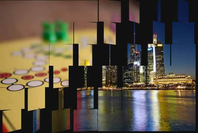
A demo with different animation curves and other values
In this demo, I used the same images as in the above example with different values for animation.
This time, the linear value is used for the curve while the animation direction is alternate.
The animation starts in 0.5s while the first picture is visible for a while before the animation starts and the second image displays with a flip transition. The animation direction is forwards. Have a look:
See online demo and code
You see, the first image specified in the img-ripple-transition class background property is displayed first unlike in the above example.
Credit: baileyparker