
The jQuery plug-in for responsive tables
As using the HTML tables in your web pages, this becomes important to make it responsive so it adjusts to the smaller screens of mobiles so users may go through it easily.
In this tutorial, a jQuery plug-in is used for creating Bootstrap-based tables that are responsive.
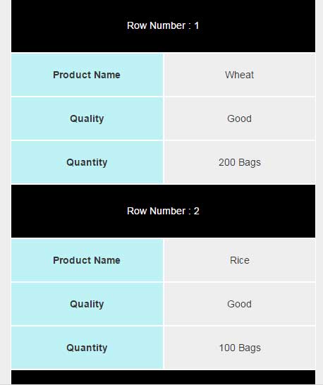
In the smaller screens, the table columns appear horizontally.
See the following section for demos and how to use this plug-in for creating responsive tables.
A demo of creating responsive Bootstrap table
For the example, an HTML table with Bootstrap and custom classes is created with a few hard-coded rows. The table structure is normal just like any other table with the table heading and table data using <th> and <td> inside the <tr> tags. Have a look at the code below that you may copy and paste into your editor.
If you are using a large screen then resize this to a small size to see how it adjusts and presents each row:
For setting up this table plug-in, follow these steps.
Step 1:
Include the Bootstrap and plug-in style file in the <head> section of the webpage where you want to use it (Get the plug-in files from the credit link below):
<link rel=”stylesheet” href=”http://maxcdn.bootstrapcdn.com/bootstrap/3.2.0/css/bootstrap.min.css”>
<link href=”css/responsive-table/style.css” rel=”stylesheet”>
Step 2:
Write the markup of the table with certain classes, for example, this markup is used for the demo:
<body>
		<div class="container">
		<h2>A demo of Responsive Table</h2>


<table class="table table-striped table-class hidden-sm hidden-xs" id= "responside-table-demo">
	<tr>
		<th>Product Name</th>
		<th>Quality</th>
		<th>Quantity</th>
	</tr>
	<tr>
		<td>Wheat</td>
		<td>Good</td>
		<td>200 Bags</td>
	</tr>
	<tr>
		<td>Rice</td>
		<td>Good</td>
		<td>100 Bags</td>
	</tr>
	<tr>
		<td>Sugar</td>
		<td>Prime</td>
		<td>200 Bags</td>
	</tr>
	<tr>
		<td>Maze</td>
		<td>Fine</td>
		<td>10 packs</td>
	</tr>
	<tr>
		<td>Wheat</td>
		<td>Good</td>
		<td>200 Bags</td>
	</tr>
	<tr>
		<td>Wheat</td>
		<td>Good</td>
		<td>200 Bags</td>
	</tr>
</table>


<div class="row visible-sm-block visible-xs-block table-xs" style="width: 100% ;">

</div>

</div> <!-- 		End of Container -->
Step 3:
Include the references of jQuery, Bootstrap and plug-in JS files just above the </body> tag:
<script src=”https://ajax.googleapis.com/ajax/libs/jquery/1.11.3/jquery.min.js”></script>
<script src=”http://maxcdn.bootstrapcdn.com/bootstrap/3.2.0/js/bootstrap.min.js”></script>
<script type=”text/javascript” src=”js/responsive-table/js.js”></script>
Step 4:
A small piece of jQuery code for calling the table and its size:
<script type="text/javascript">
        responsiveTable ('#responside-table-demo');
        balanceSize();
</script>
You may use the class name and ID in the responsiveTable method.
A demo of changing the CSS of table
As using this plug-in, you may want to change the style of the table as per need or to match with rest of the design of your website. For that, you need to use your own CSS or modify the classes in the style.css file that comes with the plug-in.
See the following demo where I have renamed the default CSS file of the plug-in and modified a few CSS classes for changing the style and look of the responsive table:
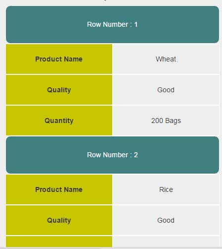
The only difference between this and the first example is the CSS while markup remains the same. In the style-custom CSS file, I changed .row-header and .table-xs .header properties where I also added the border-radius along with changing the background color of the rows for the smaller screens.
Credit: yasser-mas