
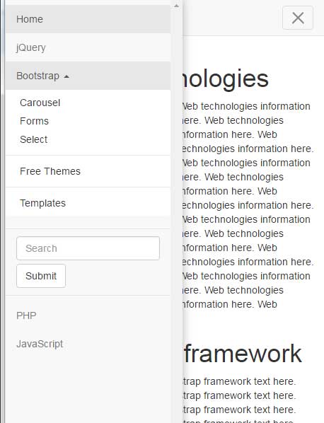
The off-canvas menu plug-in for Bootstrap that I am going to show you in this tutorial can be used for smaller screens like mobile phones as a user clicks on the three-line menu toggle button.
The menu will overlap the visible content and it will disappear as a user clicks the cross button (that you may customize).
So, let me start by an online demonstration along with a setting up guide of this off-canvas menu.
In this demo, a menu bar is created by using the typical Bootstrap navbar class. The button with three horizontal lines that show up on small screens like mobile or smartphones is given an added class apart from what you normally use i.e. offcanvas-toggle. In addition, the data-toggle=”offcanvas” data attribute is also given.
See the demo and if you are using a bigger screen, resize it so the mobile menu appears. Click on three line button to display the off-canvas menu:
See online demo and code
Notice this line and see the difference if you already experienced the navbar in Bootstrap:
<button type="button" class="navbar-toggle offcanvas-toggle pull-right" data-toggle="offcanvas" data-target="#js-bootstrap-offcanvas" style="float:left;">
To set up this plugin for your web pages, follow these steps.
Step 1:
Include the bootstrap.min.css and bootstrap.offcanvas.min.css files in the <head> section. You may get plug-in’s package by downloading it from the GitHub site (developed by iamphill) or download directly here. Unzip and get the CSS and JS files.
<link href=”http://netdna.bootstrapcdn.com/bootstrap/3.1.1/css/bootstrap.min.css” rel=”stylesheet”>
<link rel=”stylesheet” href=”css/bootstrap-offcanvas/bootstrap.offcanvas.min.css”/>
Step 2:
Just above the </body> tag, place the jQuery and bootstrap.offcanvas.js JS file. This is also contained in the downloaded package.
Step 3 – the markup:
As mentioned earlier, use the plug-in’s classes and data attribute in the <button> tag for mobile. See the complete code on the demo page.
You may use custom CSS for styling the menu or its items. Using the same off-canvas plug-in, the menu items and divider are assigned some CSS properties for demonstration.
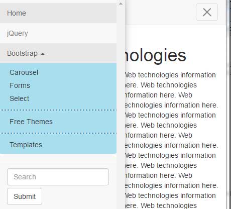
CSS used:
<style>
.dropdown-menu{
    background-color: #A8DEEE;
    border: 1px solid #428BCA;
}
.divider{
    border: 1px dashed #428BCA;
}
</style>
While you may use many other classes for the whole menu or parts of it, I have just used the dropdown-menu and divider classes in the <style> section to give off canvas menu a custom look. Rest of the code is the same as in the first example.
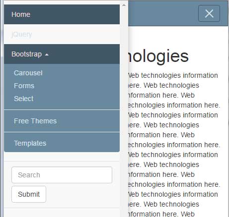
You may also override the CSS of the navbar-default class for customizing the look of the off-canvas or complete menu. For that, simply change the navbar-default related classes in the <style> section after Bootstrap’s CSS file or in your own external file.
See this demo’s output where off-canvas menu is created by overriding the navbar-default classes:
CSS code:
<style>
.navbar-default {
  background-color: #69899f;
  border-color: #425766;
}
.navbar-default .navbar-brand {
  color: #d7e2e9;
}
.navbar-default .navbar-brand:hover, .navbar-default .navbar-brand:focus {
  color: #e5dbdb;
}
.navbar-default .navbar-text {
  color: #d7e2e9;
}
.navbar-default .navbar-nav > li > a {
  color: #d7e2e9;
}
.navbar-default .navbar-nav > li > a:hover, .navbar-default .navbar-nav > li > a:focus {
  color: #e5dbdb;
}
.navbar-default .navbar-nav > li > .dropdown-menu {
  background-color: #69899f;
}
.navbar-default .navbar-nav > li > .dropdown-menu > li > a {
  color: #d7e2e9;
}
.navbar-default .navbar-nav > li > .dropdown-menu > li > a:hover,
.navbar-default .navbar-nav > li > .dropdown-menu > li > a:focus {
  color: #e5dbdb;
  background-color: #425766;
}
.navbar-default .navbar-nav > li > .dropdown-menu > li > .divider {
  background-color: #69899f;
}
.navbar-default .navbar-nav > .active > a, .navbar-default .navbar-nav > .active > a:hover, .navbar-default .navbar-nav > .active > a:focus {
  color: #e5dbdb;
  background-color: #425766;
}
.navbar-default .navbar-nav > .open > a, .navbar-default .navbar-nav > .open > a:hover, .navbar-default .navbar-nav > .open > a:focus {
  color: #e5dbdb;
  background-color: #425766;
}
.navbar-default .navbar-toggle {
  border-color: #425766;
}
.navbar-default .navbar-toggle:hover, .navbar-default .navbar-toggle:focus {
  background-color: #425766;
}
.navbar-default .navbar-toggle .icon-bar {
  background-color: #d7e2e9;
}
.navbar-default .navbar-collapse,
.navbar-default .navbar-form {
  border-color: #d7e2e9;
}
.navbar-default .navbar-link {
  color: #d7e2e9;
}
.navbar-default .navbar-link:hover {
  color: #e5dbdb;
}

@media (max-width: 767px) {
  .navbar-default .navbar-nav .open .dropdown-menu > li > a {
    color: #d7e2e9;
  }
  .navbar-default .navbar-nav .open .dropdown-menu > li > a:hover, .navbar-default .navbar-nav .open .dropdown-menu > li > a:focus {
    color: #e5dbdb;
  }
  .navbar-default .navbar-nav .open .dropdown-menu > .active > a, .navbar-default .navbar-nav .open .dropdown-menu > .active > a:hover, .navbar-default .navbar-nav .open .dropdown-menu > .active > a:focus {
    color: #e5dbdb;
    background-color: #425766;
  }
}
</style>
The markup is the same as first example.