
The jQuery method to set CSS properties
The CSS properties of the elements in the web page can be added, changed, and removed (at run time) by using the jQuery css method.
The $.css can also be used to get the CSS properties of the first matched element in DOM.
I will show you a few demos to use $.css jQuery method in a div, a menu, HTML table, list, accordion and Bootstrap navbar – so keep reading.
Syntax of $.css method
To set CSS single property (add or modify):
$(“selector”).css( “CSSpropertyName”, “PropertyValue” )
To set multiple properties at one call:
$("selector ").css({"border":" dashed 2px #eee681","font-size":"24px","color":"#eee"});

});
See the following examples for a better idea for real-time implementation. Click on demo links to see online with each example.
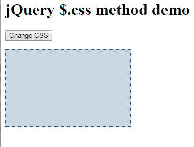
Starting with a simple div to change CSS
In this demo, a div is created with a few properties as the web page loads. The properties are specified in the <style> section of the head tag. As you click on the button, the CSS properties of the div will be changed. See online:
Code:
<!DOCTYPE html>
<html>
<head>
<script src="//code.jquery.com/jquery-1.10.2.js"></script>

<script>

$(document).ready(function(){
$(".chgcss").click(function(){
$(".divcss").css({"border":"dashed 2px #344E5F","font-size":"24px","color":"red","background-color":"#C8D7E1"});
  });


});
</script>

<style>
.divcss{
    width:30%;
    height:150px;
    border:solid 1px black;
}
</style>
</head>

<body>
<h1>jQuery $.css method demo</h1>
<p>
<button class="chgcss">Change CSS</button>
</p>

<div class="divcss">Some text</div>

</body>
</html>
You saw, a div with a solid border with black color and without any background displayed as the demo page loaded. If you clicked the button “Change CSS”, the following properties were changed:
$(".divcss").css({"border":"dashed 2px #344E5F","font-size":"24px","color":"red","background-color":"#C8D7E1"});
A few points to notice
- This line of code is placed in the click event of the button.
- You have to separate multiple CSS properties by a comma.
- A semicolon is not used after the value as we do in the CSS style section.
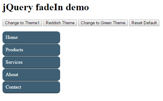
In this example, a menu is displayed with initial CSS properties set in the style section with the bluish theme. As demo page loads, you can see three buttons that you can click to change the colors of the menu.
On the click event of each button, the $.css method is attached to change the color of links class, which hierarchy, in that case is: div ul li a.
jQuery code/markup:
<!DOCTYPE html>
<html>
<head>
<script src="//code.jquery.com/jquery-1.10.2.js"></script>

<script>

$(document).ready(function(){
$(".chgcss").click(function(){
$(".men_ex ul li a").css({"background-color":"#3E5F74","color":"#fff","padding":"10px","border-top":"solid 1px #fff"});
  });

$(".chgcssRed").click(function(){
$(".men_ex ul li a").css({"background-color":"#A80000","color":"#fff","text-decoration":"none"});

  });

$(".chgcssGreen").click(function(){
$(".men_ex ul li a").css({"background-color":"#004000","color":"#eee","border-radius":"10px"});
  });


$(".reset").click(function(){
    $(".men_ex ul li a").removeAttr('style');
  });
});
</script>

<style>
.men_ex ul {
    margin: 0;
    padding: 0;
    width:185px;
    list-style-type: none;

}
.men_ex ul li a {

    color: #eee;
    padding: 10.5px 11px;
    background-color: #004080;
    display:block;
    border-bottom:solid 1px #000;
    border-radius:5px;
}

</style>
</head>

<body>
<h1>jQuery fadeIn demo</h1>
<p>
<button class="chgcss">Change to Theme1</button>
<button class="chgcssRed">Reddish Theme</button>
<button class="chgcssGreen">Change to Green Theme</button>
<button class="reset">Reset Default</button>
</p>
<div class="men_ex">
<ul>
<li><a href="#">Home</a></li>
<li><a href="#">Products</a></li>
<li><a href="#">Services</a></li>
<li><a href="#">About</a></li>
<li><a href="#">Contact</a></li>
</ul>
</div>

</body>
</html>
You may notice, the border-radius is kept 5px for the menu at the initial stage. If you click on the “Change to theme1” button, it remains the same.
That means the properties that are used in the $.css method will replace the previous values while those that are not used remain intact. So, the border-radius stayed the same.
Similarly, if you click at the “Green theme” button, the border-radius is changed in $.css method. Now it will remain the same if you click the red or first theme buttons because these buttons do not setting the border-radius property.
There is another button, Restore initial setting. Clicking this will return the menu to its original style with the same properties as set in the <style> section of the head tag.
In that button, the following script is used:
$(".reset").click(function(){

$(".men_ex ul li a").removeAttr('style');

});
So we can conclude a few points here:
- All the properties used in the initial stage (that are set at the style tag, inline or external CSS) remains the same unless you modify it in $.css method.
- If you change only a few properties out of all initial properties, the other properties will stay the same. For example, if text color was set as white with the black background and you changed the background to red. The color of the text will remain white.
- You may also use CSS 3 properties in $.css method like I used the border-radius property.
- The jQuery css method can be used to add and change the CSS properties in the specified elements.
- You may remove the properties added/modified by using the $.removeAttr method, as done by using the “Reset Default” button in the demo.
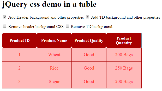
An example of using $.css in an HTML table
In this demo, a table with the initial CSS style is created with dummy data. To give it a variation, I have used check boxes instead of the buttons to call $.css jQuery method to add, change or remove CSS properties.
The code:
<!DOCTYPE html>
<html>
<head>
<script src="//code.jquery.com/jquery-1.10.2.js"></script>

<script>

$(document).ready(function(){
$("#addhcss").click(function(){
$(".demotbl th").css({"background-color":"#A80000","color":"#fff","border-radius":"6px","border":"none"});

  });

$("#addrowcss").click(function(){
$(".demotbl td").css({"background-color":"#FFB9B9","color":"#FF2D2D","border":"1px solid #A80000","font-size":"18px","text-align":"center"});
  });


$("#removecss").click(function(){
    $(".demotbl th").removeAttr('style');
  });


$("#removetdcss").click(function(){
    $(".demotbl td").removeAttr('style');
  });
});
</script>
<style>
/*Using CSS for table*/
.demotbl {
    border-collapse: collapse;
    border: 1px solid #69899F;
  }
.demotbl th{
    border: 1px solid #69899F;
    color: #3E5260;
    padding:10px;
  }
.demotbl td{
    border: 1px dotted black;
    color: #002F5E;
    padding:15px;
    width:100px;
  }
</style>
</head>
<body>
<h1>jQuery css demo in a table</h1>
<p>
<label><input type="checkbox" id="addhcss"> Add Header background and other properties</label>
<label><input type="checkbox" id="addrowcss"> Add TD background and other properties</label>
</p>
<p>
<label><input type="checkbox" id="removecss"> Remove header background CSS</label>
<label><input type="checkbox" id="removetdcss"> Remove TD background</label>
</p>

<table class="demotbl">
  <tr>
      <th>Product ID</th>
      <th>Product Name</th>
      <th>Product Quality</th>
      <th>Product Quantity</th>
  </tr>
  <tr>
      <td>1</td>
      <td>Wheat</td>
      <td>Good</td>
      <td>200 Bags</td>
  </tr>
  <tr>
      <td>2</td>
      <td>Rice</td>
      <td>Good</td>
      <td>250 Bags</td>
  <tr>
      <td>3</td>
      <td>Sugar</td>
      <td>Good</td>
      <td>200 Bags</td>
  </tr>
</table>
</body>
</html>
As you click the first checkbox, “Add Header background and other properties”, it will add background-color in the table header. Also, the border-radius is added while the border is removed. The color property is changed to what was set initially.
The table header is accessible by using the following:
$("#addhcss").click(function(){

$(".demotbl th").css({"background-color":"#A80000","color":"#fff","border-radius":"6px","border":"none"});

});
Where demotbl is the main table class!
Similarly, no background color was given initially to <td>. As you click on the second checkbox to add a background, it will not only add background color but also increase the font-size, text-align and change the border properties as well.
The following jQuery code is used in the click event of the second checkbox to change CSS:
$("#addrowcss").click(function(){

$(".demotbl td").css({"background-color":"#FFB9B9","color":"#FF2D2D","border":"1px solid #A80000","font-size":"18px","text-align":"center"});

});
The last two checkboxes, in the second row, are to remove the properties added or changed by using the jQuery $.css method. Alternatively, you can say it will change CSS to default or initial state.
Using $.css with jQuery UI accordion
Not only, you may change CSS of simple elements like div, tables etc. but also other components of jQuery UI by using the $.css method.
In that demo, an accordion is created by using the jQuery UI library. Initially, the accordion is displayed with default CSS as used in the library with three panels.
After the accordion, two buttons are given to change the CSS of panels and content area. See the demo online with a little description after it:
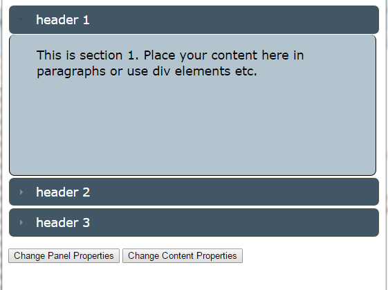
Quite a few properties are changed as you click “change header” and “change content” buttons. In the click events of buttons, the built-in UI accordion classes are used that override the default properties:
$(document).ready(function(){

$(".panelcol").click(function(){

$(".ui-accordion .ui-accordion-header").css({"background":"#415765","color":"#fff","border":"1px solid #FDF8E4","display": "block","border-radius":"8px"});

});


$(".conprop").click(function(){

$(".ui-accordion .ui-accordion-content").css({"background":"#B3C4CE","color":"#000","border":"1px solid black",

"border-top": "0","border-radius":"8px","width":"84%","margin-left":"1px"});

});

});
You can see, the ui-accordion .ui-accordion-header class will handle the header part of the accordion where background, text color, border, display and border-radius properties are used.
While the ui-accordion .ui-accordion-content deals with the content inside the accordion panels. A few properties of CSS are also changed by using the jQuery $.css method.
Complete code:
<!doctype html>
<html>
<head>

  <link rel="stylesheet" href="//code.jquery.com/ui/1.11.2/themes/smoothness/jquery-ui.css">
  <script src="//code.jquery.com/jquery-1.10.2.js"></script>
  <script src="//code.jquery.com/ui/1.11.2/jquery-ui.js"></script>

  <script>
  $(function() {
    $( "#jQuery_accordion" ).accordion({
      collapsible: true,
      active: 2
    });
  });
  </script>
<script>

$(document).ready(function(){
$(".panelcol").click(function(){
$(".ui-accordion .ui-accordion-header").css({"background":"#415765","color":"#fff","border":"1px solid #FDF8E4","display": "block","border-radius":"8px"});
 });

$(".conprop").click(function(){
$(".ui-accordion .ui-accordion-content").css({"background":"#B3C4CE","color":"#000","border":"1px solid black",
    "border-top": "0","border-radius":"8px","width":"84%","margin-left":"1px"});
 });

});
</script>

</head>
<body>

<div id="jQuery_accordion">
  <h3>header 1</h3>
    <p>
    This is section 1. Place your content here in paragraphs or use div elements etc.
    </p>
  <h3>header 2</h3>
    <p>
    This is sextion 2. You can also include images like this:
    <img src="jquery.jpg" />
    </p>
  <h3>header 3</h3>
    <div>
    <p>
    This is section 3. Content can include listing as well.
    <ol>
      <li>item 1</li>
      <li>Item 2</li>
      <li>Item 3</li>
    </ol>
    </p>
    </div>
</div>
<p>
<button class="panelcol">Change Panel Properties</button>
<button class="conprop">Change Content Properties</button>
</p>

</body>
</html>
In the final demo, I will show you changing/adding the CSS properties in the Bootstrap navbar component.
For that, a navbar is created by using the Bootstrap libraries. It uses default classes that are built-in in the framework’s CSS.
By using the $.css method, I will show you how you can change a few properties.
Code:
<!DOCTYPE html>
<html>
<head>
<title>navbar example</title>
<link rel="stylesheet" href="https://maxcdn.bootstrapcdn.com/bootstrap/3.3.6/css/bootstrap.min.css" integrity="sha384-1q8mTJOASx8j1Au+a5WDVnPi2lkFfwwEAa8hDDdjZlpLegxhjVME1fgjWPGmkzs7" crossorigin="anonymous">
<script src="https://ajax.googleapis.com/ajax/libs/jquery/1.10.2/jquery.min.js"></script>
<script src="https://maxcdn.bootstrapcdn.com/bootstrap/3.3.6/js/bootstrap.min.js" integrity="sha384-0mSbJDEHialfmuBBQP6A4Qrprq5OVfW37PRR3j5ELqxss1yVqOtnepnHVP9aJ7xS" crossorigin="anonymous"></script>
<script>
$(document).ready(function(){
$("#btnprimary").click(function(){
$(".navbar-default").css({"background":"#337AB7","color":"#fff","border-color":"#425766"});
$(".navbar-default .navbar-nav > li > a").css({"background":"#337AB7","color":"#d7e2e9","border-color":"#425766"});
});
$("#btndanger").click(function(){
$(".navbar-default").css({"background":"#D9534F","color":"#fff","border-color":"#125E6D"});
$(".navbar-default .navbar-nav > li > a").css({"background":"#D9534F","color":"#fff","border-color":"#425766"});
});
$("#btnwarning").click(function(){
$(".navbar-default").css({"background":"#F0AD4E","color":"#fff","border-color":"#425766"});
$(".navbar-default .navbar-nav > li > a").css({"background":"#F0AD4E","color":"#000","border-color":"#425766"});
});
$("#btninfo").click(function(){
$(".navbar-default").css({"background":"#5BC0DE","color":"#114453","border-color":"#114453"});
$(".navbar-default .navbar-nav > li > a").css({"background":"#5BC0DE","color":"#114453","border-color":"#114453"});
});
$("#btnsuccess").click(function(){
$(".navbar-default").css({"background":"#5CB85C","color":"#fff","border-color":"#214526"});
$(".navbar-default .navbar-nav > li > a").css({"background":"#5CB85C","color":"#d7e2e9","border-color":"#214526"});
});
$("#btndefault").click(function(){
$(".navbar-default").removeAttr('style');
$(".navbar-default .navbar-nav > li > a").removeAttr('style');
});
});
</script>
</head>
<body>
<h1>jQuery CSS demo</h1>
<nav class="navbar navbar-default">
<div class="container-fluid">
<!-- Brand and toggle get grouped for better mobile display -->
<div class="navbar-header">
<button type="button" class="navbar-toggle collapsed" data-toggle="collapse" data-target="#bs-example-navbar-collapse-1" aria-expanded="false">
<span class="sr-only">Toggle navigation</span>
<span class="icon-envelope"></span>
</button>
<a class="navbar-brand" href="#">Web</a>
</div>
<!-- Collect the nav links, forms, and other content for toggling -->
<div class="collapse navbar-collapse" id="bs-example-navbar-collapse-1">
<ul class="nav navbar-nav">
<li class="active"><a href="#">Home <span class="sr-only">(current)</span></a></li>
<li><a href="https://www.jquery-az.com/php-tutorials/">PHP</a></li>
<li><a href="https://www.jquery-az.com/jquery-tips/">jQuery</a></li>
<li class="dropdown">
<a href="https://www.jquery-az.com/bootstrap-tips-tutorials/" class="dropdown-toggle" data-toggle="dropdown" role="button" aria-haspopup="true" aria-expanded="false">Bootstrap <span class="caret"></span></a>
<ul class="dropdown-menu">
<li><a href="https://www.jquery-az.com/bootstrap-carousel-5-single-multiple-horizontal-and-vertical-sliding-demos/">Carousel</a></li>
<li><a href="https://www.jquery-az.com/bootstrap-form-customized-styles-6-online-examples/">Forms</a></li>
<li role="separator" class="divider"></li>
<li><a href="https://www.jquery-az.com/bootstrap-select-5-beautiful-styles/">Select</a></li>
</ul>
</li>
</ul>
<form class="navbar-form navbar-left" role="search">
<div class="form-group">
<input type="text" class="form-control" placeholder="Find topics">
</div>
<button type="submit" class="btn btn-default">Go</button>
</form>
<ul class="nav navbar-nav navbar-right">
<li class="dropdown">
<a href="#" class="dropdown-toggle" data-toggle="dropdown" role="button" aria-haspopup="true" aria-expanded="false">About <span class="caret"></span></a>
<ul class="dropdown-menu">
<li><a href="https://www.jquery-az.com/about-us/">Terms</a></li>
<li><a href="https://www.jquery-az.com/contact/">Contact</a></li>
</ul>
</li>
</ul>
</div><!-- /.navbar-collapse -->
</div><!-- /.container-fluid -->
</nav>
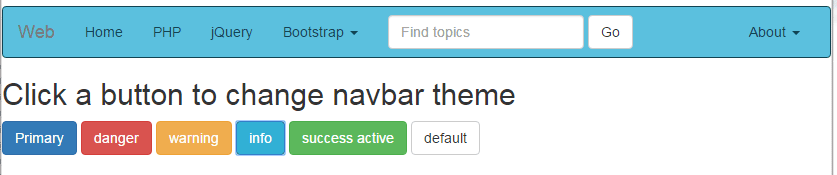
<h2>Click a button to change navbar theme</h2>
<p>
<button type="button" id="btnprimary" class="btn btn-primary">Primary</button>
<button type="button" id="btndanger" class="btn btn-danger">danger</button>
<button type="button" id="btnwarning" class="btn btn-warning">warning</button>
<button type="button" id="btninfo" class="btn btn-info">info</button>
<button type="button" id="btnsuccess" class="btn btn-success">success active</button>
<button type="button" id="btndefault" class="btn btn-default">default</button>
</p>
</div>
</body>
</html>
The demo page is loaded with a default navbar style of Bootstrap. You can also see six Bootstrap buttons below the navigation bar. Each button is given a built-in class of navbar as well, which also defines its color.
As you click on any button, the navbar’s theme is also changed which is matched to the color of the button. For example, clicking on the primary button will change the navbar theme to blue and danger to red, and so on.
To accomplish that, $.css method of jQuery is used in the click event of each button. Look at this code in the head section:
<script>

$(document).ready(function(){

$("#btnprimary").click(function(){

$(".navbar-default").css({"background":"#337AB7","color":"#fff","border-color":"#425766"});

$(".navbar-default .navbar-nav > li > a").css({"background":"#337AB7","color":"#d7e2e9","border-color":"#425766"});

});


$("#btndanger").click(function(){

$(".navbar-default").css({"background":"#D9534F","color":"#fff","border-color":"#125E6D"});

$(".navbar-default .navbar-nav > li > a").css({"background":"#D9534F","color":"#fff","border-color":"#425766"});

});


$("#btnwarning").click(function(){

$(".navbar-default").css({"background":"#F0AD4E","color":"#fff","border-color":"#425766"});

$(".navbar-default .navbar-nav > li > a").css({"background":"#F0AD4E","color":"#000","border-color":"#425766"});

});


$("#btninfo").click(function(){

$(".navbar-default").css({"background":"#5BC0DE","color":"#114453","border-color":"#114453"});

$(".navbar-default .navbar-nav > li > a").css({"background":"#5BC0DE","color":"#114453","border-color":"#114453"});

});


$("#btnsuccess").click(function(){

$(".navbar-default").css({"background":"#5CB85C","color":"#fff","border-color":"#214526"});

$(".navbar-default .navbar-nav > li > a").css({"background":"#5CB85C","color":"#d7e2e9","border-color":"#214526"});

});


$("#btndefault").click(function(){

$(".navbar-default").removeAttr('style');

$(".navbar-default .navbar-nav > li > a").removeAttr('style');

});


});


</script>
You can see, in each button, the navbar-default and navbar-default .navbar-nav > li > a classes are used in the $css method. These are built-in classes in the Bootstrap framework’s CSS. I am just overriding the properties in the click event of each button.
For that demo, only a few properties are changed, however, there are many other properties that you can work with, for example, drop-down links are not changed in that demo. In the pro website, this should be managed as well. Similarly, form’s classes can also be changed by using the $.css method.
You can see details about other classes in their own chapter here.
The last button will turn the navbar into the default theme, which is again done by using the removeAttr method of jQuery, as in the above example. So it just removed any CSS style that is applied by clicking the buttons.