
The header layouts using Bootstrap framework
In this post, I am going to share an excellent plug-in that works with Bootstrap for creating the header menu for your website. It includes 23 free templates that you may choose as per the need of your web project.
The free code is included by the developer that you may get from the demo pages below (a few) or by visiting the plug-in page in Github website (see the credit below).
The free layouts include the code for navbar right menu, center and left. Besides, if you have a shopping related site, a menu is there for you to show basket items. It also includes the mega menu template, navbar with search, sticky navbar, and many others. See the section below for the live demos of a few menus.
The following layout for the header menu contains navigation links to the right side. A dropdown menu is also added with three levels. The animation effect is used for the dropdown menu with fadeInDown and fadeOutUp values. You may set these values in the data attributes as shown in the live demo below:
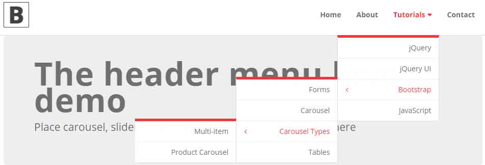
See online demo and code
Following is the markup for this header menu:
<nav class="navbar navbar-default bootsnav">

    <div class="container">

        <!-- Start Header Navigation -->

        <div class="navbar-header">

            <button type="button" class="navbar-toggle" data-toggle="collapse" data-target="#navbar-menu">

                <i class="fa fa-bars"></i>

            </button>

            <a class="navbar-brand" href="#brand"><img src="images/brand/logo-black.png" class="logo" alt=""></a>

        </div>

        <!-- End Header Navigation -->


               <div class="collapse navbar-collapse" id="navbar-menu">

            <ul class="nav navbar-nav navbar-right" data-in="fadeInDown" data-out="fadeOutUp">

                <li><a href="https://www.jquery-az.com/">Home</a></li>

                <li><a href="https://www.jquery-az.com/about-us/">About</a></li>


                <li class="dropdown">

                    <a href="#" class="dropdown-toggle" data-toggle="dropdown" >Tutorials</a>

                    <ul class="dropdown-menu">

                        <li><a href="#">jQuery</a></li>

                        <li><a href="#">jQuery UI</a></li>

                        <li class="dropdown">

                            <a href="#" class="dropdown-toggle" data-toggle="dropdown" >Bootstrap</a>

                            <ul class="dropdown-menu">

                                <li><a href="#">Forms</a></li>

                                <li><a href="#">Carousel</a></li>

                                <li class="dropdown">

                                    <a href="#" class="dropdown-toggle" data-toggle="dropdown" >Carousel Types</a>

                                    <ul class="dropdown-menu">

                                        <li><a href="#">Multi-item</a></li>

                                        <li><a href="#">Product Carousel</a></li>

                                    </ul>

                                </li>

                                <li><a href="#">Tables</a></li>

                            </ul>

                        </li>

                        <li><a href="#">JavaScript</a></li>

                    </ul>

                </li>


                <li><a href="https://www.jquery-az.com/contact/">Contact</a></li>

            </ul>

        </div><!-- /.navbar-collapse -->

    </div>

</nav>

    <!-- End Navigation -->


    <div class="clearfix"></div>


    <div class="container">

        <div class="jumbotron">

            <h1>The header menu layout demo</h1>

            <p>Place carousel, slider, other static images or textual content here</p>

        </div>

    </div>
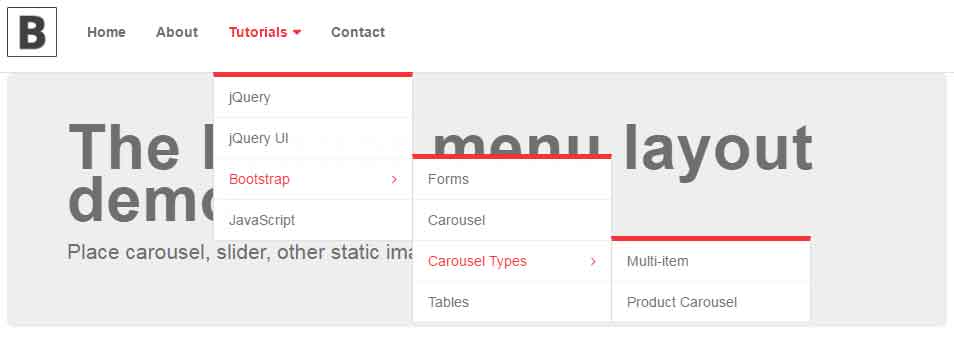
If you want to use the same menu as above with left navigation then this is just the matter of changing a class in the main div. For that, find the div with navbar-menu ID and change the navbar-right to navbar-left in the <ul> tag:
        <div class="collapse navbar-collapse" id="navbar-menu">

            <ul class="nav navbar-nav navbar-left" data-in="fadeInDown" data-out="fadeOutUp">
See the demo online:
See online demo and code
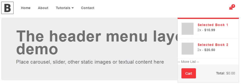
If you have a shopping related website, you may show the shopping cart items on the right corner of header menu. As the mouse is hovered over the cart icon, the items in the cart will display in the header menu. See the online demonstration:
See online demo and code
The markup:
<nav class="navbar navbar-default bootsnav">

    <div class="container">

            <!-- Start Atribute Navigation -->

        <div class="attr-nav">

            <ul>

                <li class="dropdown">

                    <a href="#" class="dropdown-toggle" data-toggle="dropdown" >

                        <i class="fa fa-shopping-bag"></i>

                        <span class="badge">3</span>

                    </a>

                    <ul class="dropdown-menu cart-list">

                        <li>

                            <a href="#" class="photo"><img src="images/thumb/thumb01.jpg" class="cart-thumb" alt="" /></a>

                            <h6><a href="#">Selected Book 1 </a></h6>

                            <p>2x - <span class="price">$10.99</span></p>

                        </li>

                        <li>

                            <a href="#" class="photo"><img src="images/thumb/thumb01.jpg" class="cart-thumb" alt="" /></a>

                            <h6><a href="#">Selected Book 2 </a></h6>

                            <p>2x - <span class="price">$20.50</span></p>

                        </li>

                        -- More List --

                        <li class="total">

                            <span class="pull-right"><strong>Total</strong>: $0.00</span>

                            <a href="#" class="btn btn-default btn-cart">Cart</a>

                        </li>

                    </ul>

                </li>

            </ul>

        </div>

        <!-- End Atribute Navigation -->

        <!-- Start Header Navigation -->

        <div class="navbar-header">

            <button type="button" class="navbar-toggle" data-toggle="collapse" data-target="#navbar-menu">

                <i class="fa fa-bars"></i>

            </button>

            <a class="navbar-brand" href="#brand"><img src="images/brand/logo-black.png" class="logo" alt=""></a>

        </div>

        <!-- End Header Navigation -->


        <!-- Collect the nav links, forms, and other content for toggling -->

        <div class="collapse navbar-collapse" id="navbar-menu">

            <ul class="nav navbar-nav navbar-left" data-in="fadeInDown" data-out="fadeOutUp">

                <li><a href="https://www.jquery-az.com/">Home</a></li>

                <li><a href="https://www.jquery-az.com/about-us/">About</a></li>


                <li class="dropdown">

                    <a href="#" class="dropdown-toggle" data-toggle="dropdown" >Tutorials</a>

                    <ul class="dropdown-menu">

                        <li><a href="#">jQuery</a></li>

                        <li><a href="#">jQuery UI</a></li>

                        <li class="dropdown">

                            <a href="#" class="dropdown-toggle" data-toggle="dropdown" >Bootstrap</a>

                            <ul class="dropdown-menu">

                                <li><a href="#">Forms</a></li>

                                <li><a href="#">Carousel</a></li>

                                <li class="dropdown">

                                    <a href="#" class="dropdown-toggle" data-toggle="dropdown" >Carousel Types</a>

                                    <ul class="dropdown-menu">

                                        <li><a href="#">Multi-item</a></li>

                                        <li><a href="#">Product Carousel</a></li>

                                    </ul>

                                </li>

                                <li><a href="#">Tables</a></li>

                            </ul>

                        </li>

                        <li><a href="#">JavaScript</a></li>

                    </ul>

                </li>


                <li><a href="https://www.jquery-az.com/contact/">Contact</a></li>

            </ul>

        </div><!-- /.navbar-collapse -->

    </div>

</nav>

    <!-- End Navigation -->


    <div class="clearfix"></div>


    <div class="container">

        <div class="jumbotron">

            <h1>The header menu layout demo</h1>

            <p>Place carousel, slider, other static images or textual content here</p>

        </div>

    </div>
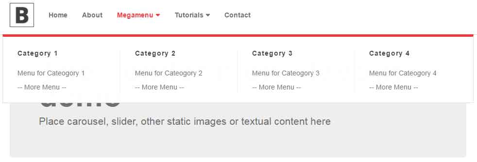
By using this plug-in, you may also create a mega menu. See the following demo where a mega menu is integrated into the above example’s menu adjacent to the dropdown.
See online demo and code
You may get the complete code from the demo page.
Setting up this header plug-in in your website
For setting up this plug-in, you need to download it from the Github website. After downloading the zipped file, extract the package and get a few dependent files:
In the <head> section:
    <!-- Bootstrap Core CSS -->

    <link rel="stylesheet" href="https://maxcdn.bootstrapcdn.com/bootstrap/3.3.4/css/bootstrap.min.css">

    <!-- Font Icons -->

    <link href="https://cdnjs.cloudflare.com/ajax/libs/font-awesome/4.6.3/css/font-awesome.css" rel="stylesheet">

    <!-- Font Style -->

    <!-- Animate -->

    <link href="css/animate.css" rel="stylesheet">


    <!-- Bootsnav -->

    <link href="css/bootsnav/bootsnav.css" rel="stylesheet">

    <link href="css/bootsnav/overwrite.css" rel="stylesheet">

    <link href="css/bootsnav/skins/color.css" rel="stylesheet">
Above the </body> tag:
   <script type="text/javascript" src="https://ajax.googleapis.com/ajax/libs/jquery/1.11.3/jquery.min.js"></script>

    <script src="https://maxcdn.bootstrapcdn.com/bootstrap/3.3.4/js/bootstrap.min.js"></script>

    <script src="js/bootsnav/bootsnav.js"></script>
The non-CDN files are included in the downloaded package.
You may also see 23 layouts linked from the source page.